
Brightlayer UI React Native Progress Icons
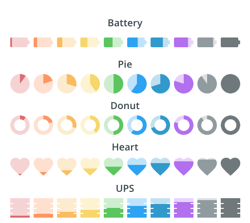
This is a library of icons with dynamic fill capabilities that can be used to show progress (similar to a traditional progress spinner or bar). These can be used to show health, battery life, etc.
Currently, we have icons available for:
- battery
- heart
- pie
- ups
Installation
To install the Brightlayer UI progress icons from NPM as a dependency for your project, you can run the following command in your project root:
yarn add @brightlayer-ui/react-native-progress-iconsPeer Dependencies
In order to use this library, you must also have react-native-svg installed in your project. You can add it by running:
yarn add react-native-svgUsing the progress icons in your application
The progress icon components can be imported and used like you would use any other component.
import {Battery, Heart, Pie} from '@brightlayer-ui/react-native-progress-icons';
...
<Battery color={'blue'} percent={100} size={36} color={'green'} charging={true} outlined={true}/>
<Heart color={'red'} percent={50} size={18} color={'pink'} outlined={true}/>
<Pie color={'green'} percent={50} size={48} color={'blue'} ring={4} outlined={true}/>
API
Shared Properties
These props are available on all of the progress icons in this package.
| Prop Name | Description | Type | Required | Default |
|---|---|---|---|---|
| backgroundColor | Background color for the unfilled area | string |
no | |
| color | The color used for the icon fill | string |
yes | |
| labelColor | Label text color | string |
no | |
| labelPosition | Where to display the text label |
'top' | 'bottom' | 'center' | 'right' | 'left'
|
no | center |
| labelSize | Size of the label in px | number |
no | size/4 |
| outlined | Whether to use the outlined style | boolean |
no | false |
| percent | The amount to fill the icon (0-100) | number |
no | 100 |
| showPercentLabel | Option to show percentage overlay | boolean |
no | false |
| size | The size of the icon (in px) | number |
no | 24 |
Any other props supplied will be provided to the root element (Svg).
Battery Properties
The battery supports all of the shared properties above and the following additional properties:
| Prop Name | Description | Type | Required | Default |
|---|---|---|---|---|
| charging | Whether to show the charging indicator | boolean |
no | false |
Pie Properties
The pie supports all of the shared properties above and the following additional properties:
| Prop Name | Description | Type | Required | Default |
|---|---|---|---|---|
| ring | The thickness of the outer ring (1 = thin ring, 10 = full circle ) | number |
no | 10 |