@maqe-vue/dropdown
The Vue2 component for dropdown
See demo on: Storybook
Installation
NPM
Install the npm package.
npm install @maqe-vue/dropdown --save
Register the component
import VqmDropdown from '@maqe-vue/dropdown'
import '@maqe-vue/dropdown/dist/style.css'

Vue.component('vmq-dropdown', VqmDropdown)
Usage
Basic


<vqm-dropdown
v-model="input"
:list="list"
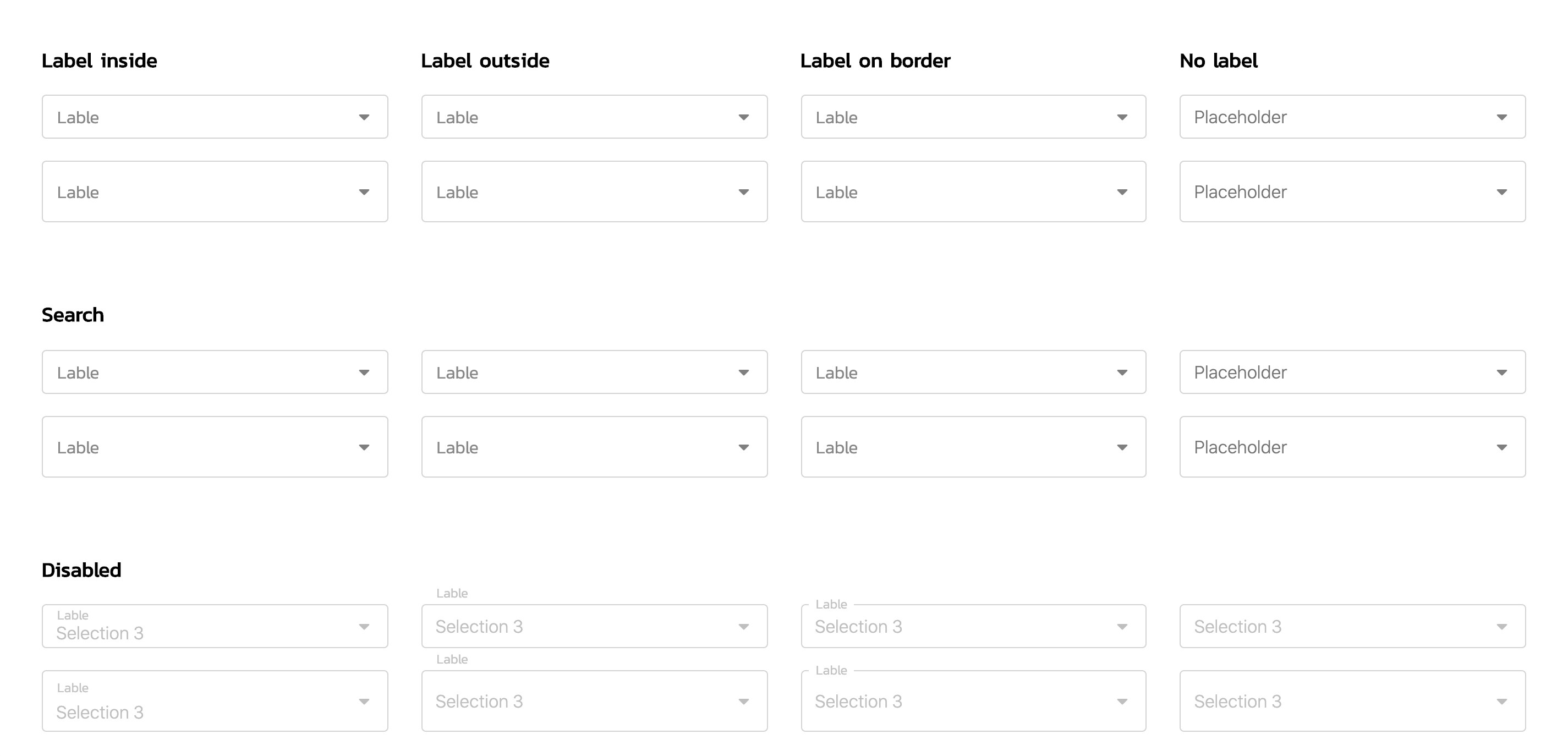
label-style="label-inside"
label="Label"
size="medium"
/>
<script>
export default {
data() {
return {
input: "",
list: [
{ title: "Selection 1", value: "1" },
{ title: "Selection 2", value: "2" },
{ title: "Selection 3", value: "3" },
{ title: "Selection 4", value: "4" },
{ title: "Selection 5", value: "5" },
{ title: "Selection 6", value: "6" }
]
};
}
};
</script>
Search

Searching supported to arrow up, down and enter keys.
<vqm-dropdown
    v-model="input"
    :list="list"
    label-style="label-inside"
    label="Label"
    size="medium"
    searchable
/>
API
Props
| Name | Type | Description | default |
|---|---|---|---|
v-model |
bind |
||
containerClass |
string |
||
searchable |
boolean |
false |
|
label-style |
string |
`label-inside | label-outside |
label |
string |
||
placeholder |
string |
||
disabled |
boolean |
false |
|
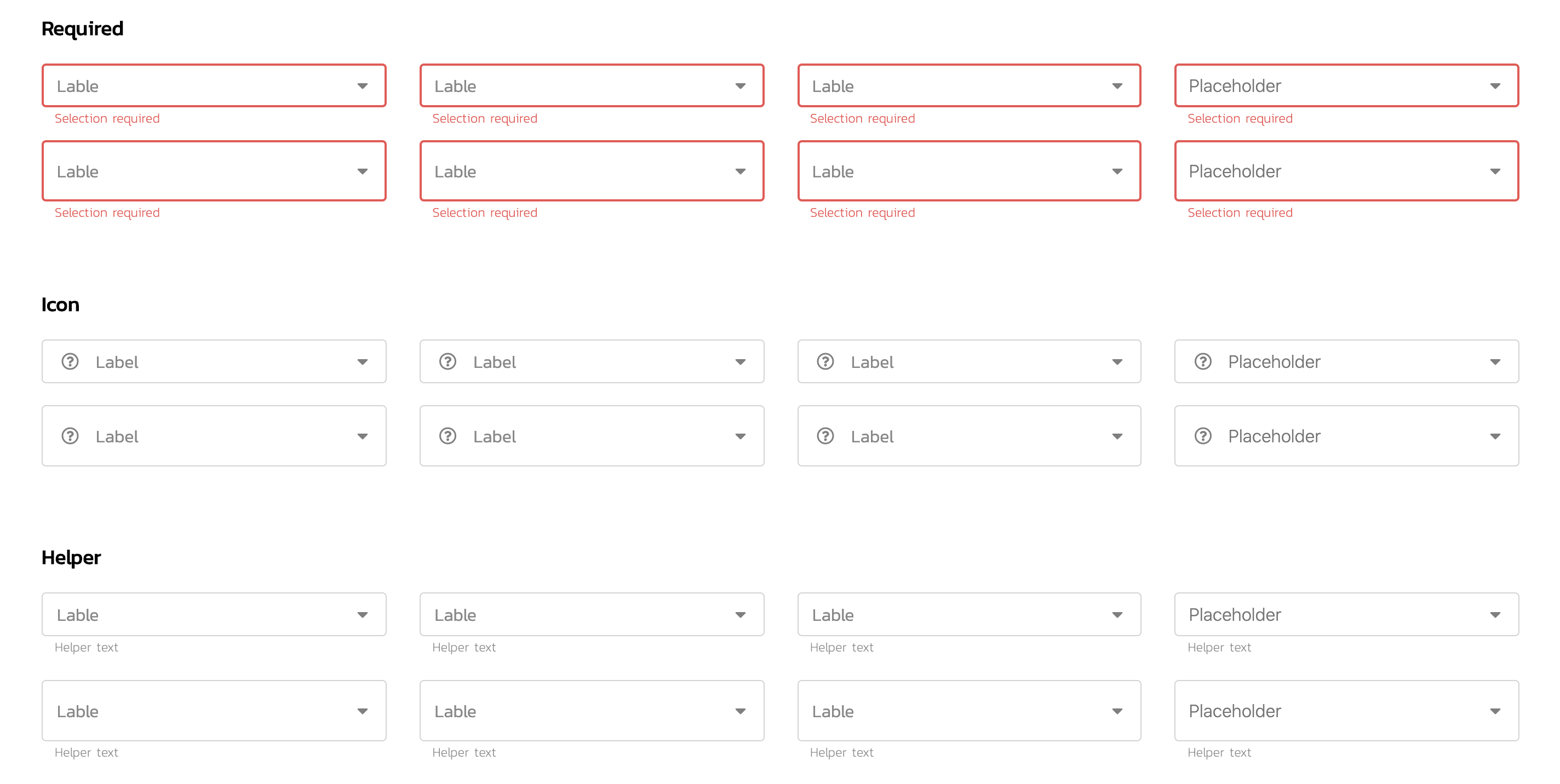
required |
boolean |
false |
|
helper-text |
string |
||
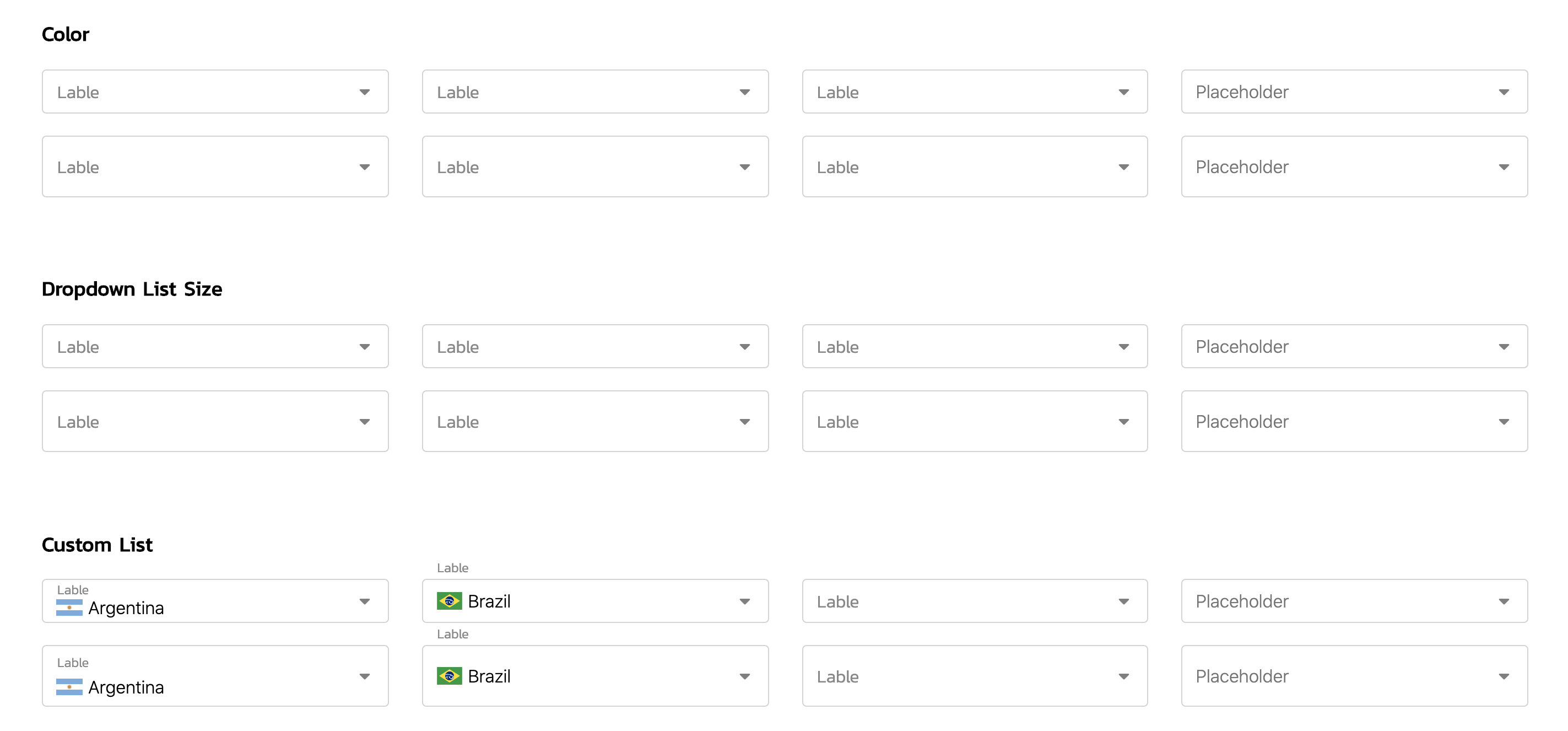
size |
`small | medium | large` |
size-dropdown-list |
`small | large` |
Style
Custom Style
Custom style with css variable

<vqm-dropdown
    v-model="input"
    :list="list"
    label-style="label-inside"
    label="Label"
    size="medium"
/>

// for example to set as a global
<style>
    :root {
        --vqm-dropdown-color: tan;
        --vqm-dropdown-hover-color: rgba(203, 203, 203, .2);
        --vqm-dropdown-selected-color: tan;
    }
</style>