
The decision to composite all 24 input types into one component, AIOInput, was made to enhance versatility, maintainability, and consistency across various input scenarios in web development.
By encapsulating all input types within a single component, developers have access to a wide range of input functionalities without the need to import and manage multiple components. This approach simplifies the component structure and streamlines development workflows, especially in projects requiring diverse input requirements.
Using a composite component allows for centralized management of common functionalities such as popover handling, option configuration, rendering layout, and event handling (e.g., onChange events). Any updates or enhancements to these shared functionalities can be implemented once within the composite component, ensuring consistent behavior across all input types.
All input types share a common configuration syntax and utilize the same underlying methods for rendering and event handling. This promotes consistency in the development process, making it easier for developers to learn, use, and maintain the component. Additionally, consistent configuration options enhance code readability and reduce the likelihood of errors.
In summary, the AIOInput component offers a unified solution for handling diverse input requirements in web applications, providing developers with a versatile, maintainable, and consistent toolset for building interactive user interfaces.
| Type | has multiple type | has popover prop | has options prop | has option prop |
|---|---|---|---|---|
| text | No | yes (if set options prop) | Yes (if set options prop) | Yes |
| number | No | yes (if set options prop) | Yes (if set options prop) | Yes |
| textarea | No | yes (if set options prop) | Yes (if set options prop) | Yes |
| password | No | No | No | No |
| color | No | No | Yes (if set options prop) | No |
| select | Yes (multiselect) | Yes | Yes | Yes |
| tabs | No | No | Yes | Yes |
| buttons | Yes (multiselect) | No | Yes | Yes |
| radio | Yes (checklist) | No | Yes | Yes |
| checkbox | No | No | No | No |
| spinner | Yes (range spinner) | No | No | No |
| slider | Yes (range slider) | No | No | No |
| date | Yes (multi date) | Yes | No | Yes |
| time | No | Yes | No | No |
| list | No | No | Yes | Yes |
| image | No | Yes | No | No |
| file | Yes (multiple files) | No | No | Yes |
| tree | No | No | No | Yes |
| acardion | Yes (multiple acardion) | No | Yes | Yes |
| table | No | No | No | No |
| form | No | No | No | No |
| button | No | Yes (if set popover prop) | No | No |
collection types are form , table and tree types that can take all input types to modify set of data:
- in input type
formyou can use all this types as elements of form. form get an object as value and inputs object by definition fields and will pass changed value automatically by onChange prop - in input type
tableyou can use all this types as table cell content. table get an array of objects as table rows by value prop and input object in columns prop will be props of each cell input. by change each input , table onChange will pass changed rows automatically. - in input type
treeyou can use all this types as text of tree node. tree get an object contain text function. you can customize tree node text as other inputs or any jsx content.
| prop | type | default | description |
|---|---|---|---|
| placeholder | string | undefined | guiding users on the expected format or content or show instead empty contents. |
| disabled | boolean | false | make input disabled. |
| loading | boolean | false | make input disabled and show loader after. |
| before | jsx | undefined | use input before content. |
| after | jsx | undefined | use input after content. |
| justify | boolean | false | make content justify. |
| attrs | attributes object | {} | custom input container standard html attributes. |
| style | style object | {} | custom input container style object. |
| className | string | undefined | custom input container className. |
| subtext | string | undefined | input subtext. show under input. |
| options | array of any | required in some input types | input selective options.use in selective input types. |
| option | object contain functions or string | undefined | configure each option.use in selective types. |
| caret | false or jsx | default caret | caret icon of dropdown inputs. set false to hide and set jsx to cutomize. use in dropdown types. |
| popover | object | undefined | customize input popover. use in dropdown types like. |
| checkIcon | array of 2 jsx | array of default checkboxes | customize check icon in toggle types like checkbox , radio , multiselect and tree. |
| justNumber | boolean or array of characters | false | When justNumber is set to true, the input field will only accept numerical values.When justNumber is an array of strings, the input field will accept numerical values along with the specified characters in the array. use in text , textarea and password input types. |
| filter | array of characters | [] | When filter is set to an array of strings, the input field will disallow the specified characters from being entered by the user. use in text , textarea and password types. |
| maxLength | number | Infinity | When maxLength is set to a number, the input field will limit the number of characters the user can input to the specified maximum length. use in text , textarea , password input types. |
| inputAttrs | attributes object | {} | set starndard input attributes like set accept attribute in type file. use in text , number , textarea , color , file and password types. |
| multiple | boolean or number | false | Enables multiple selection mode. If true, allows selecting multiple options. If a number, limits the maximum number of selections. |
- type : Array
- use in this types:
selectradiotabsbuttonstreetextnumbertextareacolor - define selective options.An array containing options for the selectable component.
- type : Object contain Functions
- use in this types :
textnumbertextareaselecttabsbuttonsradiodatelistfiletreeacardion. - configure each option of options prop , tags or rows of input.
- Each function called for each options or rows or tags and takes the original option and details as parameters and returns value configurations.
| Property | Type | Description |
|---|---|---|
| text | string | Text presentation of the option. |
| value | string | Unique value of the option. |
| before | HTMLElement | HTML element to be used before the option element. |
| after | HTMLElement | HTML element to be used after the option element. |
| subtext | string | Subtext to be rendered at the bottom of the option. |
| checked | boolean | If false, renders an unchecked checkbox before the option; if true, renders a checked checkbox before the option. |
| checkIcon | string | Customizes the checkbox of the option if checked is a boolean. |
| attrs | object | Standard attributes of the option element container. |
| className | string | Sets a custom className to the option element container. |
| style | object | Sets a custom style object to the option element container. |
| onClick | function | Sets a custom onClick event to the option element container; setting this will prevent default actions. |
| close | boolean | If content is in a popover and set to true, clicking will close the popover. |
| justify | boolean | If set to true, the container will be justified. |
| disabled | boolean | If set to true, the option will be disabled. |
| tagAttrs | object | Custom attributes of the option tags. |
| tagBefore | HTMLElement | Custom element to be used before the tag. |
| tagAfter | HTMLElement | Custom element to be used after the tag. |
<AIOInput
  type='select'
  options={[
    {name:'john',id:'1',gender:'male',color:'#ff0000'},
    {name:'stephan',id:'2',gender:'male',color:'#ffa500'},
    {name:'edvard',id:'3',gender:'male',color:'#ffff00'},
    {name:'luis',id:'4',gender:'male',color:'#9acd32'},
    {name:'carlos',id:'5',gender:'male',color:'#90ee90'}
  ]}
  option={{
    text:(option)=>option.name,
    value:(option)=>option.id,
    before:(option)=><Icon path={option.gender === 'male'?mdiHumanMale:mdiHumanFemale} size={0.8}/>,
    after:(option)=><div style={{color:'#fff',background:option.gender === 'male'?'blue':'pink'}}>{option.gender}</div>,
    subtext:(option)=>option.id,
    checked:(option)=>option.id === selectedUserId,
    checkIcon:()=>[
        <Icon path={mdiCheckboxBlankOutline} size={0.7} color='#ddd'/>,
        <Icon path={mdiCheckboxMarked} size={0.7} color='#5400ff'/>
    ],
    attrs:(option)=>{
      return {
        title:option.name
      }
    },
    className:(option)=>`my-option my-option-${option.gender}`,
    style:(option)=>{
      return {borderBottom:`1px solid ${option.gender === 'male'?'blue':'pink'`}
    },
    disabled:(option)=>option.gender === 'male'
  }}
/>
- use in this types:
-
selectdatetime -
texttextareanumberif set options prop -
buttonif you want to set custom popover about button
-
- An object to configure input popover contain :
Property Type Default Description position 'fullscreen' or 'center' or 'popover' or 'left' or 'right' or 'top' or 'bottom' 'popover' Set popover position setAttrs function that returns attributes object undefined set custom attributes of any parts of popover .it get key is parameter and suitable for each key, returns custom attributes object.avilable values of key is backdropmodalheaderbodyfooterfitHorizontal boolean false set true to fit width of popover to input width. body function undefined set custom popover for button type. limitTo string undefined set limitTo to open popover in limit of element selected by limitTo selector. fitTo string undefined set fitTo to open popover by exact size of element selected by fitTo selector. header object contain {attrs:Object,title:string,close:boolean} undefined if set title or close, a header content will render in top of popover. title is header title and if close set true , close button will be rendered. for customize header you can set attrs property. all this properties are optional
<AIOInput
   type='button'
   text='My Button'
   popover={{
      position:'center',
      body:({close})=>{
         return <Details/>
      },
      header:{
         title:'My Title',
         subtitle:'My Subtitle',
         onClose:true,
         before:'...any content',
         after:'...any content',
      },
      setAttrs:(key)=>{// key 'backdrop' | 'modal' | 'header' | 'body' | 'footer'
         if(key === 'backdrop'){
            return {
               style:{background:'rgba(0,0,0,0.3)'}
            }
         }
         if(key === 'modal'){
            return {
               //... any attributes
            }
         }
         if(key === 'header'){
            return {
               //... any attributes
            }
         }
         if(key === 'body'){
            return {
               //... any attributes
            }
         }
         if(key === 'footer'){
            return {
               //... any attributes
            }
         }
      },
      fitTo:'...string element selector',
      limitTo:'...string element selector',
      fitHorizontal:true
   }}
/>- use in this types:
-
selectradiobuttonsfilesliderspinner
-
- boolean or number :
- Enables multiple selection mode. If true, allows selecting multiple options. If a number, limits the maximum number of selections.
- enable multiple in select type will generate
multiselectinput by showing selected tags - enable multiple in radio type will generate
checklistinput. - enable multiple in slider type will generate
range sliderinput by more than one point to select a range of values.
import AIOInput from "aio-input";
function Example(){
  let [value,setValue] = useState();
  return (
      <AIOInput
          type='text'
          value={value}
          onChange={(newValue)=>setValue(newValue)}
      />
  )
}| Props | Type | Default | Description |
|---|---|---|---|
| disabled | boolean | false | make input disabled |
| placeholder | string | --- | input placeholder |
| justNumber | Boolean or Array | false | When justNumber is set to true, the input field will only accept numerical values.When justNumber is an array of strings, the input field will accept numerical values along with the specified characters in the array. |
| maxLength | number | undefined | When maxLength is set to a number, the input field will limit the number of characters the user can input to the specified maximum length. |
| filter | array of strings | undefined | When filter is set to an array of strings, the input field will disallow the specified characters from being entered by the user. |
| attrs | object | undefined | Use the attrs prop to set any additional attributes for the parent element of input.
|
| inputAttrs | object | undefined | Use the inputAttrs prop to set any additional attributes for the element. |
| style | object | undefined | Use the style prop to apply custom CSS styles to the input element. |
| className | string | undefined | custom clasName |
| after | html/jsx | undefined | Use the after prop to render additional content after the input element within your component. |
| before | html/jsx | undefined | Use the before prop to render additional content before the input element within your component. |
| subtext | string | undefined | Use the subtext prop to display additional text below the input element. |
| loading | boolean | false | Set loading to true to disable the input and display a spinning loader icon after the input. |
| options | array | undefined | Use the options prop to provide a list of options to be displayed in a dropdown list below the input element. |
| option | object of functions | undefined | Specifies custom properties for rendering and controlling each option in the dropdown list. |
| caret | boolean or jsx/html | true | Set caret to false to hide the default caret when options are provided. Set caret to a ReactNode to render a custom caret element instead of the default caret when options are provided. |
import AIOInput from "aio-input";
function Example(){
  let [value,setValue] = useState(0);
  return (
      <AIOInput
          type='number'
          value={value}
          onChange={(newValue)=>setValue(newValue)}
      />
  )
}| Props | Type | Default | Description |
|---|---|---|---|
| disabled | boolean | false | make input disabled |
| placeholder | string | --- | input placeholder |
| maxLength | number | Infinity | When maxLength is set to a number, the input field will limit the number of characters the user can input to the specified maximum length. |
| attrs | object | undefined | Use the attrs prop to set any additional attributes for the parent element of input.
|
| inputAttrs | object | undefined | Use the inputAttrs prop to set any additional attributes for the element. |
| style | object | undefined | Use the style prop to apply custom CSS styles to the input element. |
| className | string | undefined | custom clasName |
| after | html/jsx | undefined | Use the after prop to render additional content after the input element within your component. |
| before | html/jsx | undefined | Use the before prop to render additional content before the input element within your component. |
| subtext | string | undefined | Use the subtext prop to display additional text below the input element. |
| loading | boolean | false | Set loading to true to disable the input and display a spinning loader icon after the input. |
| options | array | undefined | Use the options prop to provide a list of options to be displayed in a dropdown list below the input element. |
| option | object of functions | undefined | Specifies custom properties for rendering and controlling each option in the dropdown list. |
| max | number | undefined | Use the min prop to set the minimum value allowed for the input. |
| min | number | undefined | Use the min prop to set the maximum value allowed for the input. |
| swip | number | 0 | Use the swipe prop to enable swiping functionality on a number input.The value of swipe determines the speed of value change when swiping the mouse up or down.A non-zero value will enable swiping, where the absolute value indicates the speed of change. |
| spin | boolean | true | Set spin to false to hide the spin buttons of the input. |
| caret | boolean or jsx/html | true | Set caret to false to hide the default caret when options are provided. Set caret to a ReactNode to render a custom caret element instead of the default caret when options are provided. |
import AIOInput from "aio-input";
function Example(){
  let [value,setValue] = useState();
  return (
      <AIOInput
          type='password'
          value={value}
          onChange={(newValue)=>setValue(newValue)}
      />
  )
}| Props | Type | Default | Description |
|---|---|---|---|
| disabled | boolean | false | make input disabled |
| placeholder | string | --- | input placeholder |
| justNumber | Boolean or Array | false | When justNumber is set to true, the input field will only accept numerical values.When justNumber is an array of strings, the input field will accept numerical values along with the specified characters in the array. |
| maxLength | number | undefined | When maxLength is set to a number, the input field will limit the number of characters the user can input to the specified maximum length. |
| filter | array of strings | undefined | When filter is set to an array of strings, the input field will disallow the specified characters from being entered by the user. |
| attrs | object | undefined | Use the attrs prop to set any additional attributes for the parent element of input.
|
| inputAttrs | object | undefined | Use the inputAttrs prop to set any additional attributes for the element. |
| style | object | undefined | Use the style prop to apply custom CSS styles to the input element. |
| className | string | undefined | custom clasName |
| after | html/jsx | undefined | Use the after prop to render additional content after the input element within your component. |
| before | html/jsx | undefined | Use the before prop to render additional content before the input element within your component. |
| subtext | string | undefined | Use the subtext prop to display additional text below the input element. |
| loading | boolean | false | Set loading to true to disable the input and display a spinning loader icon after the input. |
import AIOInput from "aio-input";
function Example(){
  let [value,setValue] = useState();
  return (
      <AIOInput
          type='textarea'
          value={value}
          onChange={(newValue)=>setValue(newValue)}
      />
  )
}| Props | Type | Default | Description |
|---|---|---|---|
| disabled | boolean | false | make input disabled |
| placeholder | string | --- | input placeholder |
| justNumber | Boolean or Array | false | When justNumber is set to true, the input field will only accept numerical values.When justNumber is an array of strings, the input field will accept numerical values along with the specified characters in the array. |
| maxLength | number | undefined | When maxLength is set to a number, the input field will limit the number of characters the user can input to the specified maximum length. |
| filter | array of strings | undefined | When filter is set to an array of strings, the input field will disallow the specified characters from being entered by the user. |
| attrs | object | undefined | Use the attrs prop to set any additional attributes for the parent element of input.
|
| inputAttrs | object | undefined | Use the inputAttrs prop to set any additional attributes for the element. |
| style | object | undefined | Use the style prop to apply custom CSS styles to the input element. |
| className | string | undefined | custom clasName |
| after | html/jsx | undefined | Use the after prop to render additional content after the input element within your component. |
| before | html/jsx | undefined | Use the before prop to render additional content before the input element within your component. |
| subtext | string | undefined | Use the subtext prop to display additional text below the input element. |
| loading | boolean | false | Set loading to true to disable the input and display a spinning loader icon after the input. |
| options | array | undefined | Use the options prop to provide a list of options to be displayed in a dropdown list below the input element. |
| option | object of functions | undefined | Specifies custom properties for rendering and controlling each option in the dropdown list. |
| caret | boolean or jsx/html | true | Set caret to false to hide the default caret when options are provided. Set caret to a ReactNode to render a custom caret element instead of the default caret when options are provided. |
import AIOInput from "aio-input";
function Example(){
  let [value,setValue] = useState(false);
  return (
      <AIOInput
          type='checkbox'
          value={value}
          onChange={(newValue)=>setValue(newValue)}
      />
  )
}| Props | Type | Default | Description |
|---|---|---|---|
| disabled | boolean | false | make input disabled |
| attrs | object | undefined | Use the attrs prop to set any additional attributes for the parent element of input.
|
| style | object | undefined | Use the style prop to apply custom CSS styles to the input element. |
| className | string | undefined | custom clasName |
| after | html/jsx | undefined | Use the after prop to render additional content after the input element within your component. |
| before | html/jsx | undefined | Use the before prop to render additional content before the input element within your component. |
| subtext | string | undefined | Use the subtext prop to display additional text below the input element. |
| loading | boolean | false | Set loading to true to disable the input and display a spinning loader icon after the input. |
| text | string | undefined | Use the text prop to specify the text to be displayed as the text of checkbox input. |
| checkIcon | object or array | undefined | Use the checkIcon prop to apply custom styles to the checkbox icon in the multiselect options.also can be an array with two members: the first member represents the unchecked custom checkbox, and the second member represents the checked custom checkbox. |

import AIOInput from "aio-input";
function Example(){
  let [value,setValue] = useState();
  return (
      <AIOInput
          type='select'
          value={value}
          onChange={(newValue)=>setValue(newValue)}
      />
  )
}| Props | Type | Default | Description |
|---|---|---|---|
| disabled | boolean | false | make input disabled |
| placeholder | string | undefined | input placeholder |
| attrs | object | undefined | Use the attrs prop to set any additional attributes for the parent element of input.
|
| style | object | undefined | Use the style prop to apply custom CSS styles to the input element. |
| className | string | undefined | custom clasName |
| after | html/jsx | undefined | Use the after prop to render additional content after the input element within your component. |
| before | html/jsx | undefined | Use the before prop to render additional content before the input element within your component. |
| subtext | string | undefined | Use the subtext prop to display additional text below the input element. |
| loading | boolean | false | Set loading to true to disable the input and display a spinning loader icon after the input. |
| options | array | Required | Use the options prop to provide a list of options to be displayed in a dropdown list below the input element. |
| option | object of functions | undefined | Specifies custom properties for rendering and controlling each option in the dropdown list. |
| caret | boolean or jsx/html | true | Set caret to false to hide the default caret when options are provided. Set caret to a ReactNode to render a custom caret element instead of the default caret when options are provided. |
| deSelect | boolean or function | false | Set deSelect to true to make the value of the component undefined when the user clicks on a selected option again. Set deSelect to a function to call the provided function when the user clicks on a selected option again. |
| text | string | undefined | Use the text prop to specify the text to be displayed as the selected option in the select input. When text is set, the provided text will be displayed instead of the text of the selected option. |
| hideTags | boolean | false | Set hideTags to true to hide the selected options as tags under the multiselect input. |
| checkIcon | object or array | undefined | Use the checkIcon prop to apply custom styles to the checkbox icon in the multiselect options.also can be an array with two members: the first member represents the unchecked custom checkbox, and the second member represents the checked custom checkbox. |

import AIOInput from "aio-input";
function Example(){
  let [value,setValue] = useState([]);
  return (
      <AIOInput
          type='tabs'
          value={value}
          onChange={(newValue)=>setValue(newValue)}
      />
  )
}| Props | Type | Default | Description |
|---|---|---|---|
| disabled | boolean | false | make input disabled |
| attrs | object | undefined | Use the attrs prop to set any additional attributes for the parent element of input.
|
| style | object | undefined | Use the style prop to apply custom CSS styles to the input element. |
| className | string | undefined | custom clasName |
| after | html/jsx | undefined | Use the after prop to render additional content after the input element within your component. |
| before | html/jsx | undefined | Use the before prop to render additional content before the input element within your component. |
| subtext | string | undefined | Use the subtext prop to display additional text below the input element. |
| loading | boolean | false | Set loading to true to disable the input and display a spinning loader icon after the input. |
| options | array | Required | Use the options prop to provide a list of options to be displayed in a dropdown list below the input element. |
| option | object of functions | undefined | Specifies custom properties for rendering and controlling each option in the dropdown list. |
| deSelect | boolean or function | false | Set deSelect to true to make the value of the component undefined when the user clicks on a selected option again. Set deSelect to a function to call the provided function when the user clicks on a selected option again. |
import AIOInput from "aio-input";
function Example(){
  let [value,setValue] = useState('3');
  return (
      <AIOInput
          type='radio'
          value={value}
          onChange={(newValue)=>setValue(newValue)}
      />
  )
}
| Props | Type | Default | Description |
|---|---|---|---|
| disabled | boolean | false | make input disabled |
| attrs | object | undefined | Use the attrs prop to set any additional attributes for the parent element of input.
|
| style | object | undefined | Use the style prop to apply custom CSS styles to the input element. |
| className | string | undefined | custom clasName |
| after | html/jsx | undefined | Use the after prop to render additional content after the input element within your component. |
| before | html/jsx | undefined | Use the before prop to render additional content before the input element within your component. |
| loading | boolean | false | Set loading to true to disable the input and display a spinning loader icon after the input. |
| options | array | Required | Use the options prop to provide a list of options to be displayed in a dropdown list below the input element. |
| option | object of functions | undefined | Specifies custom properties for rendering and controlling each option in the dropdown list. |
| checkIcon | object or array | undefined | Use the checkIcon prop to apply custom styles to the checkbox icon in the multiselect options.also can be an array with two members: the first member represents the unchecked custom checkbox, and the second member represents the checked custom checkbox. |
| multiple | boolean or number | false | Enables multiple selection mode. If true, allows selecting multiple options. If a number, limits the maximum number of selections. |


import AIOInput from "aio-input";
function Example(){
  let [value,setValue] = useState('2');
  return (
      <AIOInput
          type='buttons'
          value={value}
          onChange={(newValue)=>setValue(newValue)}
      />
  )
}| Props | Type | Default | Description |
|---|---|---|---|
| disabled | boolean | false | make input disabled |
| attrs | object | undefined | Use the attrs prop to set any additional attributes for the parent element of input.
|
| style | object | undefined | Use the style prop to apply custom CSS styles to the input element. |
| className | string | undefined | custom clasName |
| after | html/jsx | undefined | Use the after prop to render additional content after the input element within your component. |
| before | html/jsx | undefined | Use the before prop to render additional content before the input element within your component. |
| loading | boolean | false | Set loading to true to disable the input and display a spinning loader icon after the input. |
| options | array | Required | Use the options prop to provide a list of options to be displayed in a dropdown list below the input element. |
| option | object of functions | undefined | Specifies custom properties for rendering and controlling each option in the dropdown list. |
| deSelect | boolean or function | false | Set deSelect to true to make the value of the component undefined when the user clicks on a selected option again. Set deSelect to a function to call the provided function when the user clicks on a selected option again. |
| multiple | boolean or number | false | Enables multiple selection mode. If true, allows selecting multiple options. If a number, limits the maximum number of selections. |
multiple buttons

import AIOInput from "aio-input";
function Example(){
  let [value,setValue] = useState();
  return (
      <AIOInput
          type='date'
          value={value}
          onChange={(newValue)=>setValue(newValue)}
      />
  )
}| Props | Type | Default | Description |
|---|---|---|---|
| disabled | boolean | false | make input disabled |
| placeholder | string | undefined | input placeholder |
| attrs | object | undefined | Use the attrs prop to set any additional attributes for the parent element of input.
|
| style | object | undefined | Use the style prop to apply custom CSS styles to the input element. |
| className | string | undefined | custom clasName |
| after | html/jsx | undefined | Use the after prop to render additional content after the input element within your component. |
| before | html/jsx | undefined | Use the before prop to render additional content before the input element within your component. |
| subtext | string | undefined | Use the subtext prop to display additional text below the input element. |
| loading | boolean | false | Set loading to true to disable the input and display a spinning loader icon after the input. |
| text | string | undefined | Specifies the text for displaying in the date input. |
| pattern | string | undefined | Specifies the pattern for displaying the date and time in the date input. |
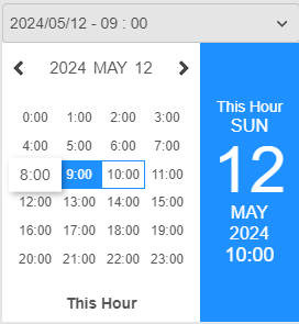
| unit | 'year' or 'month' or 'day' or 'hour' | 'day' | Use the unit prop to specify the unit for adjusting the date input. Available options are 'year', 'month', 'day', and 'hour'.The default unit is 'day'. |
| jalali | boolean | false | Set jalali to true to use the Jalali (Persian) calendar for the date input. When jalali is set to true, the date input will display and accept dates according to the Persian calendar. |
| theme | array of strings | undefined | An array containing two color values. styling calendar by this colors. |
| size | number | 180 | Set the size of the calendar. |
| deSelect | boolean or function | false | If set true, onChange will be called with undefined when clearing the value. If set as a function, this function will be called after clicking on the clear button. |
| caret | boolean or jsx/html | true | Set caret to false to hide the default caret. Set caret to a ReactNode to render a custom caret element instead of the default caret. |
| dateAttrs | function returns attrs object | undefined | A function to customize the attributes of each date element in the calendar. It receives an object with properties dateArray, isToday, isDisabled, isActive, and isMatch and should return an object with styles to apply to the date element. |
| option | object | {} | Specifies custom properties for rendering and controlling each date tag in the multipe mode of datepicker. |
| multiple | boolean or number | false | Enables multiple selection mode. If true, allows selecting multiple dates or times. If a number, limits the maximum number of selections. |
- Use the pattern prop to define the pattern for displaying the date and time in the date input.
- You can use placeholders such as {weekDay}, {day}, {month}, {monthString}, {year}, and {hour} to represent the components of the date and time.
Available placeholders:
- {weekDay}: Full name of the day of the week (e.g., Monday, Tuesday).
- {day}: Day of the month (e.g., 01, 02, ..., 31).
- {month}: Month of the year (e.g., 01, 02, ..., 12).
- {monthString}: Full name of the month (e.g., January, February).
- {year}: Year (e.g., 2022, 2023).
- {hour}: Hour of the day (e.g., 00, 01, ..., 23).
<AIOInput
    type='date'
    value={value}
    onChange={(newValue)=>setValue(newValue)}

    pattern='{weekDay} {day} {monthString} {year}'
/>
make jalali calendar.
jalali={true}
- month
unit='month'
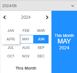
- day
unit='day'
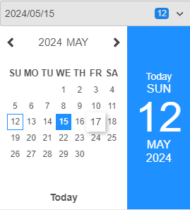
- hour
unit='hour'


set array of 2 colors to design calendar.
theme={['lightblue','#666']}
set a number to set size of calendar.
size={120}
Enables multiple selection mode. If true, allows selecting multiple dates or times. If a number, limits the maximum number of selections.
multiple={true}
Specifies custom properties for rendering and controlling each date tag in the multipe mode of datepicker. opton prop is a global prop used in many types . please read documentation of option prop in top of this document.
option={
  text:(date,details)=>`${details.weekDay} ${details.day} ${details.monthString} ${details.year}`,//change text of date tag
  close:(date,details)=>true,//close popover after seleting date
  tagAttrs:(date,details)=>{//set custom attributes of date tag
    return {
      style:{background:'orange'}
    }
  },
  tagBefore:(date,details)=><Icon/>,//any contetn before tags
  tagBefore:(date,details)=>'any cvontent',//any contetn after tags,
  ....
  //and other properties of public option prop
}The dateAttrs prop allows you to customize the attributes of each date element in the calendar. It is a function that receives an object with properties dateArray, isToday, isActive, and isMatch.
Here's what each property represents:
-
dateArray: An array containing the year, month, day and hour of the date. -
isToday: A boolean indicating whether the date is today's date. -
isActive: A boolean indicating whether the date is currently selected or active. -
isMatch: A boolean indicating whether the date matches any predefined criteria.
The dateAttrs function should return an object with styles to apply to the date element. Depending on your use case, you can customize the styles of each date element based on these properties. For example, you can change the background color of today's date or disable specific dates.
Here's an example of how you can use the dateAttrs prop:
dateAttrs={({ dateArray, isToday, isActive, isMatch }) => {
    let styles = {};
    if (isToday) {
        styles.background = 'orange';
    }
    return { style: styles };
}}
in this example today element will get background orange
dateAttrs={({ dateArray, isToday, isActive, isMatch }) => {
    if (isActive) {
        return {
          className:'active-date'
        }
    }
}}
in this example active date element will get className:'active-date'
The isMatch function within the dateAttrs prop allows you to define custom logic to match specific date elements in the calendar based on various conditions. It takes an array of strings representing date comparison conditions and returns true if any of the conditions are met for the current date element.
dateAttrs={({ isMatch }) => {
    if (isMatch(['<,2022/02/03'])) {
        return { color: 'red' };
    }
    if (isMatch(['<>,2022/03/03,2023/04/05'])) {
        return { disabled: true };
    }
}}Each string in the array represents a date comparison condition in the format 'operator,date1,date2':
The comparison operator
| Operator | Example | Example Description |
|---|---|---|
| '<' | isMatch(['<,2024/2/3']) | target is all dates before 2024/2/3 |
| '<=' | isMatch(['<,2024/2/3']) | target is all dates before or equal 2024/2/3 |
| '>' | isMatch(['>,2024/2/3']) | target is all dates after 2024/2/3 |
| '>=' | isMatch(['>=,2024/2/3']) | target is all dates after or equal 2024/2/3 |
| '=' | isMatch(['=,2024/2/3']) | target is all dates equal 2024/2/3 |
| '=' | isMatch(['=,2024/2/3,2024/2/4']) | target is all dates equal 2024/2/3 or 2024/2/4 |
| '!=' | isMatch(['!=,2024/2/3']) | target is all dates not equal 2024/2/3 |
| '!=' | isMatch(['!=,2024/2/3,2024/2/4']) | target is all dates that is not equal 2024/2/3 or 2024/2/4 |
| '<>' | isMatch(['<,2024/2/3,2025/1/1']) | target is all dates between 2024/2/3 and 2025/1/1 |
| '<=>' | isMatch(['<,2024/2/3,2025/1/1']) | target is all dates that is between or equal 2024/2/3 and 2025/1/1 |
| '!<>' | isMatch(['<,2024/2/3,2025/1/1']) | target is all dates that is not between 2024/2/3 and 2025/1/1 |
| '!<=>' | isMatch(['<,2024/2/3,2025/1/1']) | target is all dates that is not between or equal 2024/2/3 and 2025/1/1 |
| 'w' | isMatch(['w,5']) | target is all days that is 5th day of week. index from 0 |
| 'w' | isMatch(['w,5,6']) | target is all days that is 5th or 6th day of week. index from 0 |
| '!w' | isMatch(['!w,5']) | target is all days that is not 5th day of week. index from 0 |
| '!w' | isMatch(['!w,5,6']) | target is all days that is not 5th or 6th day of week. index from 0 |
<AIOInput
    type='date'
    value={value}
    onChange={(newValue) => setValue(newValue)}
    dateAttrs={({ isMatch }) => {
        let attrs = {}
        if (isMatch(['<,2022/02/03'])) {
            attrs.style = { color: 'red' };
        }
        if (isMatch(['<>,2022/03/03,2023/04/05'])) {
            attrs.style = { color: 'orange' };
        }
        if(isMatch([>,2024/4/5])){
          attrs.disabled = true
        }
        return attrs
    }}
/>- Dates before February 3, 2022, will have the color red.
- Dates between March 3, 2022, and April 5, 2023, will have the color orange.
- Dates after 2024/4/5 will be disabled
this will cause to close popover after select date.
option={{
  close:true
}}import AIOInput from "aio-input";
function Example(){
let [value,setValue] = useState({year:2022,month:4,day:12});
return (
<AIOInput
type='time'
value={value}
unit={{year:true,month:true,day:true}}
onChange={(newValue)=>setValue(newValue)}
/>
)
}| Props | Type | Default | Description |
|---|---|---|---|
| disabled | boolean | false | make input disabled |
| placeholder | string | undefined | input placeholder |
| attrs | object | undefined | Use the attrs prop to set any additional attributes for the parent element of input.
|
| style | object | undefined | Use the style prop to apply custom CSS styles to the input element. |
| className | string | undefined | custom clasName |
| after | html/jsx | undefined | Use the after prop to render additional content after the input element within your component. |
| before | html/jsx | undefined | Use the before prop to render additional content before the input element within your component. |
| subtext | string | undefined | Use the subtext prop to display additional text below the input element. |
| loading | boolean | false | Set loading to true to disable the input and display a spinning loader icon after the input. |
| text | string | undefined | Specifies the pattern for displaying the date and time in the time input. |
| unit | string contain 'year','month','day','hour','minute','second' | 'year,month,day' | Use the unit prop to specify the unit for adjusting the time input. Available options are year, month, day, hour, minute and second. |
| jalali | boolean | false | Set jalali to true to use the Jalali (Persian) calendar for the time input. When jalali is set to true, the time input will display and accept dates according to the Persian calendar. |
| caret | boolean or jsx/html | true | Set caret to false to hide the default caret. Set caret to a ReactNode to render a custom caret element instead of the default caret. |
<AIOInput
    type='time'
    value={value}
    onChange={(newValue)=>setValue(newValue)}

    unit='hour,minute,second'
/>
<AIOInput
    type='time'
    value={value}
    onChange={(newValue)=>setValue(newValue)}
    unit='year,month,day'
/>
import AIOInput from "aio-input";
function Example(){
  let [value,setValue] = useState('https://imgv3.fotor.com/images/blog-cover-image/part-blurry-image.jpg');
  return (
      <AIOInput
          type='image'
          value={value}
          onChange={(newValue)=>setValue(newValue)}
      />
  )
}| Props | Type | Default | Description |
|---|---|---|---|
| disabled | boolean | false | make input disabled |
| placeholder | string | undefined | input placeholder |
| attrs | object | undefined | Use the attrs prop to set any additional attributes for the parent element of input.
|
| style | object | undefined | Use the style prop to apply custom CSS styles to the input element. |
| className | string | undefined | custom clasName |
| after | html/jsx | undefined | Use the after prop to render additional content after the input element within your component. |
| before | html/jsx | undefined | Use the before prop to render additional content before the input element within your component. |
| subtext | string | undefined | Use the subtext prop to display additional text below the input element. |
| loading | boolean | false | Set loading to true to disable the input and display a spinning loader icon after the input. |
| deSelect | boolean or function | false | If set true, onChange will be called with undefined when clearing the value. If set as a function, this function will be called after clicking on the clear button. |
| preview | boolean | false | If set to true, a preview button will be shown on the image. Clicking it will open the image in a popup window. |
| width | number or string | undefined | The width of the image input. |
| height | number or string | undefined | The height of the image input. |
import AIOInput from "aio-input";
function Example(){
  let [value,setValue] = useState();
  return (
      <AIOInput
          type='file'
          value={value}
          onChange={(newValue)=>setValue(newValue)}
      />
  )
}| Props | Type | Default | Description |
|---|---|---|---|
| disabled | boolean | false | make input disabled |
| attrs | object | undefined | Use the attrs prop to set any additional attributes for the parent element of input.
|
| style | object | undefined | Use the style prop to apply custom CSS styles to the input element. |
| className | string | undefined | custom clasName |
| text | string | undefined | Specifies the text for displaying in the file input box. |
| after | html/jsx | undefined | Use the after prop to render additional content after the input element within your component. |
| before | html/jsx | undefined | Use the before prop to render additional content before the input element within your component. |
| subtext | string | undefined | Use the subtext prop to display additional text below the input element. |
| loading | boolean | false | Set loading to true to disable the input and display a spinning loader icon after the input. |
| preview | boolean | false | If set to true, in list of selected file under input, small preview of file will be displayed. |
| multiple | boolean or number | false | Enables multiple selection mode. If true, allows selecting multiple files. If a number, limits the maximum number of file selections. |
this input type is a round range selector. its configuration is same as slider input type.
| Props | Type | Default | Description |
|---|---|---|---|
| value | number | undefined | The current value of the range. |
| start | number | 0 | The start value of the range. |
| end | number | 100 | The end value of the range. |
| step | number | 1 | The step size for change the range value. |
| onChange | function | undefined | A callback function to handle value changes. |
| labels | array of { step: number,list:array of numbers,dynamic:boolean,setting:function } | undefined | Configuration for displaying labels on the spinner. |
| handle | function | undefined | A function to customize the appearance of the handle. get value and details object as parameter and returns an object contain handle configuration. |
| point | function | undefined | A function to customize the appearance of the range point. get value and details object as parameter and returns an object contain point configuration. |
| round | number | 1 | The extent of the circular slider in terms of a fraction of a full circle (0 to 1). |
| reverse | boolean | false | Whether to reverse the direction of the slider (clockwise vs. counterclockwise). |
| disabled | boolean or array of numbers | false | Specifies whether the spinner is disabled or an array of values to disable partially. |
| rotate | number(0 to 360) | 0 | Rotate all elements of the spinner (including scales, labels, point and handle) by the specified degree. |
| ranges | array | [[end, 1 100 #ddd]] |
An array of ranges where each range is defined by a value and a configuration string as array. |
| circles | array of strings | [] | An array of circles by a configuration string. |
The handle function takes the current value of the spinner and details object as parameter and returns an object with properties to customize the appearance of the handle:
-
size(number): The size of the handle as percentage of spinner size prop. default is 90. -
thickness(number): The thickness of the handle as percentage of spinner size prop. default is 10. -
offset(number): The distance of the handle from the center of the slider as percentage of spinner size prop. default is 0. -
color(string): The css color of the handle. default is '#000'. -
sharp(boolean): set true to set handle triangle.
The point prop is a function that takes the current value of the spinner as a parameter and returns an object with properties to customize the appearance and behavior of the spinner's thumb (point):
-
offset(number): The distance of the point from the edge of the spinner. default value is 0. -
attrs(object): the custom attributes of point. default is {} -
html(jsx/html): The HTML content of the point. default is spinner value number.
The labels prop is an array object with the following properties:
-
step(number): The step size for displaying labels on the spinner. -
list(array of numbers): The exact values for displaying labels on the spinner. -
dynamic(boolean): Determines whether labels should be updated in each render. Setting dynamic to true may cause performance issues, especially with a large number of labels. default is false. -
zIndex(number): z-index css property of labels set. default is 0. -
setting(function): setting property is a function that takes the current value of the spinner and details object as parameter and returns an object with properties to customize the appearance and content of labels. returned object is contain:Property Type Default Description offset number 0 The distance of the label from the edge of the spinner. (0 is on the edge). html JSX/HTML '' The HTML content of the label. It can be a React element or a string. If it's a React element, it will be rendered as is. If it's a string, it will be displayed as plain text. fixAngle boolean false fix label content angle.
Each range in the array of ranges prop is defined by an array containing two elements:
1- Value (number): The value at which the range begins. 2- Configuration string (string): A string containing four parameters separated by a space:
-
Thickness: The thickness of the range indicator. -
Distance: The distance of the range indicator from the edge of the spinner. (by 0 value range lines will be on edge of spinner). -
Color: The color of the range indicator. -
Round line cap: A boolean value (0 or 1) indicating whether the line cap of the range should be rounded.
for example [100,'3 0 #555 1'] means :
range line to 100 value by Thickness : 3px, Distance from edge : 0px, Color : #555 and Round Cap : true
Each circle in the circles prop is an string configuration:
Configuration string (string): A string containing five parameters separated by a space:
-
Thickness: The thickness of the range indicator. -
Radius: The radius of the circle indicator. -
Color: The color of the circle. -
Round line cap: A boolean value (0 or 1) indicating whether the line cap of the circle should be rounded. -
full: A boolean value (0 or 1) indicating whether the circle should be full rounded if round props is not 1.
for example '3 40 #555 1 1' means :
circle by Thickness : 3px, Radius : 40px, Color : #555, Round Cap : true and full rounded
import AIOInput from "aio-input";
function MyComponent() {
    const [value, setValue] = useState(50);
    return (
      <AIOInput
        type='spinner'
        value={value}
        start={0}
        end={100}
        size={100}
        onChange={setValue}
        labels={[
            {
                step:10,
                setting:(value)=>{
                    let style = value === 50?{color:'orange'}:{}
                    let content = value === 50 ? <Icon path={mdiAccount} size={0.6}/> : value;
                    return {
                        html: <div style={style}>{content}</div>,
                        color:'#333',
                        offset:20,
                        fixAngle:true
                    };
                }
            },
            {
                step:2,
                setting:(value)=>{
                    let offset,height,width,background;
                    if(value % 10 === 0){
                        offset = -5;
                        height = 5;
                        width = 5;
                        background = '#333'
                    }
                    else {
                        offset = -4;
                        height = 2;
                        width = 2;
                        background = '#888';
                    }
                    let style = {height,width,background}
                    return {
                        html:<div style={style}></div>,
                        offset
                    }
                }
            }
        ]}
        point={()=>{
            return {
                offset:20,
                attrs:{
                    style:{
                        boxShadow:'0 0 8px 0 rgba(0,0,0,0.4)'
                    }
                }
            }
        }}
        handle={(value) => {
            return {
                thickness: 12,
                size: 80,
                offset: 5,
                color: '#333',
                sharp:true
            }
        }}
        disabled={[0, 25, 75]} // Array of values to disable partially
        circles={[
            '10 3 #333'
        ]}
        ranges={()=>[
          [20, '5 10 #ff0000'], // Range from 0 to 20
          [70, '5 10 orange'], // Range from 20 to 100
          [100, '5 10 green'] // Range from 20 to 100
        ]}
    />
  );
}
this input type is a slider range selector. its configuration is same as spinner input type.
| Props | Type | Default | Description |
|---|---|---|---|
| value | number | undefined | The current value of the range. |
| start | number | 0 | The start value of the range. |
| end | number | 100 | The end value of the range. |
| step | number | 1 | The step size for change the range value. |
| onChange | function | undefined | A callback function to handle value changes. |
| labels | array of { step: number,list:array of numbers,dynamic:boolean,setting:function } | undefined | Configuration for displaying labels on the slider. |
| point | function | undefined | A function to customize the appearance of the range point. get value and details object as parameter and returns an object contain point configuration. |
| reverse | boolean | false | Whether to reverse the direction of the slider (ltr vs. rtl). |
| disabled | boolean or array of numbers | false | Specifies whether the spinner is disabled or an array of values to disable partially. |
| ranges | array | [[end, 1 100 #ddd]] |
An array of ranges where each range is defined by a value and a configuration string as array. |
The point prop is a function that takes the current value of the slider as a parameter and returns an object with properties to customize the appearance and behavior of the slider's thumb (point):
-
offset(number): The distance of the point from the edge of the slider. default value is 0. -
attrs(object): the custom attributes of point. default is {} -
html(jsx/html): The HTML content of the point. default is slider value number.
The labels prop is an array object with the following properties:
-
step(number): The step size for displaying labels on the slider. -
list(array of numbers): The exact values for displaying labels on the slider. -
dynamic(boolean): Determines whether labels should be updated in each render. Setting dynamic to true may cause performance issues, especially with a large number of labels. default is false. -
zIndex(number): z-index css property of labels set. default is 0. -
setting(function): setting property is a function that takes the current value of the slider and details object as parameter and returns an object with properties to customize the appearance and content of labels. returned object is contain:Property Type Default Description offset number 0 The distance of the label from the center of the slider. (0 is on the edge). html JSX/HTML '' The HTML content of the label. It can be a React element or a string. If it's a React element, it will be rendered as is. If it's a string, it will be displayed as plain text.
Each range in the array of ranges prop is defined by an array containing two elements:
1- Value (number): The value at which the range begins. 2- Configuration string (string): A string containing four parameters separated by a space:
-
Thickness: The thickness of the range indicator. -
Distance: The distance of the range indicator from the center of the slider. (by 0 value range lines will be on edge of slider). -
Color: The color of the range indicator. -
Round line cap: A boolean value (0 or 1) indicating whether the line cap of the range should be rounded.
for example [100,'3 0 #555 1'] means :
range line to 100 value by Thickness : 3px, Distance from center : 0px, Color : #555 and Round Cap : true
import AIOInput from "aio-input";
function MyComponent() {
    const [value, setValue] = useState(50);
    return (
      <AIOInput
        type='slider'
        value={value}
        start={0}
        end={100}
        size={100}
        onChange={setValue}
        labels={[
            {
                step:10,
                setting:(value)=>{
                    let style = value === 50?{color:'orange'}:{}
                    let content = value === 50 ? <Icon path={mdiAccount} size={0.6}/> : value;
                    return {
                        html: <div style={style}>{content}</div>,
                        color:'#333',
                        offset:20,
                        fixAngle:true
                    };
                }
            },
            {
                step:2,
                setting:(value)=>{
                    let offset,height,width,background;
                    if(value % 10 === 0){
                        offset = -5;
                        height = 5;
                        width = 5;
                        background = '#333'
                    }
                    else {
                        offset = -4;
                        height = 2;
                        width = 2;
                        background = '#888';
                    }
                    let style = {height,width,background}
                    return {
                        html:<div style={style}></div>,
                        offset
                    }
                }
            }
        ]}
        point={()=>{
            return {
                offset:20,
                attrs:{
                    style:{
                        boxShadow:'0 0 8px 0 rgba(0,0,0,0.4)'
                    }
                }
            }
        }}
        disabled={[0, 25, 75]} // Array of values to disable partially
        ranges={()=>[
          [20, '5 10 #ff0000'], // Range from 0 to 20
          [70, '5 10 orange'], // Range from 20 to 100
          [100, '5 10 green'] // Range from 20 to 100
        ]}
    />
  );
}
tree view . each tree node can render an input to change tree composition data.
| Props | Type | Default | Description |
|---|---|---|---|
| value | Composition nested JSON data | required | Represents the current state of the tree. |
| onChange | function | undefined | A callback function to handle value changes. |
| onAdd | function or object | undefined | Handles the addition of a new node to the tree. |
| onRemove | function | undefined | Handles the removal of a node from the tree. |
| option | object of functions | undefined | Configures view and actions for each tree node. |
| size | number | 48 | Sets the row height of the tree. |
| indent | number | 12 | Sets the indentation level of nodes. |
| actions | Array of Objects | undefined | Sets custom actions for the row options button dropdown. |
The option prop is an object containing functions that configure the view and actions for each tree node. Each function receives the node object as a parameter and returns the corresponding value. option is public prop of aio-input that i explained it in top of this document.
-
text: Returns jsx/html to be displayed for the node. -
value: Returns the value associated with the node (use as node id). -
before: Returns the jsx/html to be displayed before the tree node. -
onClick: Function to be called when the user clicks on the node. -
subtext: Rerurns Subtext to be rendered at the bottom of the tree node. -
checked: Returns boolean. If false, renders an unchecked checkbox before the option; if true, renders a checked checkbox before the tree node. -
checkIconReturns array of 2 jsx/html as unckecked and checked icon. Customizes the checkbox of the tree node if checked is a boolean. -
attrsReturns object. Standard attributes of the tree node element container. -
classNameReturns string. Sets a custom className to the tree node element. -
styleReturns object. Sets a custom style object to the tree node element. -
disabledReturns boolean. If set to true, the tree node will be disabled.
import React from 'react';
import AIOInput from 'aio-input';
const data = [
  {
      name:'row-0',id:'row-0',
      childs:[
          {name:'row0-0',id:'row0-0',active:true},
          {name:'row0-1',id:'row0-1'},
          {
              name:'row0-2',id:'row0-2',
              childs:[
                  {name:'row0-2-0',id:'row0-2-0'},
                  {name:'row0-2-1',id:'row0-2-1',active:true},
                  {name:'row0-2-2',id:'row0-2-2'}
              ]
          },
          {name:'row0-3',id:'row0-3'}
      ]
  },
  {name:'row-1',id:'row-1'},
  {name:'row-2',id:'row-2',active:true},
  {name:'row-3',id:'row-3'}
]
function MyComponent() {
const [value,setValue] = useState(data)
return (
  <AIOInput
      type={'tree'}
      value={[...value]}
      onAdd={{name:'New Name',value:'a' + Math.round(Math.random())}}
      onRemove={true}
      onChange={(value)=>setValue(value)}
      size={48}
      options={[
          {
              text:'Preview',
              value:'preview',
              before:<Icon path={mdiEye} size={0.7}/>,
              onClick:(row:any,parent:any)=>{
                  alert(row.name)
              }
          }
      ]}
      option={{
          text:'option.name',
          value:'option.id',
          checked:(row)=>{
              return !!row.active
          },
          subtext:(row)=>row.id,
          before:()=><Icon path={mdiFolder} size={0.6} color='#ffef17'/>,
          after:(row)=>row.active?'active':'deactive',
          checkIcon:()=>[<Icon path={mdiCheckboxBlankOutline} size={0.7} color='#ddd'/>,<Icon path={mdiCheckboxMarked} size={0.7} color='#5400ff'/>],
          onClick:(row)=>{
              row.active = !row.active;
              //very important to use ... before value
              setValue([...value])
          }
      }}
  />
);
}
The tree input type in AIOInput allows users to utilize any AIOInput input types as text for inline editing within the tree. This feature enhances the usability of the tree component by enabling inline editing directly within the tree structure.
When configuring the option prop for the tree input type, developers can specify any AIOInput input types as the text function. This allows the tree nodes to render the specified input types as text, providing users with the ability to edit the text inline.
import React from 'react';
import AIOInput from 'aio-input';

function MyComponent() {
  return (
    <AIOInput
      type="tree"
      value={treeData}
      option={{
        text: (node) => (
          <AIOInput
            type="text"
            value={node.label}
            onChange={(newValue) => handleNodeLabelChange(node, newValue)}
          />
        ),
        value: (node) => node.id,
        // other configuration options...
      }}
    />
  );
}
The form input type in AIOInput enables users to create dynamic forms with various input fields, offering flexibility in layout and customization. This documentation provides a detailed overview and usage guide for utilizing the form type effectively in your applications.
  <AIOInput
    type='form'
    ...
/>- The form input type allows developers to construct forms with diverse input fields, accommodating different data entry requirements. Users can define the layout, behavior, and validation rules for each input field, making it suitable for a wide range of use cases, from simple contact forms to complex data entry interfaces.
| Prop | Type | Default | Descripton |
|---|---|---|---|
| node | nested object(json) | Required | defining the layout and properties of the form nodes. each node can contain other nodes (horizontaly or verticaly by childs property) or any jsx element or form input. |
| showErrors | boolean or string | true | Determines how error messages are displayed.If set to true, error messages will be rendered under each form item that has an error. If set to a string as string dom seletor, the component will select the DOM element in form using the provided showError string selector and error messages will append to this dom. |
| footer | JSX/html | undefined | render content of this props in bottom of form , use as render submit button. if there is any error in form, any buttun in this prop content will disabled automatically. |
in this example form has a node contain 4 sub node placed vertically(becase of dir:'v')
const Example1: FC = () => {
    const { code }: I_CTX = useContext(CTX);
    const [setting, setSetting] = useState<any>()
    const [log,setLog] = useState<any>()
    function submit(){
        setLog(JSON.stringify(setting,null,3))
    }
    return (
        <div className='example'>
            <AIOInput
                type='form'
                value={{ ...setting }}
                onChange={(newFormData) => setSetting({ ...newFormData })}
                footer={(
                    <button type='button' className='submit-button' onClick={submit}>Submit</button>
                )}
                node={{
                    dir:'v',
                    childs: [
                        {
                            flex: 1,
                            input: {
                                type: 'checkbox',
                                text: 'Is Active'
                            },
                            label: 'Is Active',
                            field: 'value.active'
                        },
                        {
                            flex: 1,
                            input: {
                                type: 'text'
                            },
                            label: 'First Name',
                            field: 'value.firstname'
                        },
                        {
                            input: {
                                type: 'textarea'
                            },
                            label: 'Description',
                            field: 'value.description'
                        },
                        {
                            input: {
                                type: 'date'
                            },
                            label: 'Date',
                            field: 'value.date'
                        }
                    ]
                }}
            />
        </div>
    )
}
in this example form has a node contain 2 sub node placed vertically(dir:'v').first sub node has 2 sub node placed horizontally(dir:'h') and second sub node has 2 sub node placed vertically(dir:'v').
const Example1: FC = () => {
    const { code }: I_CTX = useContext(CTX);
    const [setting, setSetting] = useState<any>()
    const [log,setLog] = useState<any>()
    function submit(){
        setLog(JSON.stringify(setting,null,3))
    }
    return (
        <div className='example'>
            <AIOInput
                type='form'
                value={{ ...setting }}
                onChange={(newFormData) => setSetting({ ...newFormData })}
                footer={(
                    <button type='button' className='submit-button' onClick={submit}>Submit</button>
                )}
                node={{
                    dir:'v',
                    childs: [
                        {
                            dir:'h'
                            childs: [
                                {
                                    flex:1,
                                    input: {
                                        type: 'checkbox',
                                        text: 'Is Active'
                                    },
                                    label: 'Is Active',
                                    field: 'value.active'
                                },
                                {
                                    flex:1,
                                    input: {
                                        type: 'text'
                                    },
                                    label: 'First Name',
                                    field: 'value.firstname'
                                }
                            ]
                        },
                        {
                              dir:'v',
                              childs: [
                                {
                                    input: {
                                        type: 'textarea'
                                    },
                                    label: 'Description',
                                    field: 'value.description'
                                },
                                {
                                    input: {
                                        type: 'date'
                                    },
                                    label: 'Date',
                                    field: 'value.date'
                                }
                            ]
                        }
                    ]
                }}
            />
        </div>
    )
}
The node prop is the main configuration object for defining the layout and properties of the form inputs. It consists of an node or an array of nodes that each representing a group of input fields or custom content. The structure of each node determines its placement and arrangement within the form.
Node Structure Each node in the inputs configuration object represents a group of input fields or custom content to be displayed within the form. Nodes can be organized horizontally or vertically using the childs and dir properties, respectively.
| Property | Type | Description |
|---|---|---|
| childs | array of nodes | array of childs nodes to place horizontaly or verticaly decided by dir props ('h' |
| dir | 'h' or 'v' | childs direction to place horizontaly or verticaly |
| field | string | use just if input props is set. Specifies the field in the value prop that should be updated when the input value changes. This property enables two-way binding between form inputs and the component's state, ensuring synchronization and consistency of data. |
| input | aio-input props object | The input prop within each node's configuration specifies the type and properties of the input field. It can be any valid input type supported by AIOInput, such as text, checkbox, select, textarea, etc. Additionally, developers can customize the appearance, behavior, and validation rules of each input field according to their requirements. |
| html | jsx | Custom JSX content to be rendered within the form. This allows developers to include additional elements or components as needed for form customization.for example render hint message or any content. |
| size | number | Specifies the size (width or height) of the node within the form layout. This property helps control the spacing and alignment of contents within the form. |
| flex | number | Sets the flex style of the node, allowing it to stretch to fill available space within the form layout. Flexibility in sizing ensures optimal responsiveness and adaptability across different screen sizes and devices. |
| label | string | Specifies the input label. |
| validations | array of strings | Specifies the input validations(see examples and descriptions of validations property below). |
| show | boolean | visible or hidden form node. |
this example is contain a root node contain 5 sub node verticaly.
node={{
    dir:'v',
    childs:[
        {
            input:{type:'text'},label:'Name',field:'value.name',flex:1
        },
        {
            input:{type:'number'},label:'Age',field:'value.age',flex:1
        },
        {
            input:{type:'text'},label:'Email',field:'value.email',flex:1
        },
        {
            input:{type:'checkbox'},label:'IsActive?',field:'value.active',flex:1
        },
        {
            input:{type:'date'},label:'Date?',field:'value.date',flex:1
        },
        {
            show:value.active === true,
            html:'some message .....'
        }
    ]
}}
this example is cotain :
- root node contain 3 sub node verticaly
- form node contain 3 sub node horizontaly
- form node contain input (type:'text')
- form node contain input (type:'number')
- form node contain 2 sub node horizontaly
- form node contain input (type:'text')
- form node contain input (type:'checkbox')
- form node contain input (type:'date')
- form node contain custom html by condition visibility
- form node contain 3 sub node horizontaly
node={{
    dir:'v',
    childs:[
        {
            dir:'h',
            childs:[
                {
                    input:{type:'text'},label:'Name',field:'value.name',flex:1
                },
                {
                    input:{type:'number'},label:'Age',field:'value.age',flex:1
                }
            ]
        },
        {
            dir:'h',
            childs:[
                {
                    input:{type:'text'},label:'Email',field:'value.email',flex:1
                },
                {
                    input:{type:'checkbox'},label:'IsActive?',field:'value.active',flex:1
                },
                {
                    input:{type:'date'},label:'Date?',field:'value.date',flex:1
                }
            ]
        },
        {
            show:value.active === true,
            html:'some message .....'
        }
    ]
}}
this example is cotain :
- root node contain 4 sub node verticaly
- form node contain 2 sub node horizontaly
- form node contain input (type:'text')
- form node contain input (type:'number')
- form node contain 2 sub node horizontaly
- form node contain input (type:'text')
- form node contain input (type:'checkbox')
- form node contain input (type:'date')
- form node contain custom html by condition visibility
- form node contain 2 sub node horizontaly
node={{
    dir:'v',
    childs:[
        {
            dir:'h',
            childs:[
                {
                    input:{type:'text'},label:'Name',field:'value.name',flex:1
                },
                {
                    input:{type:'number'},label:'Age',field:'value.age',flex:1
                }
            ]
        },
        {
            dir:'h',
            row:[
                {
                    input:{type:'text'},label:'Email',field:'value.email',flex:1
                },
                {
                    input:{type:'checkbox'},label:'IsActive?',field:'value.active',flex:1
                }
            ]
        },
        {
            input:{type:'date'},label:'Date?',field:'value.date',flex:1
        },
        {
            show:value.active === true,
            html:'some message .....'
        }
    ]
}}
this example is cotain :
- root node contain 4 sub node verticaly
- form node contain 3 sub node horizontaly
- form node contain input (type:'text')
- form node contain input (type:'number')
- form node contain input (type:'text')
- from node contain input (type:'checbox')
- form node contain input (type:'date')
- form node contain custom html by condition visibility
- form node contain 3 sub node horizontaly
node={{
    dir:'v',
    column:[
        {
            dir:'h',
            row:[
                {
                    input:{type:'text'},label:'Name',field:'value.name',flex:1
                },
                {
                    input:{type:'number'},label:'Age',field:'value.age',flex:1
                },
                {
                    input:{type:'text'},label:'Email',field:'value.email',flex:1
                },
            ]
        },
        {
            input:{type:'checkbox'},label:'IsActive?',field:'value.active',flex:1
        },
        {
            input:{type:'date'},label:'Date?',field:'value.date',flex:1
        },
        {
            show:value.active === true,
            html:'some message .....'
        }
    ]
}}
aio-input standard props except value and onChange that set automatically by field props.
{//form node
  ...
    input:{
      type:'text',
      ....
    }
  ...
}
The input property of each node can receive all available props in AIOInput, except value and onChange props. These props will be automatically set by the field property. The field property defines the value of the input, and by using field, the form will understand how to change the main form data value by changing each input.
notice to this example:
const Validations: FC = () => {
    const { code }: I_CTX = useContext(CTX);
    const [setting, setSetting] = useState<any>()
    const [errors,setErrors] = useState<string[]>([''])
    const [log, setLog] = useState<any>()
    function submit() {
        setLog(JSON.stringify(setting, null, 3))
    }
    return (
        <div className='example'>
            <AIOInput
                type='form'
                value={{ ...setting }}
                onChange={(newFormData,errors) => {
                    setSetting({ ...newFormData })
                    setErrors(errors)
                }}
                footer={(
                    <button type='button' disabled={!!errors.length} className='submit-button' onClick={submit}>Submit</button>
                )}
                node={{
                    dir:'v',
                    childs: [
                        {
                            flex: 1,
                            input: {
                                type: 'checkbox',
                                text: 'Is Active'
                            },
                            label: 'Is Active',
                            field: 'value.active'
                        },
                        {
                            flex: 1,
                            input: {
                                type: 'text'
                            },
                            label: 'First Name',
                            field: 'value.firstname',
                            validations:['required']
                        },
                        {
                            input: {
                                type: 'textarea'
                            },
                            label: 'Description',
                            field: 'value.description',
                            validations:['required','>,10','<,30']
                        },
                        {
                            input: {
                                type: 'date'
                            },
                            label: 'Date',
                            field: 'value.date',
                            validations:['required','<,2024','>,2022']
                        }
                    ]
                }}
            />
        </div>
    )
}
The validations prop of each form node allows specifying validation rules for the input fields within the form. Each validation rule is represented by a string in the format 'operator,target', where:
-
operatorindicates the type of comparison to perform. -
targetis the threshold value for the comparison.
structure: ['operator,target',...]
| Operator | Format | Description |
|---|---|---|
| 'required' | 'required' | Validates that the input field must have a value and cannot be empty. |
| '>' | '>,target' | Validates that the value of the input field (if it's a number) should be greater than the specified target. If the value is an array, it checks that its length should be greater than target. |
| '>=' | '>=,target' | Validates that the value of the input field (if it's a number) should be greater than or equal to the specified target. If the value is an array, it checks that its length should be greater than or equal to target. |
| '<' | '<,target' | Validates that the value of the input field (if it's a number) should be less than the specified target. If the value is an array, it checks that its length should be less than target. |
| '<=' | '<=,target' | Validates that the value of the input field (if it's a number) should be less than or equal to the specified target. If the value is an array, it checks that its length should be less than or equal to target. |
| '<>' | '<>,min,max' | Validates that the value of the input field (if it's a number) should be between min and max, exclusive. |
| '<=>' | '<=>,min,max' | Validates that the value of the input field (if it's a number) should be between or equal to min and max. |
| '!<>' | '!<>,min,max' | Validates that the value of the input field (if it's a number) should not be between min and max, exclusive. |
| '!<=>' | '!<=>,min,max' | Validates that the value of the input field (if it's a number) should not be between or equal to min and max. |
| 'contain' | 'contain,substring' | Validates that the value of the input field (if it's a string) must contain the specified substring. |
| 'contain' | 'contain,letter' | Validates that the value of the input field (if it's a string) must contain at least one letter. |
| 'contain' | 'contain,number' | Validates that the value of the input field (if it's a string) must contain at least one digit. |
| '!contain' | '!contain,substring' | Validates that the value of the input field (if it's a string) must not contain the specified substring. |
| Value | Validation | Description |
|---|---|---|
| 12 | '<,10' | Value should be less than 10 |
| 'john doe' | '<,10' | Value should be less than 10 characters |
| [1,2,3,4,5,6,7] | '<,10' | Length of value should be less than 10 |
| 15 | '>,10' | Value should be greater than 10 |
| 'Lorem Ipsum' | '>,10' | Value should be greater than 10 characters |
| [1,2,3,4,5,6,7] | '>,10' | Length of value should be greater than 10 |
| 10 | '<=,10' | Value should be less than or equal to 10 |
| 'john' | '<=,10' | Value should be less than or equal to 10 characters |
| [1,2,3,4,5] | '<=,10' | Length of value should be less than or equal to 10 |
| 20 | '>=,20' | Value should be greater than or equal to 20 |
| 'Lorem Ipsum' | '>=,20' | Value should be greater than or equal to 20 characters |
| [1,2,3,4,5,6] | '>=,20' | Length of value should be greater than or equal to 20 |
| 5 | '<>,3,10' | Value should be between 3 and 10, exclusive |
| 'john' | '<>,3,10' | Length of value should be between 3 and 10, exclusive |
| [1,2,3,4,5,6] | '<>,3,10' | Length of value should be between 3 and 10, exclusive |
| 10 | '<=>,10,20' | Value should be between or equal to 10 and 20 |
| 'john doe' | '<=>,10,20' | Length of value should be between or equal to 10 and 20 |
| [1,2,3,4] | '<=>,3,5' | Length of value should be between or equal to 3 and 5 |
| 15 | '!<>,10,20' | Value should not be between 10 and 20, exclusive |
| 'Lorem Ipsum' | '!<>,10,20' | Length of value should not be between 10 and 20, exclusive |
| [1,2,3,4,5,6] | '!<>,10,20' | Length of value should not be between 10 and 20, exclusive |
| 20 | '!<=>,10,20' | Value should not be between or equal to 10 and 20 |
| 'john doe' | '!<=>,10,20' | Length of value should not be between or equal to 10 and 20 |
| [1,2,3] | '!<=>,3,5' | Length of value should not be between or equal to 3 and 5 |
| 'hello@example.com' | 'contain,@' | Value should contain '@' character |
| 'abc123' | 'contain,letter' | Value should contain at least one letter |
| '123456' | 'contain,number' | Value should contain at least one digit |
| 'abc$123' | '!contain,@' | Value should not contain '@' character |
You can apply these validation rules to the input fields within your form nodes to enforce specific data constraints and ensure data integrity. If any validation rule fails, you can provide feedback to the user indicating what went wrong and prevent form submission until all validations pass.
  showError={true} //show each error message under form input
  showError='#my-form-error-list' // append list of errors in DOM#my-form-error-list, selected by showError string
showError={false} //will not show any errors footer={(
<button type='button'>Submit</button>
)} //render submit button
<AIOInput
    type='spinner'
    size={120}
    value={value}
    start={0} end={100} step={1}
    round={0.5}
    onChange={(newValue)=>setValue(newValue)}
    handle={false}
    point={false}
    labels={[
        {
            step:10,
            setting:(value)=>{
                return {
                    offset:16,fixAngle:true,
                    html:(
                        <div style={{fontSize:10,color:'#999'}}>{value}</div>
                    )
                }
            }
        },
        {
            step:10,
            setting:(value)=>{
                return {
                    offset:5,
                    html:(
                        <div style={{height:1,width:4,background:'#ccc'}}></div>
                    )
                }
            }
        }
    ]}
    ranges={[
        [value,'20 0 rgb(140,198,64)'],
        [100,'20 0 #eee']
    ]}
    text={()=>{
        return (
            <div className='gauge-html'>
                <div className='gauge-text'>{`${value}%`}</div>
                <div className='gauge-subtext'>Metric</div>
            </div>
        )
    }}
/>
<AIOInput
    type='spinner'
    size={120}
    value={value}
    start={0} end={100} step={1}
    round={0.75}
    onChange={(newValue)=>setValue(newValue)}
    handle={false}
    point={false}
    ranges={[
        [value,'20 0 #EE5723'],
        [100,'20 0 #eee']
    ]}
    labels={[
        {
            step:10,
            setting:(value)=>{
                return {
                    offset:16,
                    fixAngle:true,
                    html:(
                        <div style={{fontSize:10,color:'#999'}}>{value}</div>
                    )
                }
            }
        },
        {
            step:5,
            setting:(value)=>{
                return {
                    offset:5,
                    html:(
                        <div style={{height:1,width:4,background:'#ccc'}}></div>
                    )
                }
            }
        }
    ]}
    text={()=>{
        return (
            <div className='gauge-html'>
                <div className='gauge-text'>{`${value}%`}</div>
                <div className='gauge-subtext'>Metric</div>
            </div>
        )
    }}
/>
<AIOInput
    type='spinner'
    size={160}
    value={value}
    start={0} end={200} step={1}
    round={0.75}
    onChange={(newValue)=>setValue(newValue)}
    point={false}
    handle={()=>{
        return {
            width:6,
            height:52,
            color:'red',
            offset:5,
            sharp:true
        }
    }}
    ranges={[
        [150,'10 8 green'],
        [200,'10 8 orange']
    ]}
    circles={[
        '1 100 #ccc',
        '3 5 red 0 1'
    ]}
    labels={[
        {
            step:25,
            setting:(value)=>{
                return {
                    offset:16,
                    fixAngle:true,
                    html:<div style={{fontSize:10,color:'#999'}}>{value}</div>
                }
            }
        },
        {
            step:25,
            setting:(value)=>{
                return {
                    offset:-5,
                    html:<div style={{width:4,height:1,background:'#aaa'}}></div>
                }
            }
        }
    ]}
/>
<AIOInput
    type='spinner'
    size={160}
    value={value}
    start={0} end={140} step={1}
    round={1}
    onChange={(newValue)=>setValue(newValue)}
    point={false}
    handle={false}
    ranges={[
        [value,'8 0 #1367bb 1']
    ]}
    circles={[
        '8 80 #ddd 0 1',
    ]}
    rotate={180}
    reverse={true}
    labels={[
        {
            step:20,
            setting:(value)=>{
                return {
                    html:<div style={{fontSize:12,color:'#666',fontFamily:'Arial'}}>{value}</div>,
                    offset:-28,
                    fixAngle:true
                }
            }
        },
        {
            step:10,
            setting:(value)=>{
                let width,offset;
                if(value % 20 === 0){
                    width = 10;
                    offset = -12;
                }
                else {
                    width = 6;
                    offset = -10
                }
                let style = {height:1,width,background:'#444'};
                return {
                    html:<div style={style}></div>,
                    offset
                }
            }
        }
    ]}
    text={()=><div style={{fontSize:10,color:'#000',fontWeight:'bold'}}>Temperature</div>}
/>
<AIOInput
    type='spinner'
    style={{border:'none'}}
    size={120}
    value={value}
    start={0} end={100} step={1}
    round={0.75}
    onChange={(newValue)=>setValue(newValue)}
    circles={['1 60 #ccc']}
    handle={()=>{
        return {
            thickness:10,
            size:-8,
            color:'dodgerblue',
            offset:60
        }
    }}
    point={false}
    labels={[
        {
            step:10,
            setting:(value)=>{
                return {
                    fixAngle:true,
                    offset:16,
                    html:<div style={{fontSize:10,color:'#999'}}>{value}</div>
                }
            }
        },
        {
            step:10,
            setting:()=>{
                return {
                    offset:6,
                    html:<div style={{height:1,width:4,background:'#333'}}></div>
                }
            }
        }
    ]}
    text={()=>{
        return (
            <div className='gauge-html'>
                <div className='gauge-text'>{`${value}%`}</div>
                <div className='gauge-subtext'>Metric</div>
            </div>
        )
    }}
/>