
dynamic-react-grid
Installation
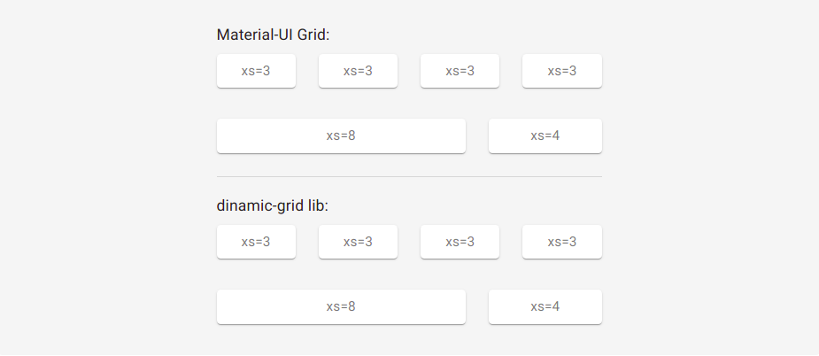
npm install --save dynamic-react-grid yarn add dynamic-react-gridDynamic grid for react, responsive and inspired by the material-UI grid, however bringing greater simplicities, functionalities and customizations.
This lib was inspired by the Grid of material-UI, containing similar assignments.
Props
| Name | value | Description |
|---|---|---|
| row | true/false |
If assigned, indicates to component that it should be a line |
| xs, xs-m, sm, sm-m, md, md-m, lg, lg-m, xl | recommendable: 0...12 (but it can be from 0 to infinity, but this is madness) |
They are the standard breakpoints, but you can customize and create yours (we'll see that later). |
| spacing | 0...infinity |
Defined in Grid tag with row props. Indicates column spacing, ranging from 0 to infinity. Default 0
|
| spacingY | 0...infinity |
Defined in the Grid tag with row props. Indicates the vertical spacing of columns, ranging from 0 to infinity. |
| spacingX | 0...infinity |
Defined in the Grid tag with row props. Indicates the horizontal column spacing, ranging from 0 to infinity. |
| direction |
row row-reverse column column-reverse inherit initial unset
|
flex-direction values |
| justify |
center flex-start flex-end space-between space-around inherit initial unset
|
justify-content values |
| alignContent |
center flex-start flex-end space-between space-around stretch inherit initial unset
|
align-content values |
| align |
normal stretch center start end flex-start flex-end self-start self-end baseline first baseline last baseline safe center unsafe center inherit initial unset
|
align-items values |
| wrap |
nowrap wrap wrap-reverse inherit initial unset
|
flex-wrap values |
| self |
auto center flex-start flex-end baseline stretch inherit initial unset
|
align-self values. Default wrap
|
| order | 0...infinity |
order values |
Breakpoints Ramifications
I can also put Breakpoints ramifications for the above mentioned props, example:
    import Grid from 'dynamic-react-grid'

    <Grid row spacing={2} or spacing={{xs:1, sm:4, md:3, /*...*/}}>
        <Grid order={1} or order={{xs:1, sm:2, md:4, /*...*/}}>
        </Grid>
    </Grid>

    <Grid row direction='row' or direction={{xs:'row', sm:'row-reverse', md:'column-reverse', /*...*/}}>
        <Grid xs={12} md={6}>
        </Grid>
    </Grid>
This goes for all of the above props, except the row props
breakpoints
By default there are the following breakpoints:
    {
        xs: 0,
        'xs-m': 300,
        sm: 600,
        'sm-m': 780,
        md: 960,
        'md-m': 1120,
        lg: 1280,
        'lg-m': 1600,
        xl: 1920
    }
However you can create your own points:
    import {WithBreakpoints} from 'dynamic-react-grid'

    let Grid = WithBreakpoints({
        xs:0,
        sm:400,
        jsIsLife:600,
        reactIsGood:1000
    })

    <Grid row>
        <Grid row>
            <Grid xs={6} jsIsLife={9} reactIsGood={12}>
                ...
            </Grid>
        </Grid>
    </Grid>
you can also use window.breakpoints = {/.../} which dynamic-react-grid will automatically detect, but not recommended; if you're using React it can be, but if it's Next I don't recommend it due to problems related to server-side renderings, to revert this instead of window you can use globalThis, but then there are also issues related to the javascript or node version.
If you prefer, you can also work as follows:
You can enter unique breakpoints for a given Grid tag:
    <Grid row>
        <Grid row>
            <Grid bp-sm={100} bp-hello={500} sm={6} hello={9}>
                ...
            </Grid>
        </Grid>
    </Grid>
    /*@media(min-width):100 e @media(min-width):500*/
bp-* is short for breakpoint-*
Nestling grid
The properties row and (the breakpoints) are independent. They can be combined.
    <Grid row>
        <Grid row xs={12} md={6}>
            <Grid lg={5}>
                ...
            </Grid>
        </Grid>
    </Grid>
Limitations
Negative margin
There is a limitation with the negative margin we use to implement spacing between items. A horizontal scrollbar will appear if a negative margin goes beyond the <body>. There are 2 solutions available:
- Do not use the spacing feature and implement it in userspace spacing={0} (Default).
- Applying Padding to the Father with at least 4 times the spacing value applied to the child:
    <body>
        <div style={{ padding: 20 }}>
            <Grid row spacing={5}>
                //...
            </Grid>
        </div>
    </body>
Automatic leyout
Both 4 columns below will have automatic widths, there is a flex-grow: 1 set by default, just set how to true the first breakpoint value:
    <Grid row spacing={2}>
        <Grid xs>xs</Grid>
        <Grid xs>xs</Grid>
        <Grid xs>xs</Grid>
        <Grid xs>xs</Grid>
    </Grid>
Public utilities
useful to be used with @emotion/styled or styled-components
    import {media, mapMedia, breakpoints} from 'dynamic-react-grid'


    let Container = styled.div(props => media(breakpoints)({
        padding: 30,
        color: 'red',
        display: props.style.display,
        // --------------------------------------
        width: {xs:20, md:'50%', sm:'100vw'}
        //or
        width: mapMedia({xs:20, sm:30, md:40}, [key, val] => `calc(100px - ${val}px)`) // return -> {xs:'calc(100px - 20px)', sm:'calc(100px - 30px)', md:'calc(100px - 40px)'}
        //or
        width: mapMedia({xs:20, sm:30, md:40}, [key, val] => [`${key}-m`, `calc(100px - ${val}px)`]) // return -> {xs-m:'calc(100px - 20px)', sm-m:'calc(100px - 30px)', ...}
    }))

    //...

    <Container
        style={{
            display: {
                xs:'flex',
                sm:'block',
                md:'none',
                /*...*/
            }
        }}
    >
        ...
    </Container>