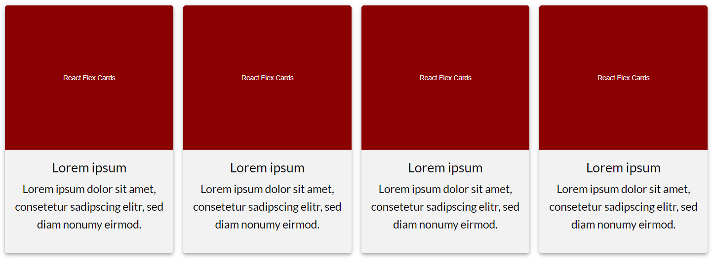
React Flex Cards


Installation
npm install flex-cards
Minimal setup example
const cards = img: src: 'http://example.com/example/img1.jpg' alt: 'Lorem ipsum' title: 'Lorem ipsum' description: 'Lorem ipsum dolor sit amet, consetetur sadipscing elitr.' href: 'http://example.com' img: src: 'http://example.com/example/img2.jpg' alt: 'Lorem ipsum' title: 'Lorem ipsum' description: 'Lorem ipsum dolor sit amet, consetetur sadipscing elitr.' href: 'http://example.com' ...; <FlexCards cards=cards />;You can also show iFrames (useful e.g. for YouTube videos) or videos (.mp4 or .ogg) instead of images. To do this, write the following iframe or video object instead of your img object in your data array:
iframe: src: 'https://www.youtube.com/embed/HxM46vRJMZs' ... video: src: mp4: 'video.mp4' ogg: 'video.ogg' ... If you enter more than one media object (img, iframe, video), the image will be shown by default. If no image is available default will be iFrame. You can override this behaviour with the prop mediaPriority.
<FlexCards cards=cards mediaPriority="video" />If the mediaPriority is set e.g. to video the video will be shown even if there is an image or an iFrame. If there is no video available, the image or the iFrame will still be shown.
With the prop noMedia you can hide images, iFrames and videos. This will override the mediaPriority prop.
With the prop noTextbox you can hide the text box below the media box.
Props
With props you have a lot of possibilities to easily customize this module.
| prop | type | default | notes |
|---|---|---|---|
| cards | array | includes data of all cards | |
| cardColor | string | '#f2f2f2' | background color of each card |
| cardsPerRow | number | 4 | amount of cards per row (on desktop screens) |
| className | string | class to style the whole container with css | |
| containerColor | string | '#fff' | background color of the whole container |
| label | string | 'Read more' | text that appears on the image when hovering over a card |
| labelColor | string | 'rgba(255, 255, 255, 0.9)' | background color of the label |
| noLabel | boolean | false | true hides the label |
| noLink | boolean | false | true removes the anchor tag or Link component from the card |
| noTextbox | boolean | false | true hides the textbox below the picture |
| noMedia | boolean | false | true hides the image or iframe above the text |
| mediaPriority | string | 'image' | if both img and iframe are specified in the data object, the value specified in mediaPriority is shown. (image/iframe/video) |
| mobileBreakpoint | string | '480px' | media breakpoint (mobile devices) |
| tabletBreakpoint | string | '768px' | media breakpoint (tablet devices) |
| margin | string | '8px' | value will be used to calculate all margins/paddings in this component |
| width | string | '100%' | width of the whole container; content is centered; accepts the same values as the css width property (some values, e.g. px may not be responsive) |
| maxWidth | string | '100%' | max width of the whole container; content is centered |
License
Licensed under the MIT license by Peter R. Stuhlmann.