Lyef Switch Button

A switch button (on/off) React component.
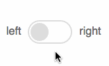
Demo
Installation
$ npm install --save lyef-switch-buttonRemember to import the styles on css/main.css folder to your project.
Basic Usage
import SwitchButton from 'lyef-switch-button'; ... { return <SwitchButton ="my-button" ="left" ="right" = /> ;}...Props
id(string)- requiredlabelLeft(string) - create a label to the left of the buttonlabelRight(string) - create a label to the right of the buttonisChecked(bool) - start the button as checkeddisabled(bool) - disable the button for user interactionaction(func) - call a function when the input is changed
Architecture
We've developed this component using the following boilerplate: lyef-react-component.
To know more about the architecture or if you want to contribute with this component: Contributing Documentation.