m-bee-datetimePicker
fork and modified width react-mobile-datepicker
a lightweight react date picker for mobile, Not more than 4k
m-bee-datetimePicker provides a component that can set year, month and day by sliding up or down.
Features
- is only 4k.
- It does not depend on moment.js
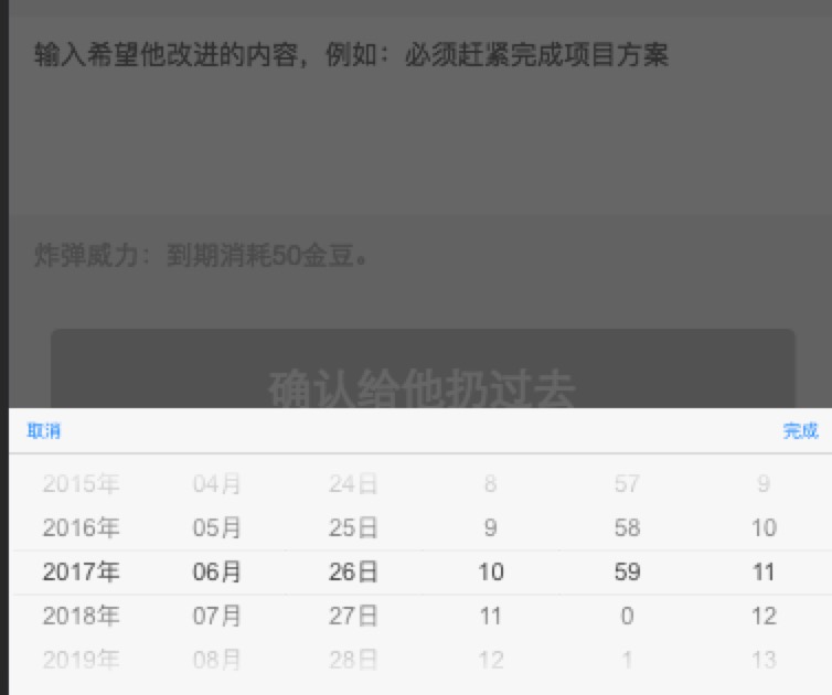
Screenshots
Getting Started
Install
Using npm:
$ npm install m-bee-datetimePicker --save
Import what you need
The following guide assumes you have some sort of ES2015 build set up using babel and/or webpack/browserify/gulp/grunt/etc.
// Using an ES6 transpiler like Babel;;;Usage Example
Component state = time: isOpen: false { this; } { this; } { this; } { return <div className="App"> <a className="select-btn" onClick=thishandleClick> select time </a> <DatePicker value=thisstatetime isOpen=thisstateisOpen onSelect=thishandleSelect onCancel=thishandleCancel /> </div> ; } ReactDOM;PropTypes
| Property | Type | Default | Description |
|---|---|---|---|
| isPopup | Boolean | true | whether as popup add a overlay |
| isOpen | Boolean | false | whether to open datepicker |
| theme | String | default | theme of datepicker, include 'default', 'dark', 'ios', 'android', 'android-dark' |
| dateFormat | Array | ['YYYY', 'M', 'D'] | according to year, month, day format specified display text. E.g ['YYYY年', 'MM月', 'DD日'] |
| value | Date | new Date() | date value |
| min | Date | new Date(1970, 0, 1) | minimum date |
| max | Date | new Date(2050, 0, 1) | maximum date |
| onSelect | Function | () => {} | the callback function after click button of done, Date object as a parameter |
| onCancel | Function | () => {} | the callback function after click button of cancel |
Changelog
How to Contribute
Anyone and everyone is welcome to contribute to this project. The best way to start is by checking our open issues, submit a new issues or feature request, participate in discussions, upvote or downvote the issues you like or dislike.