material-ui-upload

Upload controls made in material-ui using FileAPI
Components
Upload
Upload button, based on FlatButton.

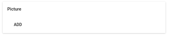
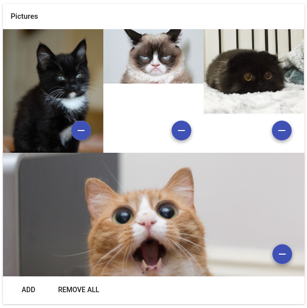
Upload Preview
Upload with preview for images, based on Card.
Empty
With pictures
Requirements
- Your project should be configured to use CSS modules
Installation
yarn add material-ui-upload
Or with npm
npm i --save material-ui-uploadUsage example
You could see live examples providen with storybook, just
make storybook-serverin the root of the repository.
Upload
import React Component from 'react';import Upload from 'material-ui-upload/Upload';console;{return<Upload ="Add" =/>;}
UploadPreview
import React Component from 'react';import UploadPreview from 'material-ui-upload/UploadPreview';{;thisstate =pictures:;}this;{return<UploadPreview="Picture"="Add"==/>;}
Properties
Upload
FlatButton props can be used on this component.
For FlatButton props please see material-ui docs.
| Name | Type | Default | Description |
|---|---|---|---|
| fileTypeRegex | RegExp |
/.*/ |
Regexp that matches allowed file names. |
| onFileLoad | function |
(e, file) => undefined |
FileReader#onload event handler which receives a FileReader event and original file object. |
| buttonControl | function |
material-ui/FlatButton |
Control constructor to use as upload button. |
UploadPreview
Upload component props can be used on this component.
| Name | Type | Default | Description |
|---|---|---|---|
| title | string |
'' |
Title of the Card. |
| onFileLoad | function |
(e, file) => undefined |
FileReader#onload event handler which receives a FileReader event and original file object. |
| label | string |
Upload |
Upload button label. |
| onChange | function |
(items) => undefined |
When state of the component changes(file added, removed, removed all) this function will be fired with a hash of items as argument(each item key is a sha1 of the base64 dataURI this may change to 'hash of a file content' in the future). |
| initialItems | object |
{} |
Predefined items. |