- Getting Started
- Basic Usage Guide
- Intermediate Usage Guide
- Advanced Usage Guide
- API Reference
- Troubleshooting
- Contributing
This section will guide users through the initial setup and installation of the npm module.
Instructions on how to install the module using npm.
npm install mediasfu-reactjsA basic guide on how to use the module for common tasks.
This section will guide users through the initial setup and installation of the npm module.
If users are interested in the Android/iOS (mobile) versions, they can refer to the Expo React Native project that is configured to produce both web and mobile apps. The source code for this project is available on GitHub at MediaSFU/MediaSFU.
For the community edition, users can visit the GitHub repository at MediaSFU/MediaSFUOpen.
Users can follow the instructions provided in the README of the respective GitHub repositories to set up and install the projects for both web and mobile platforms, ensuring a consistent user experience across different platforms.
Users can follow the instructions provided here and in the README of the GitHub repository to set up and install the project for both web and mobile platforms using Expo. This allows for seamless development and deployment across multiple platforms, ensuring a consistent user experience.
MediaSFU is a 2-page application consisting of a prejoin/welcome page and the main events room page. This guide will walk you through the basic usage of the module for setting up these pages.
MediaSFU provides prebuilt event rooms for various purposes. These rooms are rendered as full pages and can be easily imported and used in your application. Here are the available prebuilt event rooms:
- MediasfuGeneric: A generic event room suitable for various types of events.
- MediasfuBroadcast: A room optimized for broadcasting events.
- MediasfuWebinar: Specifically designed for hosting webinars.
- MediasfuConference: Ideal for hosting conferences.
- MediasfuChat: A room tailored for interactive chat sessions.
To use these prebuilt event rooms, simply import them into your application:
import { MediasfuGeneric, MediasfuBroadcast, MediasfuWebinar, MediasfuConference, MediasfuChat } from 'mediasfu-reactjs';The simplest way to use MediaSFU is by directly rendering a prebuilt event room component, such as MediasfuGeneric:
import { MediasfuGeneric } from 'mediasfu-reactjs';

const App = () => {
  return (
    <MediasfuGeneric />
  );
}

export default App;If you prefer to fetch the required tokens programmatically without visiting MediaSFU's website, you can use the PreJoinPage component and pass your credentials as props:
import { MediasfuGeneric, PreJoinPage } from 'mediasfu-reactjs';

const App = () => {
  const credentials = { apiUserName: "yourAPIUserName", apiKey: "yourAPIKey" };

  return (
    <MediasfuGeneric PrejoinPage={PreJoinPage} credentials={credentials} />
  );
}

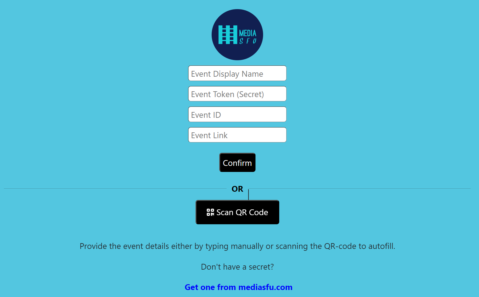
export default App;Alternatively, you can design your own welcome/prejoin page. The core function of this page is to fetch user tokens from MediaSFU's API and establish a connection with the returned link if valid.
MediaSFU passes relevant parameters to the custom welcome/prejoin page:
let { showAlert, updateIsLoadingModalVisible, onWeb, connectSocket, socket, updateSocket, updateValidated,
     updateApiUserName, updateApiToken, updateLink, updateRoomName, updateMember, validated } = parameters;
Ensure that your custom page implements the following updates:
await updateSocket(socket);
await updateApiUserName(apiUserName);
await updateApiToken(apiToken);
await updateLink(link);
await updateRoomName(apiUserName);
await updateMember(userName);
await updateValidated(true);
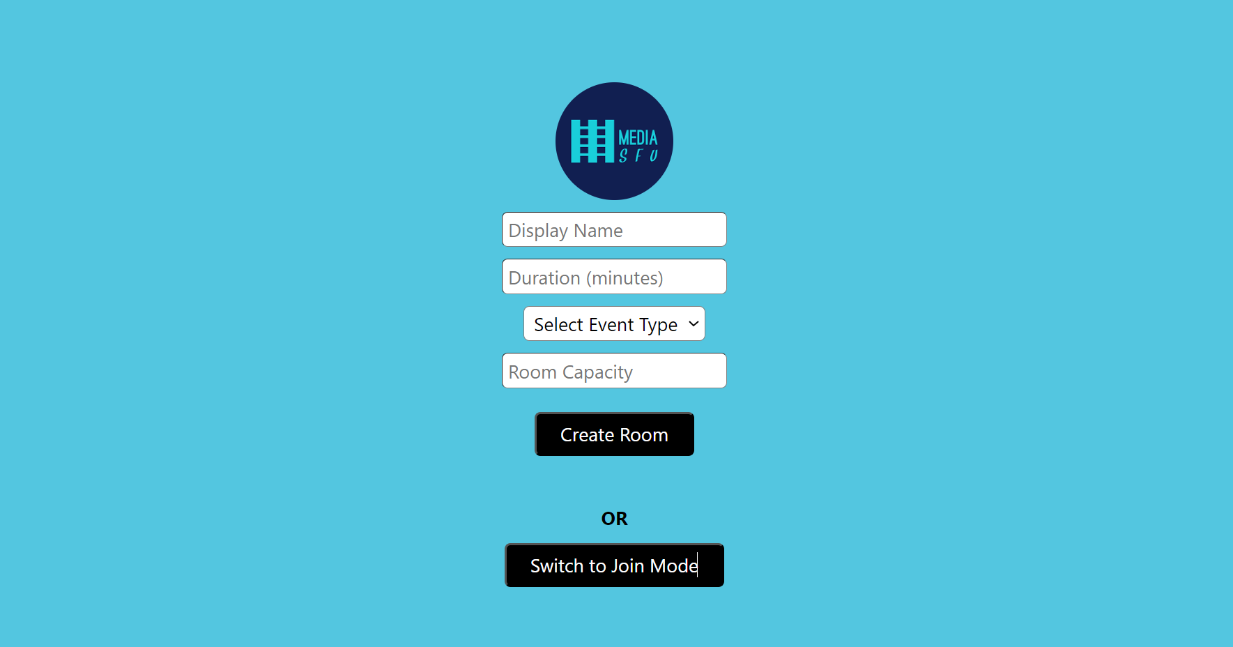
See the following code for the PreJoinPage page logic:
import React, { useState } from 'react';
import Cookies from 'universal-cookie';

const cookies = new Cookies();
const MAX_ATTEMPTS = 10; // Maximum number of unsuccessful attempts before rate limiting
const RATE_LIMIT_DURATION = 3 * 60 * 60 * 1000; // 3 hours in milliseconds
const apiKey = 'yourAPIKEY'
const apiUserName = 'yourAPIUSERNAME'
const user_credentials = { apiUserName, apiKey };

async function joinRoomOnMediaSFU(payload, apiUserName, apiKey) {
    try {

        //check if apiUserName and apiKey are valid
        if (!apiUserName || !apiKey) {
            return { data: null, success: false };
        }

        //check if generic apiUserName and apiKey are used
        if (apiUserName === 'yourAPIUSERNAME' || apiKey === 'yourAPIKEY') {
            return { data: null, success: false };
        }

        //apiKey must be 64 characters long
        if (apiKey.length !== 64) {
            return { data: null, success: false };
        }

        if (apiUserName.length < 6) {
            return { data: null, success: false };
        }

        const response = await fetch('https://mediasfu.com/v1/rooms/', {

            method: 'POST',
            headers: {
                'Content-Type': 'application/json',
                'Authorization': 'Bearer ' + apiUserName + ':' + apiKey,
            },
            body: JSON.stringify(payload)
        });

        if (!response.ok) {
            throw new Error(`HTTP error! Status: ${response.status}`);
        }

        const data = await response.json();

        return { data, success: true };
    } catch (error) {

        return { data: null, success: false };
    }
}

async function createRoomOnMediaSFU(payload, apiUserName, apiKey) {
    try {

        //check if apiUserName and apiKey are valid
        if (!apiUserName || !apiKey) {
            return { data: null, success: false };
        }

        //check if generic apiUserName and apiKey are used
        if (apiUserName === 'yourAPIUSERNAME' || apiKey === 'yourAPIKEY') {
            return { data: null, success: false };
        }

        //apiKey must be 64 characters long
        if (apiKey.length !== 64) {
            return { data: null, success: false };
        }

        if (apiUserName.length < 6) {
            return { data: null, success: false };
        }


        const response = await fetch('https://mediasfu.com/v1/rooms/', {

            method: 'POST',
            headers: {
                'Content-Type': 'application/json',
                'Authorization': 'Bearer ' + apiUserName + ':' + apiKey,
            },
            body: JSON.stringify(payload)
        });

        if (!response.ok) {
            throw new Error(`HTTP error! Status: ${response.status}`);
        }

        const data = await response.json();

        return { data, success: true };
    } catch (error) {

        return { data: null, success: false };
    }
}

const PreJoinPage = ({ parameters, credentials = user_credentials }) => {

    const [isCreateMode, setIsCreateMode] = useState(false);
    const [name, setName] = useState('');
    const [duration, setDuration] = useState('');
    const [eventType, setEventType] = useState('');
    const [capacity, setCapacity] = useState('');
    const [eventID, setEventID] = useState('');
    const [error, setError] = useState('');

    let { showAlert, updateIsLoadingModalVisible, onWeb, connectSocket, socket, updateSocket, updateValidated,
        updateApiUserName, updateApiToken, updateLink, updateRoomName, updateMember, validated } = parameters;


    const checkLimitsAndMakeRequest = async ({ apiUserName, apiToken, link, apiKey = "", userName }) => {
        const TIMEOUT_DURATION = 10000; // 10 seconds

        let unsuccessfulAttempts = parseInt(cookies.get('unsuccessfulAttempts')) || 0;
        let lastRequestTimestamp = parseInt(cookies.get('lastRequestTimestamp')) || 0;

        if (unsuccessfulAttempts >= MAX_ATTEMPTS) {
            if (Date.now() - lastRequestTimestamp < RATE_LIMIT_DURATION) {
                if (showAlert) {
                    showAlert({
                        message: 'Too many unsuccessful attempts. Please try again later.',
                        type: 'danger',
                        duration: 3000,
                    });
                }
                cookies.set('lastRequestTimestamp', Date.now().toString());
                return;
            } else {
                unsuccessfulAttempts = 0;
                cookies.set('unsuccessfulAttempts', unsuccessfulAttempts.toString());
                cookies.set('lastRequestTimestamp', Date.now().toString());
            }
        }

        try {
            updateIsLoadingModalVisible(true);

            const socketPromise = connectSocket(apiUserName, apiKey, apiToken, link);
            const timeoutPromise = new Promise((_, reject) =>
                setTimeout(() => reject(new Error('Request timed out')), TIMEOUT_DURATION)
            );

            const socket = await Promise.race([socketPromise, timeoutPromise]);

            if (socket && socket.id) {
                unsuccessfulAttempts = 0;
                cookies.set('unsuccessfulAttempts', unsuccessfulAttempts.toString());
                cookies.set('lastRequestTimestamp', Date.now().toString());
                await updateSocket(socket);
                await updateApiUserName(apiUserName);
                await updateApiToken(apiToken);
                await updateLink(link);
                await updateRoomName(apiUserName);
                await updateMember(userName);
                await updateValidated(true);
            } else {
                unsuccessfulAttempts += 1;
                cookies.set('unsuccessfulAttempts', unsuccessfulAttempts.toString());
                cookies.set('lastRequestTimestamp', Date.now().toString());
                updateIsLoadingModalVisible(false);

                if (unsuccessfulAttempts >= MAX_ATTEMPTS) {
                    if (showAlert) {
                        showAlert({
                            message: 'Too many unsuccessful attempts. Please try again later.',
                            type: 'danger',
                            duration: 3000,
                        });
                    }
                } else {
                    if (showAlert) {
                        showAlert({
                            message: 'Invalid credentials.',
                            type: 'danger',
                            duration: 3000,
                        });
                    }
                }
            }
        } catch (error) {

            if (showAlert) {
                showAlert({
                    message: 'Unable to connect. Check your credentials and try again.',
                    type: 'danger',
                    duration: 3000,
                });
            }

            unsuccessfulAttempts += 1;
            cookies.set('unsuccessfulAttempts', unsuccessfulAttempts.toString());
            cookies.set('lastRequestTimestamp', Date.now().toString());
            updateIsLoadingModalVisible(false);
        }
    };


    const handleCreateRoom = async () => {

        try {

            setError('');

            if (!name || !duration || !eventType || !capacity) {
                setError('Please fill all the fields.');
                return;
            }

            // Call API to create room
            const payload = {
                action: 'create',
                duration: parseInt(duration),
                capacity: parseInt(capacity),
                eventType,
                userName: name
            };

            updateIsLoadingModalVisible(true);

            const response = await createRoomOnMediaSFU(payload, credentials?.apiUserName, credentials?.apiKey);

            if (response.success) {
                // Handle successful room creation
                await checkLimitsAndMakeRequest({ apiUserName: response.data.roomName, apiToken: response.data.secret, link: response.data.link, userName: name });
                setError('');
            } else {
                // Handle failed room creation
                updateIsLoadingModalVisible(false);

                if (showAlert) {
                    showAlert({
                        message: `Unable to create room. ${response.data ? response.data.message : ''}`,
                        type: 'danger',
                        duration: 3000,
                    });
                } else {
                    setError(`Unable to create room. ${response.data ? response.data.message : ''}`);
                }
            }

        } catch (error) {

            updateIsLoadingModalVisible(false);

            if (showAlert) {
                showAlert({
                    message: `Unable to connect. ${error.message}`,
                    type: 'danger',
                    duration: 3000,
                });
            } else {
                setError(`Unable to connect.  ${error.message}`);
            }

        }

    };

    const handleJoinRoom = async () => {

        try {

            setError('');

            if (!name || !eventID) {
                setError('Please fill all the fields.');
                return;
            }

            // Call API to join room
            const payload = {
                action: 'join',
                meetingID: eventID,
                userName: name
            };

            updateIsLoadingModalVisible(true);

            const response = await joinRoomOnMediaSFU(payload, credentials?.apiUserName, credentials?.apiKey);

            if (response.success) {
                // Handle successful room join
                await checkLimitsAndMakeRequest({ apiUserName: response.data.roomName, apiToken: response.data.secret, link: response.data.link, userName: name });
                setError('');
            } else {
                // Handle failed room join
                updateIsLoadingModalVisible(false);

                if (showAlert) {
                    showAlert({
                        message: `Unable to connect to room. ${response.data ? response.data.message : ''}`,
                        type: 'danger',
                        duration: 3000,
                    });
                } else {
                    setError(`Unable to connect to room. ${response.data ? response.data.message : ''}`);
                }
            }

        } catch (error) {
            updateIsLoadingModalVisible(false);

            if (showAlert) {
                showAlert({
                    message: `Unable to connect. ${error.message}`,
                    type: 'danger',
                    duration: 3000,
                });
            } else {
                setError(`Unable to connect.  ${error.message}`);
            }

        }


};Entering the event room without the correct credentials may result in IP blockage, as the page automatically attempts to connect with MediaSFU servers, which rate limit bad requests based on IP address.
If users attempt to enter the event room without valid credentials or tokens, it may lead to IP blockage due to MediaSFU servers' rate limiting mechanism. To avoid unintentional connections to MediaSFU servers during UI development, users can pass the useLocalUIMode parameter as true.
In this mode, the module will operate locally without making requests to MediaSFU servers. However, to render certain UI elements such as messages, participants, requests, etc., users may need to provide seed data. They can achieve this by importing random data generators and passing the generated data to the event room component.
import { MediasfuBroadcast, generateRandomParticipants, generateRandomMessages } from 'mediasfu-reactjs';

function App() {
  const useSeed = true;
  let seedData = {};

  if (useSeed) {
    const memberName = 'Alice';
    const hostName = 'Fred';
    const participants_ = generateRandomParticipants(memberName, "", hostName, true);
    const messages_ = generateRandomMessages(participants_, memberName, "", hostName, true);

    seedData = {
      participants: participants_,
      messages: messages_,
      member: memberName,
      host: hostName,
    };
  }

  const useLocalUIMode = useSeed ? true : false;

  return (
    <MediasfuBroadcast useLocalUIMode={useLocalUIMode} useSeed={useSeed} seedData={useSeed ? seedData : {}} />
  );
}

export default App;import { MediasfuGeneric, generateRandomParticipants, generateRandomMessages, generateRandomRequestList, generateRandomWaitingRoomList } from 'mediasfu-reactjs';
function App() {
const useSeed = true;
let seedData = {};
const eventType = 'webinar'; // 'broadcast', 'chat', 'webinar', 'conference'
if (useSeed) {
const memberName = 'Prince';
const hostName = 'Fred';
const participants_ = generateRandomParticipants(memberName, "", hostName, eventType==="broadcast" || eventType==="chat" ? true : false);
const messages_ = generateRandomMessages(participants_, memberName, "", hostName, eventType==="broadcast" || eventType==="chat" ? true : false);
const requests_ = generateRandomRequestList(participants_, memberName, "", 3);
const waitingList_ = generateRandomWaitingRoomList(participants_, memberName, "", 3);
seedData = {
participants: participants_,
messages: messages_,
requests: requests_,
waitingList: waitingList_,
member: memberName,
host: hostName,
eventType: eventType
};
}
const useLocalUIMode = useSeed ? true : false;
return (
<MediasfuGeneric useLocalUIMode={useLocalUIMode} useSeed={useSeed} seedData={useSeed ? seedData : {}} />
);
}
export default App;In the provided examples, users can set useLocalUIMode to true during UI development to prevent unwanted connections to MediaSFU servers. Additionally, they can generate seed data for rendering UI components locally by using random data generators provided by the module.
During local UI development, the MediaSFU view is designed to be responsive to changes in screen size and orientation, adapting its layout accordingly. However, since UI changes are typically linked to communication with servers, developing the UI locally might result in less responsiveness due to the lack of real-time data updates. To mitigate this, users can force trigger changes in the UI by rotating the device, resizing the window, or simulating server responses by clicking on buttons within the page.
While developing locally, users may encounter occasional error warnings as the UI attempts to communicate with the server. These warnings can be safely ignored, as they are simply indicative of unsuccessful server requests in the local development environment.
If users experience responsiveness issues, whether during local development or in production, they can optimize their HTML configuration to ensure proper scaling and viewport settings. By adding the following meta tag to the HTML <head> section, users can specify viewport settings for optimal display:
<meta name="viewport" content="width=device-width, initial-scale=1, maximum-scale=1, user-scalable=no" />Expands on the basic usage, covering more advanced features and scenarios.
In the Intermediate Usage Guide, we'll explore the core components and functionalities of the MediaSFU ReactJS module, focusing on media display, controls, and modal interactions.
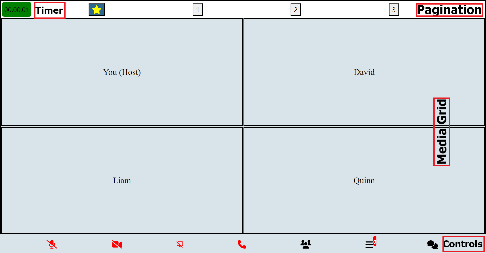
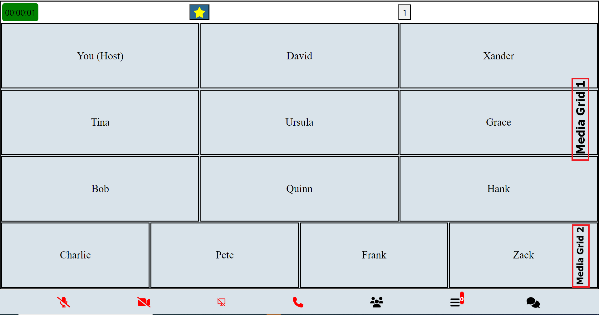
The main items displayed on an event page are media components (such as video, audio, and blank cards) and control components (for pagination, navigation, etc.).
| Component Name | Description |
|---|---|
| Main Aspect Component | Serves as a container for the primary aspect of the user interface, typically containing the main content or focus of the application. |
| Main Screen Component | Responsible for rendering the main screen layout of the application, providing the foundation for displaying various elements and content. |
| Main Grid Component | Crucial part of the user interface, organizing and displaying primary content or elements in a grid layout format. |
| Sub Aspect Component | Acts as a secondary container within the user interface, often housing additional elements or controls related to the main aspect. |
| Main Container Component | Primary container for the application's content, encapsulating all major components and providing structural organization. |
| Other Grid Component | Complements the Main Grid Component by offering additional grid layouts, typically used for displaying secondary or auxiliary content. |
| Component Name | Description |
|---|---|
| Control Buttons Component | Comprises a set of buttons or controls used for navigating, interacting, or managing various aspects of the application's functionality. |
| Control Buttons Alt Component | Provides alternative button configurations or styles for controlling different aspects of the application. |
| Control Buttons Component Touch | Specialized component designed for touch-enabled devices, offering floating buttons or controls for intuitive interaction with the application's features. |
These components collectively contribute to the overall user interface, facilitating navigation, interaction, and content display within the application.
| Modal Component | Description |
|---|---|
| LoadingModal | Modal for displaying loading indicator during data fetching or processing. |
| MainAspectComponent | Component responsible for displaying the main aspect of the event page. |
| ControlButtonsComponent | Component for displaying control buttons such as pagination controls. |
| ControlButtonsAltComponent | Alternate control buttons component for specific use cases. |
| ControlButtonsComponentTouch | Touch-enabled control buttons component for mobile devices. |
| OthergridComponent | Component for displaying additional grid elements on the event page. |
| MainScreenComponent | Component for rendering the main screen content of the event. |
| MainGridComponent | Main grid component for displaying primary event content. |
| SubAspectComponent | Component for displaying secondary aspects of the event page. |
| MainContainerComponent | Main container component for the event page content. |
| AlertComponent | Modal for displaying alert messages to the user. |
| MenuModal | Modal for displaying a menu with various options. |
| RecordingModal | Modal for managing recording functionality during the event. |
| RequestsModal | Modal for handling requests from participants during the event. |
| WaitingRoomModal | Modal for managing waiting room functionality during the event. |
| DisplaySettingsModal | Modal for adjusting display settings during the event. |
| EventSettingsModal | Modal for configuring event settings. |
| CoHostModal | Modal for managing co-host functionality during the event. |
| ParticipantsModal | Modal for displaying participant information and controls. |
| MessagesModal | Modal for managing messages and chat functionality during the event. |
| MediaSettingsModal | Modal for adjusting media settings during the event. |
| ConfirmExitModal | Modal for confirming exit from the event. |
| ConfirmHereModal | Modal for confirming certain actions or selections. |
| ShareEventModal | Modal for sharing the event with others. |
| WelcomePage | Welcome page modal for the event. |
| PreJoinPage | Prejoin page modal for the event. |
Each modal has corresponding functions to trigger its usage:
-
launchMenuModal: Launches the menu modal for settings and configurations. -
launchRecording: Initiates the recording modal for recording functionalities. -
startRecording: Starts the recording process. -
confirmRecording: Confirms and finalizes the recording. -
launchWaiting: Opens the waiting room modal for managing waiting room interactions. -
launchCoHost: Opens the co-host modal for managing co-host functionalities. -
launchMediaSettings: Launches the media settings modal for adjusting media-related configurations. -
launchDisplaySettings: Opens the display settings modal for adjusting display configurations. -
launchSettings: Initiates the settings modal for general event settings and configurations. -
launchRequests: Opens the requests modal for managing user requests. -
launchParticipants: Displays the participants modal for viewing and managing event participants. -
launchMessages: Opens the messages modal for communication through chat messages. -
launchConfirmExit: Prompts users to confirm before exiting the event.
These components facilitate media display and control functionalities:
- Pagination: Handles pagination and page switching.
- FlexibleGrid: Renders flexible grid layouts for media display.
- FlexibleVideo: Displays videos in a flexible manner within the grid.
- AudioGrid: Renders audio components within the grid layout.
These components enable seamless media presentation and interaction within the event environment, providing users with a rich and immersive experience.
| UI Media Component | Description |
|---|---|
| MeetingProgressTimer | Component for displaying a timer indicating the progress of a meeting or event. |
| MiniAudio | Component for rendering a compact audio player with basic controls. |
| MiniCard | Component for displaying a minimized card view with essential information. |
| AudioCard | Component for displaying audio content with control elements, details, and audio decibels. |
| VideoCard | Component for displaying video content with control elements, details, and audio decibels. |
| CardVideoDisplay | Video player component for displaying embedded videos with controls and details. |
| MiniCardAudio | Component for rendering a compact card view with audio content and controls. |
| MiniAudioPlayer | Utility method for playing audio and rendering a mini audio modal when the user is not actively displayed on the page. |
With the Intermediate Usage Guide, users can explore and leverage the core components and functionalities of the MediaSFU ReactJS module to enhance their event hosting and participation experiences.
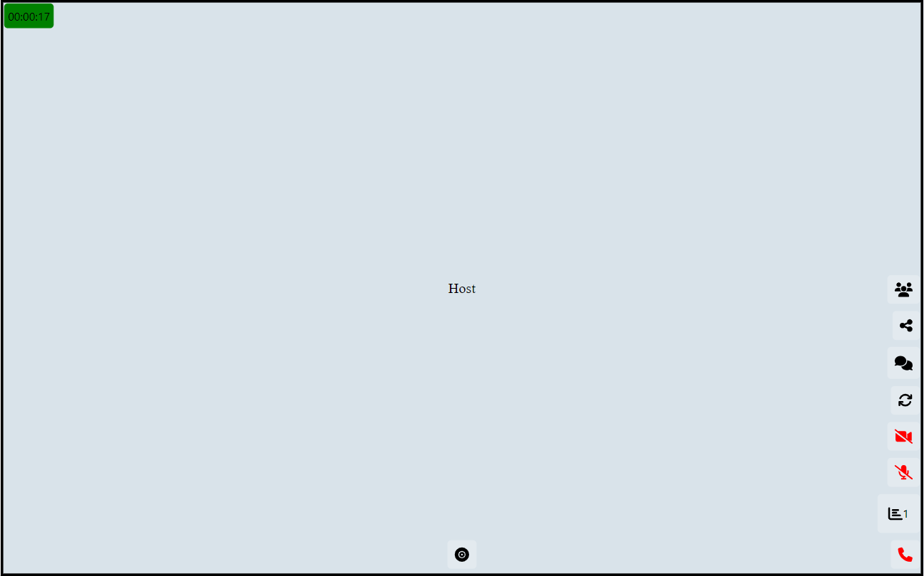
Here's a sample import and usage code for a Broadcast screen:
import React, { useState, useEffect, useRef } from 'react';
import { PrejoinPage, MainContainerComponent, MainAspectComponent, MainScreenComponent, MainGridComponent, FlexibleVideo, ControlButtonsComponentTouch, AudioGrid } from 'mediasfu-reactjs';

const BroadcastScreen = () => {
    // State variables and constants
    const [validated, setValidated] = useState(false);
    const eventType = useRef('broadcast');
    const controlHeight = 0.1; // Height of control buttons as a fraction of screen height

    // Sample control button configurations
    const controlBroadcastButtons = [/* define your control buttons here */];
    const recordButton = [/* define your record button here */];
    const recordButtons = [/* define your record buttons here */];

    // Sample component sizes
    const componentSizes = useRef({
        mainHeight: 0,
        mainWidth: 0,
    });

    // Sample function to update component sizes
    const updateComponentSizes = () => {
        // Update component sizes logic
    };

    // Sample function to update validation state
    const updateValidated = (isValidated) => {
        setValidated(isValidated);
    };

    // Sample credentials
    const credentials = {
        apiUserName: "yourAPIUserName",
        apiKey: "yourAPIKey"
    };

    // Sample socket
    const socket = useRef(null);

    // Sample function to connect socket
    const connectSocket = () => {
        // Connect socket logic
    };

    // Sample function to handle recording
    const handleRecording = () => {
        // Handle recording logic
    };

    // Sample meeting progress time
    const meetingProgressTime = 0; // Set to actual meeting progress time

    // Sample record state
    const recordState = "rgba(255, 0, 0, 0.5)"; // Set to actual record state color

    // Sample main grid stream
    const mainGridStream = useRef([]);

    // Sample audio only streams
    const audioOnlyStreams = useRef([]);

    // Sample main height and width
    const mainHeightWidth = 0; // Set to actual main height and width

    // Render the PrejoinPage if not validated, otherwise render the main components
    return (
        !validated ? (
            <PrejoinPage
                parameters={{
                    showAlert, isLoadingModalVisible, updateIsLoadingModalVisible, onWeb: true, eventType: eventType.current, connectSocket, socket: socket.current,
                    updateSocket, updateValidated, updateApiUserName, updateApiToken, updateLink, updateRoomName, updateMember, validated
                }}
                credentials={credentials}
            />
        ) : (
            <MainContainerComponent>
                <MainAspectComponent backgroundColor="rgba(217, 227, 234, 0.99)" defaultFraction={1 - controlHeight} updateIsWideScreen={updateIsWideScreen} updateIsMediumScreen={updateIsMediumScreen} updateIsSmallScreen={updateIsSmallScreen} showControls={eventType.current == 'webinar' || eventType.current == 'conference'}>
                    <MainScreenComponent
                        doStack={true}
                        mainSize={mainHeightWidth}
                        updateComponentSizes={updateComponentSizes}
                        defaultFraction={1 - controlHeight}
                        componentSizes={componentSizes.current}
                        showControls={eventType.current == 'webinar' || eventType.current == 'conference'}
                    >
                        <MainGridComponent
                            height={componentSizes.current.mainHeight}
                            width={componentSizes.current.mainWidth}
                            backgroundColor="rgba(217, 227, 234, 0.99)"
                            mainSize={mainHeightWidth}
                            defaultFraction={1 - controlHeight}
                            showAspect={mainHeightWidth > 0 ? true : false}
                            timeBackgroundColor={recordState}
                            meetingProgressTime={meetingProgressTime}
                        >
                            <FlexibleVideo
                                customWidth={componentSizes.current.mainWidth}
                                customHeight={componentSizes.current.mainHeight}
                                rows={1}
                                columns={1}
                                componentsToRender={mainGridStream.current ? mainGridStream.current : []}
                                showAspect={mainGridStream.current.length > 0}
                            />
                            {/* Additional components */}
                        </MainGridComponent>
                    </MainScreenComponent>
                </MainAspectComponent>
            </MainContainerComponent>
        )
    );
};

export default BroadcastScreen;
This sample code demonstrates the import and usage of various components and features for a Broadcast screen, including rendering different UI components based on the validation state, handling socket connections, displaying video streams, controlling recording, and managing component sizes.
Here's a sample usage of the control button components as used above:
   const recordButton = [
        {
            icon: faRecordVinyl,
            text: 'Record',
            onPress: () => {
                // Action for the Record button
                launchRecording({
                    parameters: {
                        ...getAllParams(),

                    }
                });
            },
            activeColor: 'black',
            inActiveColor: 'black',
            show: true,
        }
    ];

   const recordButtons = [
        //recording state control and recording timer buttons
        //Replace or remove any of the buttons as you wish

        //Refer to ControlButtonsAltComponent.js for more details on how to add custom buttons

        {
            icon: faPlayCircle,
            active: recordPaused.current === false,
            onPress: () => { updateRecording({ parameters: { ...getAllParams(), ...mediaSFUFunctions() } }); },
            activeColor: 'black',
            inActiveColor: 'black',
            alternateIcon: faPauseCircle,
            show: true,
        },
        {
            icon: faStopCircle,
            active: false,
            onPress: () => { stopRecording({ parameters: { ...getAllParams(), ...mediaSFUFunctions() } }); },
            activeColor: 'green',
            inActiveColor: 'black',
            show: true,
        },
        {
            customComponent: (
                <div style={{ backgroundColor: 'transparent', borderWidth: 0, padding: 0, margin: 2 }}>
                    <span style={{ backgroundColor: 'transparent', borderWidth: 0, padding: 0, margin: 0 }}>
                        {recordingProgressTime}
                    </span>
                </div>
            ),
            show: true,
        },
        {
            icon: faDotCircle,
            active: false,
            onPress: () => console.log('Status pressed'),
            activeColor: 'black',
            inActiveColor: recordPaused.current === false ? 'red' : 'yellow',
            show: true,
        },
        {
            icon: faCog,
            active: false,
            onPress: () => {
                launchRecording({
                    parameters: {
                        ...getAllParams(),

                    }
                });
            },
            activeColor: 'green',
            inActiveColor: 'black',
            show: true,
        },
    ];

    const controlBroadcastButtons = [
        // control buttons for broadcast
        //Replace or remove any of the buttons as you wish

        //Refer to ControlButtonsComponentTouch.js for more details on how to add custom buttons

        {
            icon: faUsers,
            active: true,
            alternateIcon: faUsers,
            onPress: () => { launchParticipants({ updateIsParticipantsModalVisible: updateIsParticipantsModalVisible, IsParticipantsModalVisible: isParticipantsModalVisible }) },
            activeColor: 'black',
            inActiveColor: 'black',
            show: islevel.current === '2',
        },
        {
            icon: faShareAlt,
            active: true,
            alternateIcon: faShareAlt,
            onPress: () => updateIsShareEventModalVisible(!isShareEventModalVisible),
            activeColor: 'black',
            inActiveColor: 'black',
            show: true,
        },
        {
            customComponent: (
                <div style={{ position: 'relative' }}>
                    {/* Your icon */}
                    <FontAwesomeIcon icon={faComments} size={'lg'} color="black" />
                    {/* Conditionally render a badge */}
                    {showMessagesBadge && (
                        <div
                            style={{
                                position: 'absolute',
                                top: -2,
                                right: -2,
                                flexDirection: 'row',
                                alignItems: 'center',
                                justifyContent: 'center',
                            }}
                        >
                            <div
                                style={{
                                    backgroundColor: 'red',
                                    borderRadius: 12,
                                    paddingHorizontal: 4,
                                    paddingVertical: 4,
                                }}
                            >
                                <span style={{ color: 'white', fontSize: 12, fontWeight: 'bold' }}>
                                </span>
                            </div>
                        </div>
                    )}
                </div>
            ),
            onPress: () => launchMessages({ updateIsMessagesModalVisible: updateIsMessagesModalVisible, IsMessagesModalVisible: isMessagesModalVisible }),
            show: true,
        },
        {
            icon: faSync,
            active: true,
            alternateIcon: faSync,
            onPress: () => switchVideoAlt({
                parameters: {
                    ...getAllParams(), ...mediaSFUFunctions(),
                    //others
                    MediaStream,
                    MediaStreamTrack,
                    mediaDevices,
                    device: device.current,
                    socket: socket.current,
                    showAlert,
                    checkPermission,
                    streamSuccessVideo,
                    hasCameraPermission,
                    requestPermissionCamera,
                    checkMediaPermission: 'web' !== 'web'
                }
            }),
            activeColor: 'black',
            inActiveColor: 'black',
            show: islevel.current === '2',
        },
        {
            icon: faVideoSlash,
            alternateIcon: faVideo,
            active: videoActive,
            onPress: () => clickVideo({
                parameters: {
                    ...getAllParams(),
                    ...mediaSFUFunctions(),
                    //others
                    MediaStream,
                    MediaStreamTrack,
                    mediaDevices,
                    device: device.current,
                    socket: socket.current,
                    showAlert,
                    checkPermission,
                    streamSuccessVideo,
                    hasCameraPermission,
                    requestPermissionCamera,
                    checkMediaPermission: 'web' !== 'web'
                }
            }),
            show: islevel.current === '2',
            activeColor: 'green',
            inActiveColor: 'red',
        },
        {
            icon: faMicrophoneSlash,
            alternateIcon: faMicrophone,
            active: micActive,
            onPress: () => clickAudio({
                parameters: {
                    ...getAllParams(),
                    ...mediaSFUFunctions(),
                    //others
                    MediaStream,
                    MediaStreamTrack,
                    mediaDevices,
                    device: device.current,
                    socket: socket.current,
                    showAlert,
                    checkPermission,
                    streamSuccessAudio,
                    hasAudioPermission,
                    requestPermissionAudio,
                    checkMediaPermission: 'web' !== 'web'
                }
            }),
            activeColor: 'green',
            inActiveColor: 'red',
            show: islevel.current === '2',
        },
        {
            customComponent: (
                <div style={{ backgroundColor: 'transparent', borderWidth: 0, padding: 0, margin: 5, flexDirection: 'row', alignItems: 'center', justifyContent: 'center' }}>
                    <FontAwesomeIcon icon={faChartBar} size={'lg'} color="black" />
                    <span style={{ backgroundColor: 'transparent', borderWidth: 0, padding: 0, margin: 0 }}>
                        {participantsCounter.current}
                    </span>
                </div>
            ),
            show: true,
        },
        {
            icon: faPhone,
            active: endCallActive,
            onPress: () => launchConfirmExit({ updateIsConfirmExitModalVisible: updateIsConfirmExitModalVisible, IsConfirmExitModalVisible: isConfirmExitModalVisible }),
            activeColor: 'green',
            inActiveColor: 'red',
            show: true,
        },
        {
            icon: faPhone,
            active: endCallActive,
            onPress: () => console.log('End Call pressed'), //not in use
            activeColor: 'transparent',
            inActiveColor: 'transparent',
            backgroundColor: 'transparent',
            show: false,
        }
    ];
This sample code defines arrays recordButtons and controlBroadcastButtons, each containing configuration objects for different control buttons. These configurations include properties such as icon, active state, onPress function, activeColor, inActiveColor, and show flag to control the visibility of each button.
You can customize these configurations according to your requirements, adding, removing, or modifying buttons as needed. Additionally, you can refer to the relevant component files (ControlButtonsAltComponent.js and ControlButtonsComponentTouch.js) for more details on how to add custom buttons.
In-depth documentation for advanced users, covering complex functionalities and customization options.
Introduction to Advanced Media Control Functions:
In advanced usage scenarios, users often encounter complex tasks related to media control, connectivity, and streaming management within their applications. To facilitate these tasks, a comprehensive set of functions is provided, offering granular control over various aspects of media handling and communication with servers.
These advanced media control functions encompass a wide range of functionalities, including connecting to and disconnecting from WebSocket servers, joining and updating room parameters, managing device creation, switching between different media streams, handling permissions, processing consumer transports, managing screen sharing, adjusting layouts dynamically, and much more.
This robust collection of functions empowers developers to tailor their applications to specific requirements, whether it involves intricate media streaming setups, real-time communication protocols, or sophisticated user interface interactions. With these tools at their disposal, developers can create rich and responsive media experiences that meet the demands of their users and applications.
Here's a tabulated list of advanced control functions along with brief explanations:
| Function | Explanation |
|---|---|
connectSocket |
Connects to the WebSocket server. |
disconnectSocket |
Disconnects from the WebSocket server. |
joinRoomClient |
Joins a room as a client. |
updateRoomParametersClient |
Updates room parameters as a client. |
createDeviceClient |
Creates a device as a client. |
switchVideoAlt |
Switches video/camera streams. |
clickVideo |
Handles clicking on video controls. |
clickAudio |
Handles clicking on audio controls. |
clickScreenShare |
Handles clicking on screen share controls. |
streamSuccessVideo |
Handles successful video streaming. |
streamSuccessAudio |
Handles successful audio streaming. |
streamSuccessScreen |
Handles successful screen sharing. |
streamSuccessAudioSwitch |
Handles successful audio switching. |
checkPermission |
Checks for media access permissions. |
producerClosed |
Handles the closure of a producer. |
newPipeProducer |
Creates receive transport for a new piped producer. |
updateMiniCardsGrid |
Updates the mini-grids (mini cards) grid. |
mixStreams |
Mixes streams and prioritizes interesting ones together. |
dispStreams |
Displays streams (media). |
stopShareScreen |
Stops screen sharing. |
checkScreenShare |
Checks for screen sharing availability. |
startShareScreen |
Starts screen sharing. |
requestScreenShare |
Requests permission for screen sharing. |
reorderStreams |
Reorders streams (based on interest level). |
prepopulateUserMedia |
Populates user media (for main grid). |
getVideos |
Retrieves videos that are pending. |
rePort |
Handles re-porting (updates of changes in UI when recording). |
trigger |
Triggers actions (reports changes in UI to backend for recording). |
consumerResume |
Resumes consumers. |
connectSendTransportAudio |
Connects send transport for audio. |
connectSendTransportVideo |
Connects send transport for video. |
connectSendTransportScreen |
Connects send transport for screen sharing. |
processConsumerTransports |
Processes consumer transports to pause/resume based on the current active page. |
resumePauseStreams |
Resumes or pauses streams. |
readjust |
Readjusts display elements. |
checkGrid |
Checks the grid sizes to display. |
GetEstimate |
Gets an estimate of grids to add. |
calculateRowsAndColumns |
Calculates rows and columns for the grid. |
addVideosGrid |
Adds videos to the grid. |
onScreenChanges |
Handles screen changes (orientation and resize). |
sleep |
Pauses execution for a specified duration. |
changeVids |
Changes videos. |
compareActiveNames |
Compares active names (for recording UI changes reporting). |
compareScreenStates |
Compares screen states (for recording changes in grid sizes reporting). |
createSendTransport |
Creates a send transport. |
resumeSendTransportAudio |
Resumes a send transport for audio. |
receiveAllPipedTransports |
Receives all piped transports. |
disconnectSendTransportVideo |
Disconnects send transport for video. |
disconnectSendTransportAudio |
Disconnects send transport for audio. |
disconnectSendTransportScreen |
Disconnects send transport for screen sharing. |
connectSendTransport |
Connects a send transport. |
getPipedProducersAlt |
Gets piped producers. |
signalNewConsumerTransport |
Signals a new consumer transport. |
connectRecvTransport |
Connects a receive transport. |
reUpdateInter |
Re-updates the interface based on audio decibels. |
updateParticipantAudioDecibels |
Updates participant audio decibels. |
closeAndResize |
Closes and resizes the media elements. |
autoAdjust |
Automatically adjusts display elements. |
switchUserVideoAlt |
Switches user video (alternate) (back/front). |
switchUserVideo |
Switches user video (specific video id). |
switchUserAudio |
Switches user audio. |
receiveRoomMessages |
Receives room messages. |
formatNumber |
Formats a number (for broadcast viewers). |
connectIps |
Connects IPs (connect to consuming servers) |
startMeetingProgressTimer |
Starts the meeting progress timer. |
updateRecording |
Updates the recording status. |
stopRecording |
Stops the recording process. |
In the context of a room's real-time communication, various events occur, such as user actions, room management updates, media controls, and meeting status changes. To effectively handle these events and synchronize the application's state with the server, specific functions are provided. These functions act as listeners for socket events, allowing the application to react accordingly.
| Function | Explanation |
|---|---|
userWaiting |
Triggered when a user is waiting. |
personJoined |
Triggered when a person joins the room. |
allWaitingRoomMembers |
Triggered when information about all waiting room members is received. |
roomRecordParams |
Triggered when room recording parameters are received. |
banParticipant |
Triggered when a participant is banned. |
updatedCoHost |
Triggered when the co-host information is updated. |
participantRequested |
Triggered when a participant requests access. |
screenProducerId |
Triggered when the screen producer ID is received. |
updateMediaSettings |
Triggered when media settings are updated. |
producerMediaPaused |
Triggered when producer media is paused. |
producerMediaResumed |
Triggered when producer media is resumed. |
producerMediaClosed |
Triggered when producer media is closed. |
controlMediaHost |
Triggered when media control is hosted. |
meetingEnded |
Triggered when the meeting ends. |
disconnectUserSelf |
Triggered when a user disconnects. |
receiveMessage |
Triggered when a message is received. |
meetingTimeRemaining |
Triggered when meeting time remaining is received. |
meetingStillThere |
Triggered when the meeting is still active. |
startRecords |
Triggered when recording starts. |
reInitiateRecording |
Triggered when recording needs to be re-initiated. |
getDomains |
Triggered when domains are received. |
updateConsumingDomains |
Triggered when consuming domains are updated. |
RecordingNotice |
Triggered when a recording notice is received. |
timeLeftRecording |
Triggered when time left for recording is received. |
stoppedRecording |
Triggered when recording stops. |
hostRequestResponse |
Triggered when the host request response is received. |
allMembers |
Triggered when information about all members is received. |
allMembersRest |
Triggered when information about all members is received (rest of the members). |
disconnect |
Triggered when a disconnect event occurs. |
// Example usage of provided socket event handling functions

import { participantRequested,screenProducerId } from 'mediasfu-reactjs'

socket.current.on('participantRequested', async ({ userRequest }) => {
    await participantRequested({
        userRequest,
        parameters: { ...getAllParams(), ...mediaSFUFunctions() },
    });
});

socket.current.on('screenProducerId', async ({ producerId }) => {
    await screenProducerId({
        producerId,
        parameters: { ...getAllParams(), ...mediaSFUFunctions() },
    });
});
These functions enable seamless interaction with the server and ensure that the application stays synchronized with the real-time events occurring within the room.
For detailed information on the API methods and usage, please refer to the MediaSFU API Documentation.
If you need further assistance or have any questions, feel free to ask!
-
Optimizing HTML Configuration: If users experience responsiveness issues, whether during local development or in production, they can optimize their HTML configuration to ensure proper scaling and viewport settings. By adding the following meta tag to the HTML
<head>section, users can specify viewport settings for optimal display:<meta name="viewport" content="width=device-width, initial-scale=1, maximum-scale=1, user-scalable=no" />
-
Issues with Starting User Media (Audio/Video): If users encounter issues with starting user media (audio/video), they should try running in HTTPS mode. To enable HTTPS mode, users can modify their start script in the package.json file as follows:
"start": "set HTTPS=true && react-scripts start",
-
Interactive Testing with MediaSFU's Frontend: Users can interactively join MediaSFU's frontend in the same room to analyze if various events or media transmissions are happening as expected. For example, adding a user there to check changes made by the host and vice versa.
These troubleshooting steps should help users address common issues and optimize their experience with MediaSFU. If the issues persist or additional assistance is needed, users can refer to the documentation or reach out to the support team for further assistance.
We welcome contributions from the community to improve the project! If you'd like to contribute, please check out our GitHub repository and follow the guidelines outlined in the README.
If you encounter any issues or have suggestions for improvement, please feel free to open an issue on GitHub.
We appreciate your interest in contributing to the project!
If you need further assistance or have any questions, feel free to ask!
