
NativeColorPicker


About
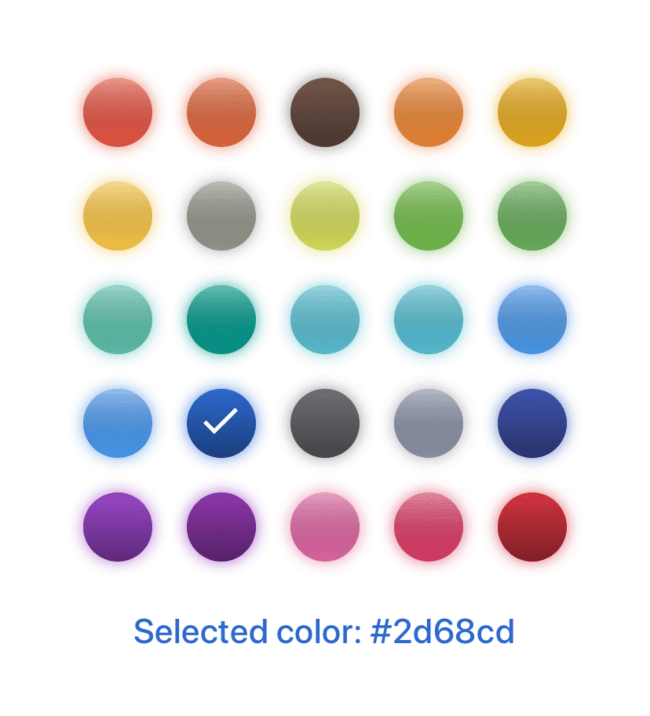
Color picker for React Native (Expo projects only)
How to Install
First, install the library in your project by npm:
$ npm install native-color-pickerOr Yarn:
$ yarn add native-color-pickerGetting Started
• Connect libary with project using ES6 import:
;Options
| Name | Type | Default | Description | Available options |
|---|---|---|---|---|
| animate | string | |
Animate marker on item select | scale or rotate |
| colors | string[] | [] |
Colors to display in a color picker | e.g.: ['#f96204', '#43d8c9'] |
| columns | number | 5 |
Number of columns in color list (only vertical) | Number of columns |
| gradient | boolean | false |
Enable or disable gradient layer over the color item | true - enable, false - disable |
| horizontal | boolean | false |
Enable or disable horizontal scroll direction | true - horizontal, false - vertical |
| itemSize | number | 44 |
Size (width & height) of list item |
Size of list item |
| markerType | string | border |
Type of marker for selected item | border, checkmark, fade, none |
| markerDisplay | string | contrast |
Color style of marker | adjust, contrast or color |
| onSelect | function | item => item |
Select color item | e.g.: elem => { /* code */ } |
| selectedColor | string | |
Marked item | Color from the list colors |
| shadow | boolean | false |
Display shadow for list items | true - enable, false - disable |
| sort | boolean | false |
Order colors by perception | true - enable, false - disable |
| itemProps | TouchableOpacity | {} |
Item props | TouchableOpacity props |
| itemStyle | StyleProps | {} |
Styles for Item | View styles |
| linearGradientProps | LinearGradientProps | {} |
Gradient props | LinearGradientProps props |
| linearGradientStyle | StyleProps | {} |
Styles for Gradient | View styles |
License
This project is licensed under the MIT License © 2019-present Jakub Biesiada