
ngx-crud-forms

ngx-crud-forms is an Angular module, which creates UI elements directly from your business objects.
The module performs client-side authorization tasks too.
Compatibility
Different versions of ngx-crud-forms are compatible with different versions of the Angular framework. The following table shows the compatibility relations.
| ngx-crud-forms | Bootstrap | Angular |
|---|---|---|
| 1.x, 2.x | 4.x | 7, 8 |
| 3.x | 4.x | 9, 10, 11 |
| 4.x | 4.x | 12 |
| 5.x | 4.x | 13 |
| 6.x | 5.x | 14 |
Installing the library
To use ngx-crud-forms, you should import CSS files from other modules to your project.
-
Run the following command:
npm install --save bootstrap primeng primeicons @ng-select/ng-select -
In your
angular.jsoncopy the following lines to thestylesproperty of your project:"node_modules/bootstrap/dist/css/bootstrap.min.css", "node_modules/primeng/resources/themes/nova/theme.css", "node_modules/primeng/resources/primeng.min.css", "node_modules/primeicons/primeicons.css", "node_modules/@ng-select/ng-select/themes/default.theme.css"
-
Install
ngx-crud-forms:npm install --save ngx-crud-forms -
Import
CrudTableLibModulein yourAppModule. ImportingHttpClientModuleis also required for ourGeneralRestServiceto work:import { CrudTableLibModule } from 'ngx-crud-forms'; @NgModule({ ... imports: [ BrowserModule, HttpClientModule CrudTableLibModule ], ... }) export class AppModule { ...
Using the library
FormField decorator
You can put the FormField decorator to your business object's fields to define information about its visualisation.
The FormField decorator has the following input properties. All of these are optional.
| Name | Type | Default value | Description |
|---|---|---|---|
| className | string | null | Type of the form element that should be shown. One of these values:
|
| defaultValue | string | null | Default value of the form element. |
| format | string | null | Standard format of string data, if applicable. Allowed value(s): 'json'. |
| header | string | '' | Label of the form element. |
| required | boolean | false | Indicates, whether the form element's value is required or not. |
| order | number | 1 | Position of the form element on the generated form. |
| type | string | 'text' | Type of the input element, where applicable (e.g. email, password, number). |
| hidden | boolean | false | Indicates whether the form element should be hidden (e.g. for IDs). |
| hideOnCreate | boolean | false | Indicates whether the form element should be hidden when creating a new record. |
| editable | boolean | true | Indicates whether the form element can be modified. |
| linkedObject | string | null | Name of the linked object. |
| linkedData | object | null | Name and field of the linked object (e.g. {entity: 'task', value: 'taskName'}) |
Usage example
class User {
    @FormField({
        className: 'TextboxInput',
        header: 'Id',
        required: true,
        type: 'number',
        order: 1,
        hidden: true
    })
    id: number;
}
Permissions decorator
You can put the Permissions decorator to your business object to define authorization permissions.
Input object of the Permissions decorator defines Access Control Entries. The entries are allow operations on an object to different roles.
There are two built-in roles in the system: 'admin' and '*'.
-
'admin'is the top-level role, it is the default role in case of any error (e.g. when no role is defined for an operation). -
'*'represents that the given operation is allowed to any roles in the system.
Beyond these, you can define roles with any names in your system.
The Permissions decorator waits an object as input parameter with the following fields: create, read, update, delete.
The fields can contain the '*' string (so any role can do the operation) or a string array with the allowed roles for the operation.
If no role is defined for an operation, the library defines the 'admin' role for it by default.
To use the values defined in the decorator on server-side, please consult this example implementation.
Usage example
@Permissions({
    create: ['admin'],
    read: '*',
    update: ['admin', 'manager'],
    delete: ['admin']
})
export default class User { }
CRUD table
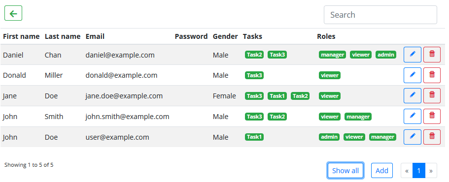
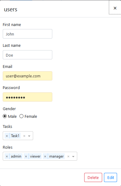
The Crud Table Component can be used in your Angular project to visualise your data.
You can put the <lib-crud-table> selector to your HTML templates. It has the following input/output properties:
| Name | Input/Output | Type | Description |
|---|---|---|---|
| entity | Input | any | An instance of the class to visualize (e.g. new User()) |
| permissions | Input | string[] | Roles of the current user (e.g. [ 'manager', 'viewer' ]) |
| entityName | Input | string | Name of the entity. |
| itemsPerPage | Input | number | Number of items should shown in a page. |
| filter | Input | string | Value of the search field. |
| selectionType | Input | string | Type of selection. (default: 'multiple') Possible values:- 'multiple' - Selecting multiple rows is possible. - 'one' - Only one row can be selected. |
| showAdd | Input | boolean | Indicates whether the 'Add' button should shown. |
| showEdit | Input | boolean | Indicates whether the 'Edit' button should shown. |
| showDelete | Input | boolean | Indicates whether the 'Delete' button should shown. |
| showBack | Input | boolean | Indicates whether the 'Back' button should shown. |
| rowSelect | Output | Function | This function is called after a row is selected. |
| cellSelect | Output | Function | This function is called after a cell is selected. |
| backClicked | Output | Function | This function is called after the Back button is clicked. |
| operationResult | Output | Function | This function is called after syncronization of data is ended. It gets a object with the following fields: success (boolean) - indicates if the operation was successful, title (string) - title of the operation result, message (string) - message of the operation result. |
Usage example
<!-- userEntity is one instance of the User class [e.g. new User()] -->
<lib-crud-table
    [entityName]="'users'"
    [entity]="userEntity"
    [permissions]="[ 'manager', 'viewer' ]"
    [itemsPerPage]="5"
    (cellSelect)="userCellSelected($event)"
    (operationResult)="handleResult($event)"
    (backClicked)="goBack()">
</lib-crud-table>
License
The module licensed under the MIT License.
Contributors' Guide
You can find notes for contributors here.