
Image Cropper for Angular


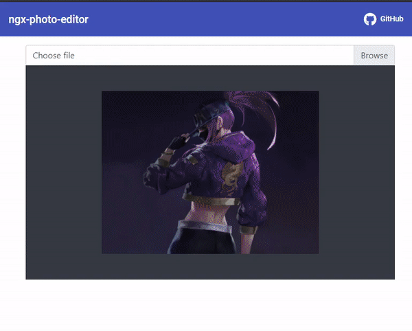
Demo
Features
- NgxPhotoEditor Component Injection without being passed
ViewContainerRef - High performance
- Highly configurable and customizable
- Overridable styles
- Fully Supported
Install
npm install ngx-photo-editor --save Setup
Step 1:
- Import CSS.
@import "~ngx-photo-editor/photo-editor.css";- If you are using angular-cli you can add it to your angular.json
"styles": [
  "styles.scss",
  "node_modules/ngx-photo-editor/photo-editor.css" // try adding '../' if you're using angular cli before 6
]
Step 2:
- Add NgxPhotoEditorModule to app.module.ts
import {NgModule} from '@angular/core';
import {BrowserModule} from '@angular/platform-browser';
import {AppComponent} from './app.component';
import {NgxPhotoEditorModule} from "ngx-photo-editor";

@NgModule({
  declarations: [
    AppComponent
  ],
  imports: [
    BrowserModule,
    NgxPhotoEditorModule,
  ],
  providers: [],
  bootstrap: [AppComponent]
})
export class AppModule {
}
Usage
<input type="file" (change)="fileChangeHandler($event)">
<img [src]="output?.base64" alt="">
And add this to your .ts file:
import {Component} from '@angular/core';
import {NgxCroppedEvent, NgxPhotoEditorService} from "ngx-photo-editor";

@Component({...})
export class AppComponent {
  output?: NgxCroppedEvent;

  constructor(private service: NgxPhotoEditorService) {}

  fileChangeHandler($event: any) {
    this.service.open($event, {
      aspectRatio: 4 / 3,
      autoCropArea: 1
    }).subscribe(data => {
      this.output = data;
    });
  }
}
You can pass any supported type of parameters to NgxPhotoEditorService.open() to open the cropper. After click Apply button the observer will return an object with the cropped image as a Base64, Blob in its payload.
Parameters
| Name | Type | Description |
|---|---|---|
source |
`FileEvent | File |
options |
check below para |
This is an optional parameter |
Options
| Name | Type | Default | Description |
|---|---|---|---|
format |
string | source Image format | Output format (png, jpeg, webp, bmp, ico) (not all browsers support all types, png is always supported, others are optional) |
aspectRatio |
number | NaN |
The width / height ratio (e.g. 1 / 1 for a square, 4 / 3, 16 / 9 ...) |
resizeToWidth |
number | 0 (disabled) | Cropped image will be resized to this width (in px) |
resizeToHeight |
number | 0 (disabled) | Cropped image will be resized to this height (in px) |
roundCropper |
boolean | false | Set this to true for a round cropper mask. Resulting image will still be square, use border-radius: 100% on resulting image to show it as round. |
imageQuality |
number | 92 | This only applies when using jpeg or webp as output format. Entering a number between 0 and 100 will determine the quality of the output image. |
autoCrop |
boolean | true | Enable to crop the image automatically when initialized. |
autoCropArea |
number | 1 (80% of the image) | A number between 0 and 1. Define the automatic cropping area size (percentage). |
viewMode |
number | 0 | Define the ViewMode of the cropper. |
mask |
boolean | true | Show the black modal above the image and under the crop box. |
guides |
boolean | true | Show the dashed lines above the crop box. |
centerIndicator |
boolean | true | Show the center indicator above the crop box. |
scalable |
boolean | true | Enable to scale the image. |
zoomable |
boolean | true | Enable to zoom the image. |
cropBoxMovable |
boolean | true | Enable to move the crop box by dragging. |
cropBoxResizable |
boolean | true | Enable to resize the crop box by dragging. |
imageSmoothingEnabled |
boolean | true | Smooth image output. |
imageSmoothingQuality |
string | low | quality of image smoothing, one of "low" or "medium", or "high". |
modalMaxWidth |
string | '500px' | max-width property of the dialog container |
hideModalHeader |
boolean | false | Hide Modal Header. |
applyBtnText |
string | Apply | Apply button text |
closeBtnText |
string | Close | Close button text |
Interfaces
NgxCroppedEvent
| Property | Type | Description |
|---|---|---|
| base64 | string | Base64 string of the cropped image |
| file | file(Blob) | Blob(File) of the cropped image |
viewMode
- Type:
Number - Default:
0 - Options:
-
0: no restrictions -
1: restrict the crop box to not exceed the size of the canvas. -
2: restrict the minimum canvas size to fit within the container. If the proportions of the canvas and the container differ, the minimum canvas will be surrounded by extra space in one of the dimensions. -
3: restrict the minimum canvas size to fill fit the container. If the proportions of the canvas and the container are different, the container will not be able to fit the whole canvas in one of the dimensions.
-
Define the view mode of the cropper. If you set viewMode to 0, the crop box can extend outside the canvas, while a value of 1, 2 or 3 will restrict the crop box to the size of the canvas. A viewMode of 2 or 3 will additionally restrict the canvas to the container. Note that if the proportions of the canvas and the container are the same, there is no difference between 2 and 3.