
Description
This library is created to make life easier for fellows who needs to implement, NovaPoshta © address and warehouse selects. It contains two selects, which requires almost zero configuration.
Advantages:
⭐ Zero configuration
Table of Contents
Installation
Script tag:
<script type="text/javascript" src="https://cdn.jsdelivr.net/npm/np-select@1.0.3/build/np-select.umd.js"></script>- Also you can go to
/buildfolder and downloadnp-select.umd.js,np-select.d.tsif you want to have.tstypes
Now select is availiable under NpSelect global variable:
document.addEventListener('DOMContentLoaded', () => {
  NpSelect.NpCitySelect({...});
  NpSelect.NpWarehoseSelect({...});
});
Package managers:
npm install --save np-select

yarn add np-select
import { NpCitySelect, NpWarehouseSelect, utils } from 'np-select';
NpCitySelect({...});
NpWarehouseSelect({...});NpCitySelect:
This select is searchable and it fetches Nova Poshta cities on user input.

  NpCitySelect({
    apiKey: API_KEY,
    input: {
      name: 'city',
      placeholder: 'Select City',
    },
    button: {
      text: 'Select City',
    },
    root: document.querySelector('#city'),
  });
NpWarehouseSelect:
| Name | Type | Description |
|---|---|---|
city? |
string |
if passed select will fetch warehouses for this city |
This select is filterable and it filters passed options on user input.
- If passed
cityNpCitySelectwill fetch all warehouses for this city when mounted
  NpCitySelect({
    apiKey: API_KEY,
    input: {
      name: 'city',
      placeholder: 'Select City',
    },
    button: {
      text: 'Select City',
    },
    root: document.querySelector('#city'),
    city: 'Київ'
  });
Shared Properties:
List of configuration properties when you creating selects
| Name | Type | Description |
|---|---|---|
root |
HTMLElement |
root html element |
apiKey |
string |
Your NovaPoshta API_KEY
|
input? |
{ name: string, placeholder: string } |
input props |
button? |
{ text: string } |
button props |
placeholder? |
{ text: string } |
placeholder props |
options? |
{ label: string; value: string }[] |
initial list of options |
getOption? |
(item: ApiResponse) => {label: string, value: string}[] |
method to extract property and value from ApiResponse |
Hooks:
| Name | Type | Description |
|---|---|---|
onMounted |
(select) => void |
called after select is mounted |
onSelect |
(item, select) => void |
called when item is selected. |
onOpen |
(select) => void |
called when select opened, if onOpen returns false, select will not be opened |
onInput |
(value: string, select) => void |
called when input value changes |
Methods
| Name | Type | Description |
|---|---|---|
validate |
() => boolean |
validates select |
getFiltered |
() => {label: string, value: string}[] |
returns filtered options |
setFiltered |
(options: {label: string, value: string}[]) => void |
set filtered options |
getOptions |
() => {label: string, value: string}[] |
returns all options |
setOptions |
(options: {label: string, value: string}[]) => void |
set all options |
setOpen |
(open: boolean) => void |
open or close select |
getOpen |
() => boolean |
return is select open |
setDisabled |
(disabled: boolean) => void |
disable or enable select |
getDisabled |
() => boolean |
returns is select disabled |
getValue |
() => string |
get input value |
setValue |
(value: string) => string |
set input value |
setLoading |
(loading: boolean) => void |
set select loading |
getLoading |
() => boolean |
get is select loading |
Styling
ClassNames:
| Class | Type |
|---|---|
.np-select |
Select classs |
.np-select__button |
Select button |
.np-select__input |
Select input |
.np-select__box |
Options box class |
.np-select__option |
Option class |
Active states:
| Class | Type |
|---|---|
.np-select[aria-invalid='true'] |
Invalid/error class |
.np-select[aria-busy='true'] |
Loading class |
.np-select[aria-disabled='true'] |
Disabled class |
.np-select.open |
Select open class |
.np-select__option.selected |
Option selected class |
CSS variables:
| Name | Description | Default Value |
|---|---|---|
--np-select-error |
Error color | tomato |
--np-select-white |
White color | #fff |
--np-select-text |
Text color | #221f1f |
--np-select-active |
Active color | #e5f5ec |
--np-select-disabled |
Disabled color. | #d2d2d2 |
--np-select-box-shadow |
Box shadow color | #221f1f40 |
Example usage:
import NpSelect from 'np-select';

NpSelect.NpCitySelect({
  root: document.querySelector('#city'),
  apiKey: API_KEY,
  input: {
    name: 'city',
  },
  button: {
    text: 'Select City',
  },
});

NpSelect.NpWarehouseSelect({
  root: document.querySelector('#warehouse'),
  apiKey: API_KEY,
  input: {
    name: 'warehouse',
  },
  button: {
    text: 'Select Warehouse',
  },
});
Common cases:
Warehouse select disabled untill city is not selected:
Most common case:
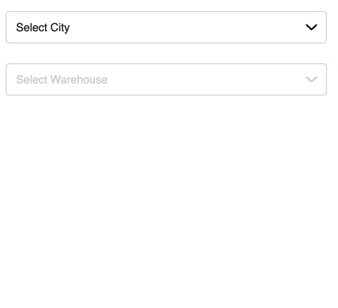
const warehouseSelect = NpWarehouseSelect({
  apiKey: API_KEY,
  input: {
    name: 'warehouse',
    placeholder: 'Select Warehouse',
  },
  button: {
    text: 'Select Warehouse',
  },
  root: document.querySelector('#warehouse'),
  onMounted: select => select.setDisabled(true),
});

NpCitySelect({
    apiKey: API_KEY,
    input: {
    name: 'city',
     placeholder: 'Select City',
    },
    button: {
     text: 'Select City',
    },
    root: document.querySelector('#city'),
      onSelect: async (item, select) => {
      const warehouses = await select.api.getNpWarehouses(item.value);

      warehouseSelect.setOptions(warehouses);
      warehouseSelect.setDisabled(false);
      warehouseSelect.setOpen(true);
    },
  });
});
Validate select on form submit:
Library provides error styles for select, which you can modify with css.
form.addEventListener('submit', e => {
  e.preventDefault();
  const isValid = warehouseSelect.validate();

  if (!isValid) {
    return;
  }
});
Validate multiple selects on form submit:
For this case you can use utility method validateMultiple()
form.addEventListener('submit', e => {
  e.preventDefault();
  const isValid = NpSelect.validateMultiple([warehouseSelect, citySelect]);

  if (!isValid) {
    return;
  }
});
Get select value:
Getting value as easy as getting it from <input /> element, or using getValue method
form.addEventListener('submit', e => {
  e.preventDefault();
  const isValid = NpSelect.validate(citySelect);

  if (!isValid) {
    return;
  }

  // Using getValue
  const city = citySelect.getValue();

  // Using form data
  const form = new FormData(e.target);
  const city = form.get('city');

  // Using querySelector
  const city = document.querySelector('[name="city"]').value;
});