oni.button
avalon.oniui2 button and buttonset component
npm install onibutton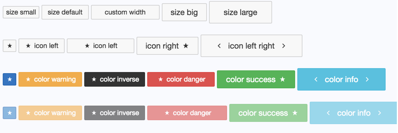
button
buttonTextaaabbb| prop | default | type | description |
|---|---|---|---|
| type | 'text' | text','icon','labeledIcon' | the type of button |
| width | 'auto' | number | the width of the button |
| position | 'left' | 'left','right','left-right' | this position of icons |
| size | "default" | "small", "default", "big", "large" | the size of the button |
| disabled | false | boolean | the state of the button |
| color | "default" | "primary", "warning", "danger", "success", "info", "inverse", "default" | the style of the button, as same as bootstrap |
| corner | 2 | true or number | the borderRadius value of button |
tricks
If you want to display ICON type, you don't write icon or type in the MS-WIDGET configuration,
instead of whiting icon text in the <ms-button> innerText directly
<!--no "icon" configuration item--> If you want to display LABELEDICON type, you don't write type in the MS-WIDGET configuration, instead of whiting icon and position configuration item
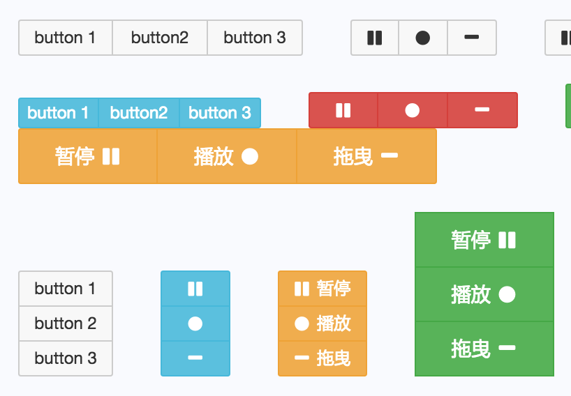
<!--no "icon" configuration item-->has labeled buttonset
按钮1 按钮2 按钮3| prop | default | type | description |
|---|---|---|---|
| isVertical | true | boolean | the arrangement of the buttons |
| width | 'auto' | number | the width of buttons |