
rc-pinterest-grid(react component)
English | 简体中文
This is a react component which provides a pinterest layout grid, and :
- no need to provide height for each block.
- the height of each block can be changed by user (etc reszie) while the grid can be relayouted automatically.
- support automatically responsive.
- support self-defined responsive.
install
npm install --S rc-pinterest-grid
Usage
import PinterestGrid from 'rc-pinterest-grid';<PinterestGrid = // = // = // = // > <div ="A">A</div> <div ="B">B</div> <div ="C">C</div> // ... more blocks here </PinterestGrid>PinterestGrid Props
| Prop Name | Description | Type | Required | Default |
|---|---|---|---|---|
| columns | it specifies how may columns in one row | number | true | 4 |
| columnWidth | it specifies the width of every block | number | true | 200 |
| gutterWidth | horizontal gutter between each block | number | false | 10 |
| gutterHeight | vertical gutter between each block | number | false | 10 |
| responsive | to be responsive or not responding with the screen width | boolean | ResponsiveConfigObject | undefined | false | false |
ResponsiveConfigObject
Note:
- if
responsiveisfalseor not provided(undefined), it will NOT be responsive. - if
responsiveistrue, it will calculate responsive behavior with default min-padding and max-width. - if
responsive.minPaddingis provided, it will useresponsive.minPaddingto calculate responsive behavior. - if
responsive.maxWidthis provided, it will useresponsive.maxWidthto calculate responsive behavior. - if
responsive.customBreakPointsis provided, it will follow the self-defined breakPoints to layout responsively to screen width.
BreakPoint ( for responsive.customBreakPoints )
| Prop Name | Description | Type | Required | Default |
|---|---|---|---|---|
| minScreenWidth | min screen width for this break point,it should be 0 for first break point | number | true | None |
| maxScreenWidth | max screen width for this break point, it should be Infinity for last break point | number | true | None |
| columnWidth | under this break point,the width for every block | number | true | None |
| columns | under this break point, how many columns should be placed in one row | number | true | None |
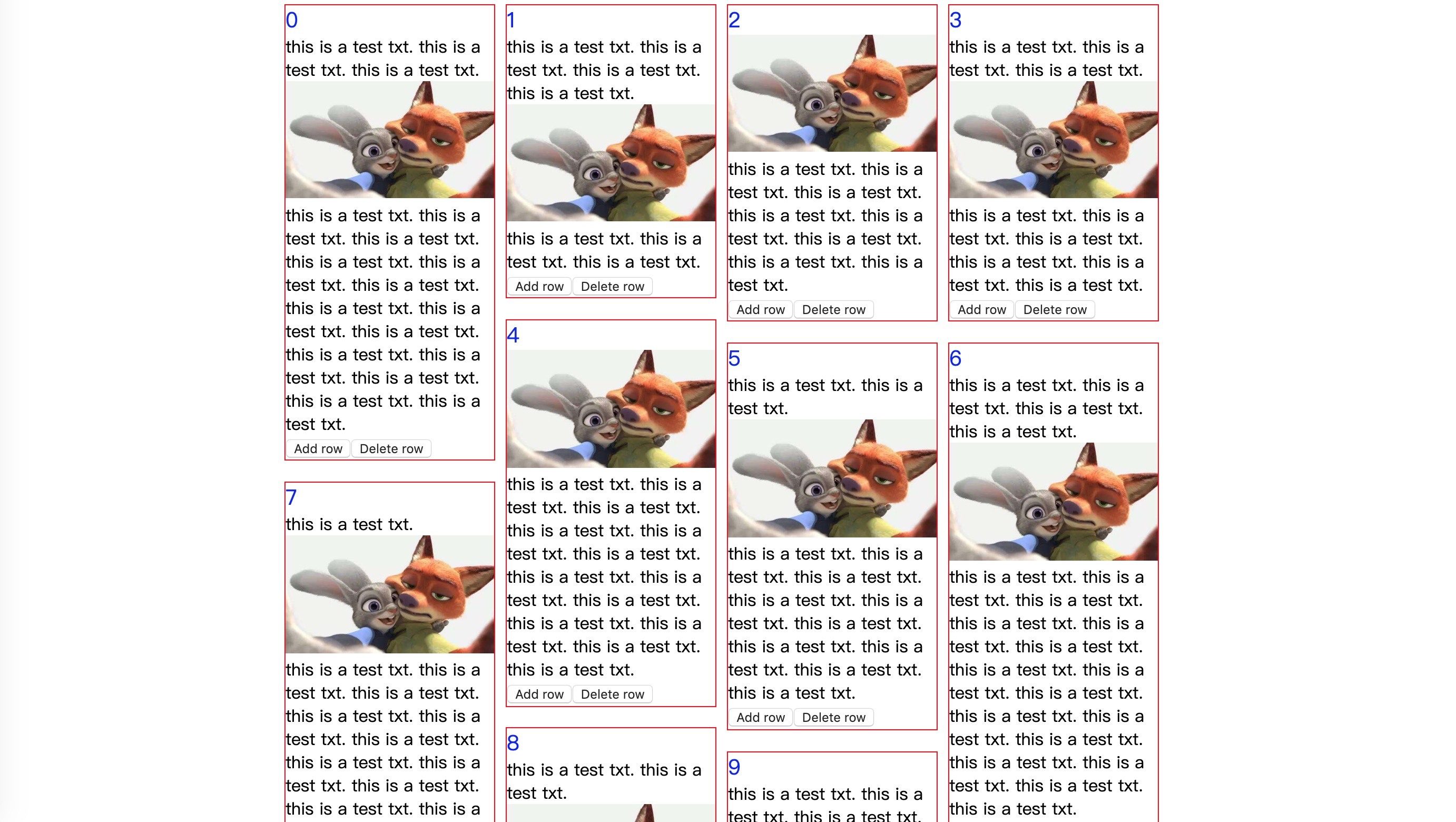
Use Case 1: simple usage
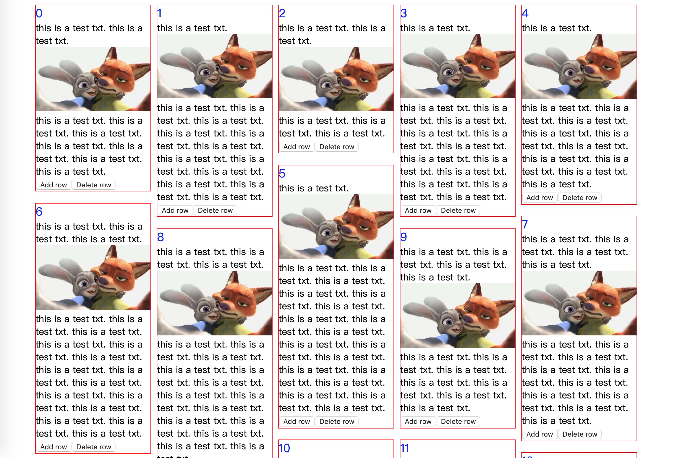
import * as React from 'react';import * as ReactDOM from 'react-dom';import PinterestGrid from 'rc-pinterest-grid'; const list = 123456789101112; const Demo = <PinterestGrid = = = = > list </PinterestGrid> ReactDOM; Use Case 2:automatic responsive
import * as React from 'react';import * as ReactDOM from 'react-dom';import PinterestGrid from 'rc-pinterest-grid'; const list = 123456789101112; const Demo = <PinterestGrid = = = = = > list </PinterestGrid> ReactDOM;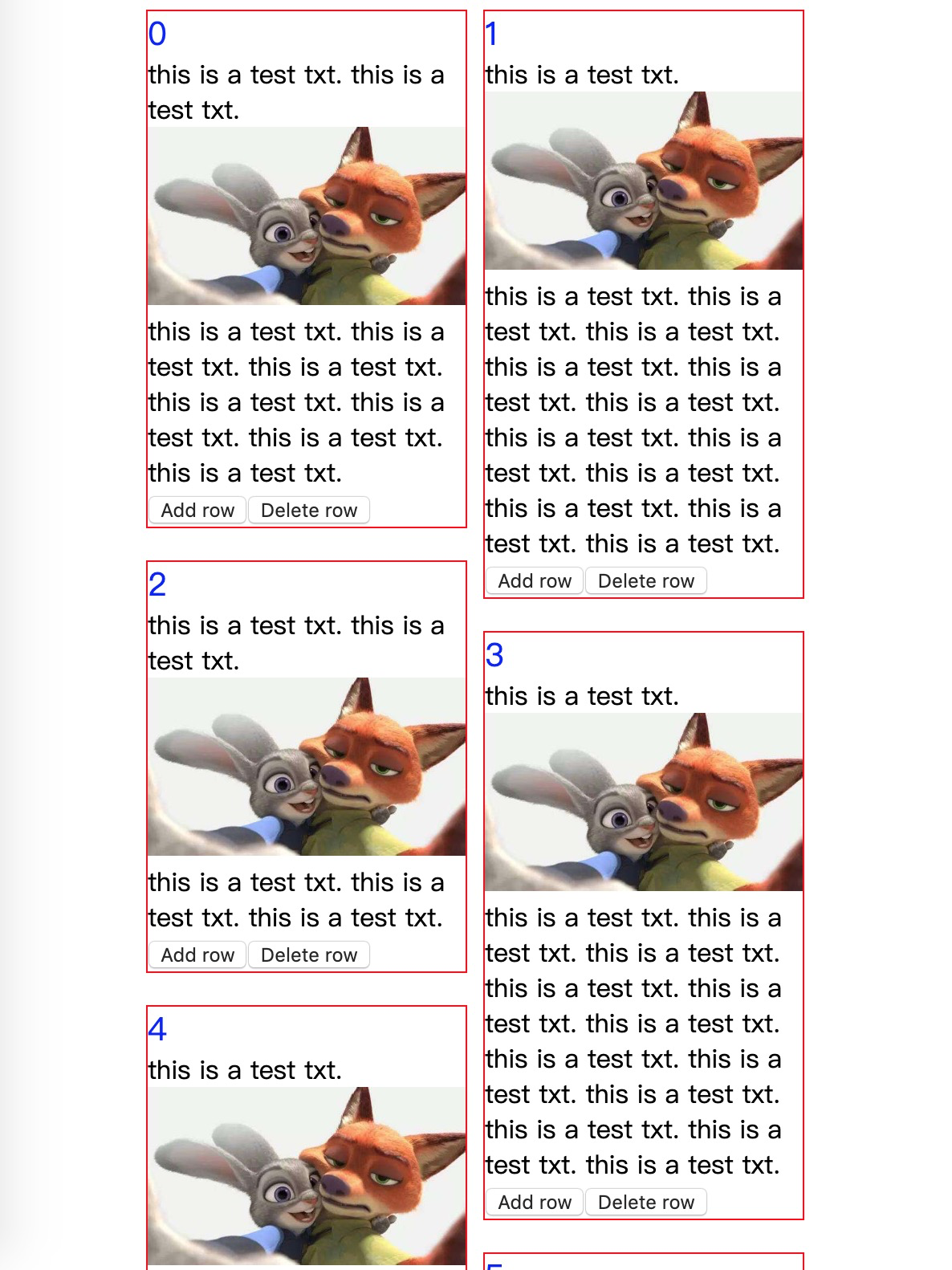
Use Case 3: self-defined responsive
import * as React from 'react';import * as ReactDOM from 'react-dom';import PinterestGrid from 'rc-pinterest-grid'; const list = 123456789101112; // self-defined break pointsconst breakPoints = minScreenWidth: 0 maxScreenWidth: 300 columns: 1 columnWidth: 200 minScreenWidth: 300 maxScreenWidth: 900 columns: 2 columnWidth: 300 minScreenWidth: 900 maxScreenWidth: Infinity columns: 3 columnWidth: 600 const Demo = <PinterestGrid = = = = = > list </PinterestGrid> ReactDOM;License
MIT