React Date Picker Clickyab
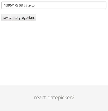
A simple and reusable Datepicker component for React (with persian jalali calendar support) Demo.
This package uses react-persian-datepicker project under the hood.
This project Forked from react-datepicker2 and some feature added to it. since none of pull requested reviewed, we decide to publish it as stand alone project.
Installation
The package can be installed via NPM:
npm install react-datepicker-cy --save
At this point you can import react-datepicker-cy and its styles in your application as follows:
; // Be sure to include styles at some point, probably during your bootstrapping;Below is a simple example on how to use the Datepicker in a React view. You will also need to require the css file from this package (or provide your own). The example below shows how to include the css from this package if your build system supports requiring css files (webpack is one that does).
; ; You can also use the standalone build by including react-datepicker2.js and react-datepicker2.css in your page. (If you do this though you'll also need to include the dependencies.) For example:
Range support only implemented for Calender component, first import it to the project and set isRange property to true,
; <Calendar isGregorian=false defaultMonth=thisstatecurrentMonth inputFormat="jYYYY/jM/jDD" calendarClass="persian-calendar-range first-picker" syncSelectedDay= console isRange=true selectedDayArray=thisstateselectedDayArray />synceSelectedDay property will pass selected Day.
selectedDayArray will get array of days
Some other property that have been added
Datepicker Component added features
tetherAttachment: specify position of Datepicker thether. example:
tetherAttachment="top right"-
onOpen : pass out if datepicker popup is open or not.
-
inputReadOnly: it allows you to make your datepicker readonly
-
calendarClass: accept class name for calendar customization
Calendar Component added features
-
isRange: set it to true if you would like to use range picker
-
calendarClass: accept class name for calendar customization
Configuration
The most basic use of the DatePicker can be described with:
<DatePicker onChange= this value=thisstatevalue />Local Development
The master branch contains the latest version of the Datepicker component. To start your example app, you can run npm install then npm start. This starts a simple webserver on http://localhost:4000.
Todo
- Write some tests
- Better documentation
- UI improvements
- Remove classnames dependency
Built With
- moment-jalaali - A Jalaali (Jalali, Persian, Khorshidi, Shamsi) calendar system plugin for moment.js.
Thanks
Special thanks to @mohebifar and @mberneti for his open-source project which this component is based on.
Contributing
Contributions are welcome and will be fully credited. I'd be happy to accept PRs for that.
License
Copyright (c) 2018 clickyab Inc. and individual contributors. Licensed under MIT license, see LICENSE for the full license.