Installation
Add the dependency:
Pure React Native
npm i react-native-apple-card-viewsExpo Version
npm i react-native-apple-card-views#expoPeer Dependencies
IMPORTANT! You need install them
"react-native-androw": ">= 0.0.33",
"react-native-linear-gradient": ">= 2.5.6",
"@freakycoder/react-native-bounceable": ">= 0.1.1"
Expo Peer Dependencies
IMPORTANT! You need install them
"expo-linear-gradient": ">= 9.2.0"
"@freakycoder/react-native-bounceable": ">= 0.1.1"
Options
Usage
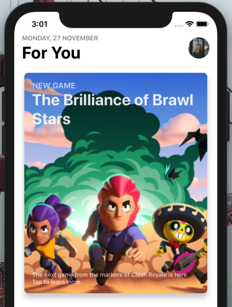
AppleCard Usage
<AppleCard
  smallTitle=""
  largeTitle=""
  footnoteText=""
  resizeMode="cover"
  source={require("./assets/hero_bg_brawlstars_.jpg")}
  backgroundStyle={{
    height: 200,
  }}
  onPress={() => {}}
/>
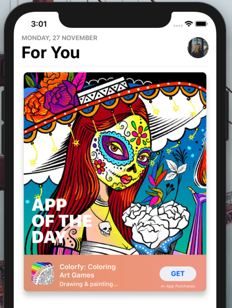
AppOfTheDayCard Usage
<AppOfTheDayCard
  iconSource={require("./assets/Colorfy.jpg")}
  backgroundSource={require("./assets/ColorfyBG.jpg")}
  onPress={() => {}}
  buttonOnPress={() => {}}
/>
Configuration - Props
AppleCard Props
| Property | Type | Default | Description |
|---|---|---|---|
| source | image | default image | set the image background |
| style | style | default | change the style of the card |
| shadowColor | color | #000 | change the main card's shadow color |
| smallTitle | string | NEW GAME | change the small title |
| largeTitle | string | The Brilliance of Brawl Stars | change the main large title |
| footnoteText | string | The next game from the markers of Clash Royale is here. Tap to learn more. | change the footnote text |
| backgroundStyle | style | default | set custom style for background image |
| smallTitleTextStyle | style | default | set custom style for small title |
| largeTitleTextStyle | style | default | set custom style for large title |
| footnoteTextStyle | style | default | set custom style for footnote |
| onPress | function | null | use this to set onPress functionality |
AppOfTheDayCard Props
| Property | Type | Default | Description |
|---|---|---|---|
| style | style | default | change the style of the card and image background |
| shadowStyle | style | default | change the style of the card's shadow |
| backgroundSource | image | default image | set the image background for main card |
| iconSource | image | default image | set the logo image |
| largeTitle | string | "APP OF THE DAY" | change the main large title |
| title | string | "Colorfy: Coloring Art Games" | change the title text |
| subtitle | string | "Drawing & painting for everyone" | change the subtitle text |
| buttonText | string | "GET" | change the button's text |
| gradientColors | Array | ["#de9c7c", "#ef9f81", "#efa192"] | change the gradient colors |
| buttonSubtitle | string | "In-App Purchases" | change the button's bottom subtitle |
| largeTitleTextStyle | style | default | set the custom style for large title |
| subtitleTextStyle | style | default | set the custom style for subtitle text |
| titleTextStyle | style | default | set the custom style for title text |
| iconStyle | style | default | set the custom style for icon |
| buttonOnPress | function | null | set a function for button's onPress |
| onPress | function | null | set a function for main card's onPress |
Roadmap
- [ ]
AppleCardRewritten and Code Cleaning - [ ]
AppleCardMore Customization Options
Author
FreakyCoder, kurayogun@gmail.com
License
React Native Apple Card Views Library is available under the MIT license. See the LICENSE file for more info.


