<Onboarding />
Onboarding experience made a breeze.
Originally inspired by AndroidOnboarder.
Quick demo
 |
 |
 |
|---|---|---|
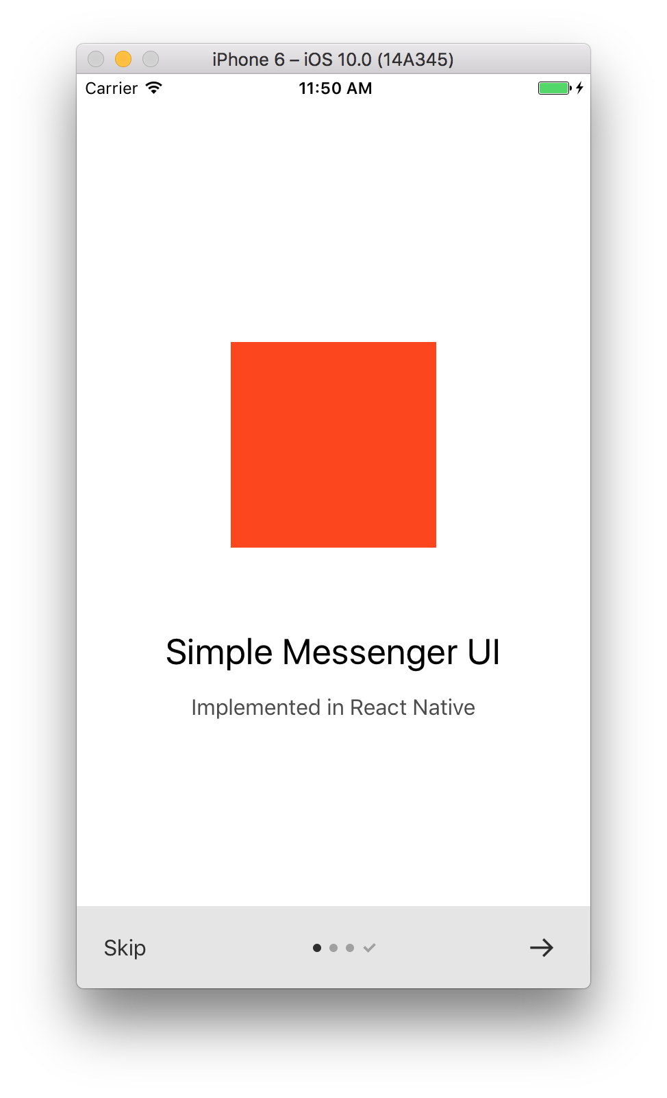
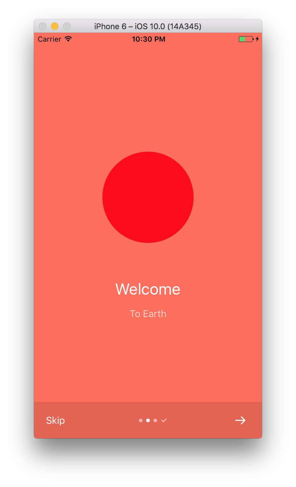
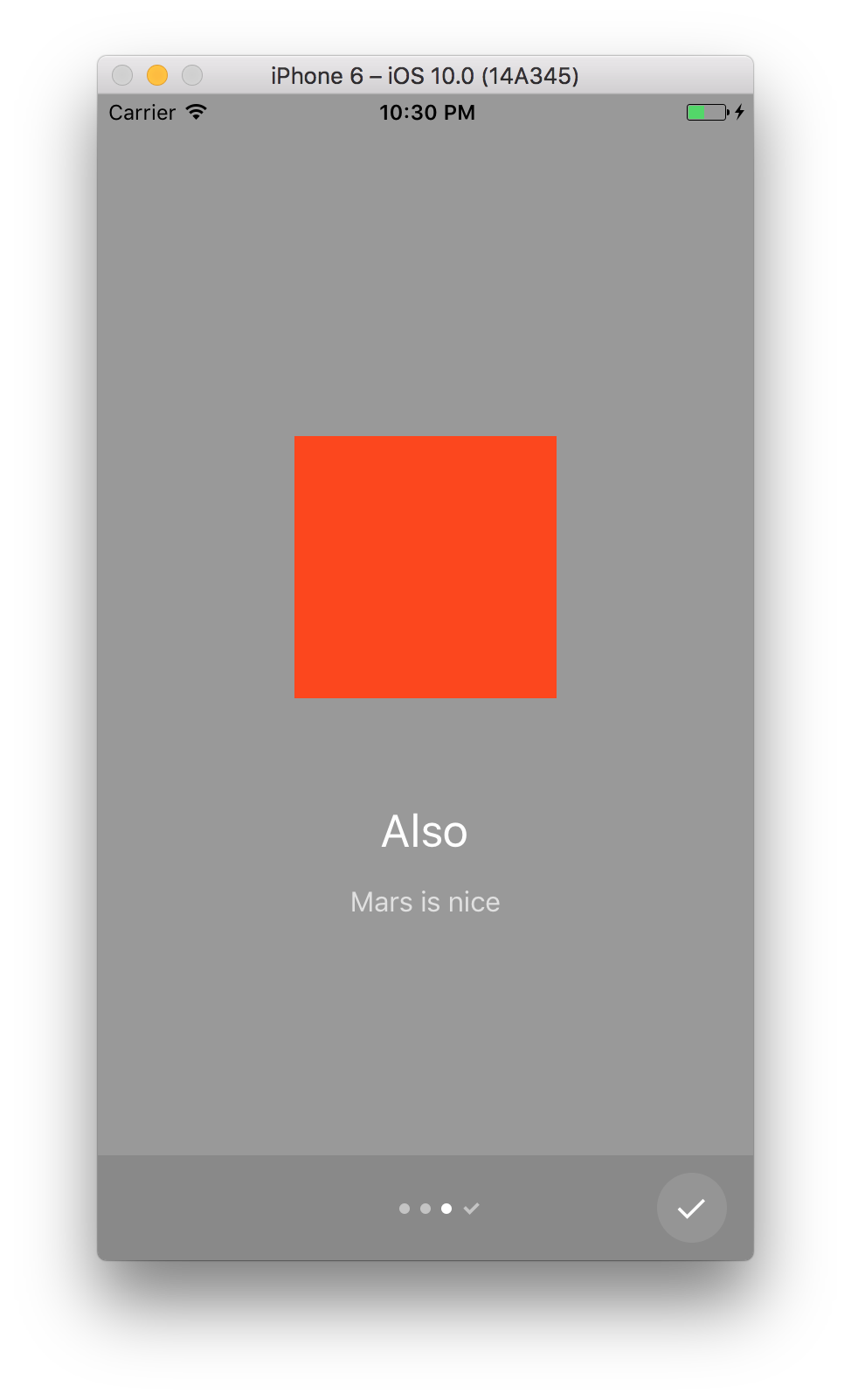
| Adapts to bright backgrounds | and dark, too | shows the Done button |
<Onboarding pages= backgroundColor: '#fff' image: <Square /> title: 'Simple Messenger UI' subtitle: 'Implemented in React Native' backgroundColor: "#fe6e58" image: <Circle /> title: 'Welcome' subtitle: 'To Earth' backgroundColor: "#999" image: <Square /> title: 'Also' subtitle: 'Mars is nice' onEnd={}/>Install
npm install --save react-native-simple-onboarding
;Usage
<Onboarding /> component
Props:
pages(required): an array of onboarding pages. A page is an object of shape:backgroundColor(required): a background color for the pageimage(required): a component instance displayed at the top of the pagetitle(required): a string titlesubtitle(required): a string subtitle
onEnd(optional): a callback that is fired after the onboarding is completebottomOverlay(optional): a bool flag indicating whether the bottom bar overlay should be shown. Defaults totrue.showSkip(optional): a bool flag indicating whether the Skip button should be show. Defaults totrue.showNext(optional): a bool flag indicating whether the Next arrow button should be show. Defaults totrue.showDone(optional): a bool flag indicating whether the Done checkmark button should be show. Defaults totrue.
To Do
- animations
- accessibility
License
MIT.