React Password Strength Indicator
A password strength checker with various indicator options using zxcvbn library.
Demo App
Try it live
Getting Started
These instructions will get you a copy of the project up and running on your local machine for development.
Prerequisites
react/react-dom is a peer dependency. You should be using this in a React project.
Installing
Add password strength indicator to your project by executing
npm install react-password-strength-variant-indicator
Usage
Here's an example of basic usage:
;; state = inputprops: inputclass: "form-control" autocomplete: "off" tabIndex: 0 value: '' { this }; { return <div> <StrengthCheck changecallback= { ; } validscore="1" inputprops=thisstateinputprops variant="circle" /> </div> ; }User guide
Props
| Prop name | Description | Default value | Example values |
|---|---|---|---|
| minLength | The minimum length of password to be typed. | 5 | minLength=6 |
| validscore | The minimum valid score the password should have(The score value ranges from 0 to 4 depends on strength and complexity) | 2 | validscore=3 |
| strength | The strength of the password based on the score | { 0: "Worst", 1: "Bad",2: "Weak",3: "Good",4: "Strong"} | strength={0: "Weak",1: "Weak",2: "moderate",3: "Good",4: "Strong"} |
| className | The className which get added to the component | No | className=form |
| inputprops | Object which accepts all the parameters that will be used in input tag | No | inputprops={{inputclass: 'form-control-input',autocomplete: 'off'tabIndex=-1,} |
| variant | This gives different types of variant options that can be choosed for strength display | linear-stripped | variant=line |
| changecallback | A callback function which gets triggered onChange which gives the input value in the format {value: typedValue,isValid: boolean,score: score}.isValid is a boolean which depends on the input length and score.score value ranges from 0 to 4 which depends on password strength and complexity.value gives the inputvalue in the field |
No | changecallback={val => {changeCallBackHandler(val);}} |
variants
| variant name | Example |
|---|---|
variant=linear |
 |
variant=linear-stripped |
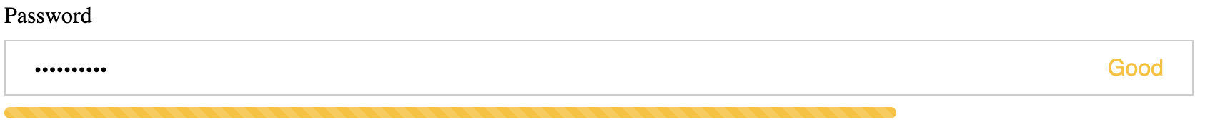 |
variant=discontinuous |
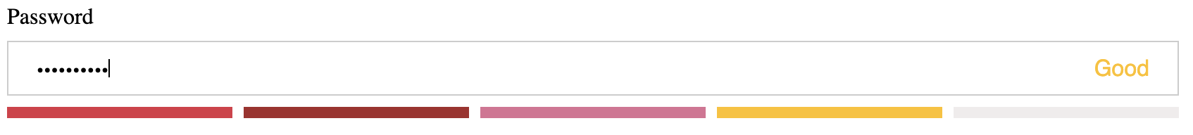 |
variant=discontinuous-stripped |
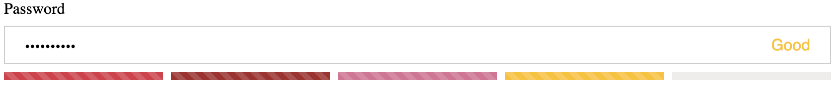 |
variant=circle |
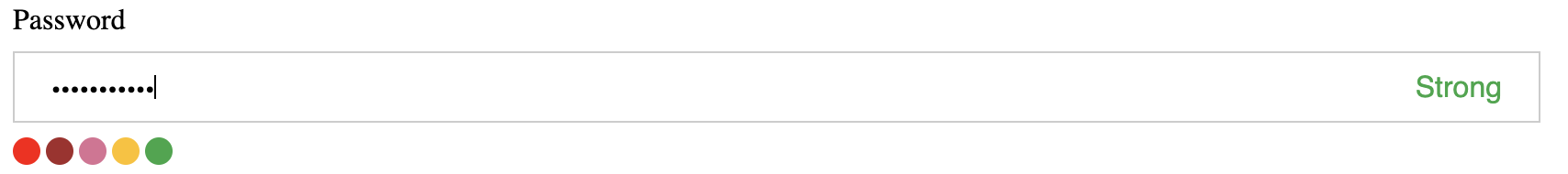 |
variant=line |
 |
License
This project is licensed under the MIT License - see the LICENSE.md file for details