🙋 React Pullable
Simple, customizable React component for pull to refresh on touch devices.
Usage
Install with yarn add react-pullable or npm install react-pullable
Import in your components with import Pullable from 'react-pullable'
Component styles
To prevent Chrome overscroll set overscroll-behavior-y: contain [or] none; on <body> (learn more).
Required props
| Prop | Type | Description |
|---|---|---|
| onRefresh | Function | Called when a pull is triggered |
Optional props
| Prop | Type | Default | Description |
|---|---|---|---|
| className | String | pullable |
Class applied to the component |
| centerSpinner | Boolean | true |
Is the spinner vertically centered or top-aligned? |
| fadeSpinner | Boolean | true |
Does the spinner fade in/out when pulled? |
| rotateSpinner | Boolean | true |
Does the spinner rotate when pulled? |
| spinnerSize | Number | 24 |
Pixel width/height of the spinner |
| spinnerOffset | Number | 0 |
Pixel offset of the spinner (from the top) |
| spinnerColor | String | #000000 |
Color of the spinner |
| spinSpeed | Number | 1200 |
Time to rotate the spinner 360° (in ms) |
| popDuration | Number | 200 |
Time to expand the spinner before it rotates (0 = skip pop) |
| distThreshold | Number | spinnerSize * 3 |
Distance where refresh is triggered |
| resistance | Number | 2.5 |
How hard it is to pull down |
| refreshDuration | Number | 1000 |
Time spent spinning before resetting (in ms) |
| resetDuration | Number | 400 |
Time to reset (in ms) |
| resetEase | String | cubic-bezier(0.215, 0.61, 0.355, 1) |
Ease when resetting |
| shouldPullToRefresh | Function | () => window.scrollY <= 0 |
When to allow pulling |
| disabled | Boolean | Disables all functionality |
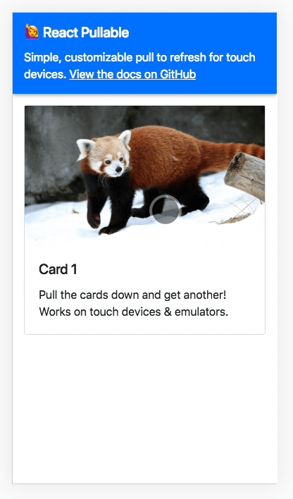
Examples
Using only the required onRefresh prop:
<Pullable => thisstatecards</Pullable>Using some optional props:
<Pullable = = ="#FFFFFF" => thisstatetasks</Pullable>Credits
Inspired by BoxFactura’s PulltoRefresh.js
Spinner SVG from Feather Icons
Built using NWB
Contributing
To test using the included demo app:
- Clone the repo
- Open the directory and run
npm installandnpm start - The demo app will update to reflect any changes to it or the component
To test in your own local app:
- Clone the repo
- Open the directory and run
npm installandnpm link - Open a directory with a test project and run
npm link [package name] - Back in the react-preload-image directory run
npm run build