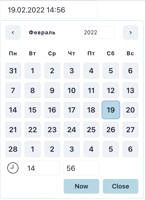
import React from "react";
import { DateTimePicker } from "shulga-pickers";
import { DateTime } from "luxon";

export default function App() {
  const [date, setDate] = React.useState<DateTime | null>(null);

  return (
    <div>
      <DateTimePicker
        inputFormat="dd.LL.yyyy HH:mm"
        date={date}
        onChangeDate={setDate}
      />
    </div>
  );
}import React from "react";
import { DateTimePicker } from "shulga-pickers";
import { Components } from "shulga-pickers/components";
import { DateTime } from "luxon";
import {
Box,
Button,
ChakraProvider,
Input,
Stack,
Table,
Tbody,
Td,
Text,
Th,
Tr,
Flex,
} from "@chakra-ui/react";
import { ChevronLeftIcon, ChevronRightIcon } from "@chakra-ui/icons";
const ForwardRefInput = React.forwardRef<
HTMLInputElement,
React.DetailedHTMLProps<
React.InputHTMLAttributes<HTMLInputElement>,
HTMLInputElement
>
>(({ size, ...props }, ref) => (
<Input placeholder="Дата" isReadOnly {...props} ref={ref} />
));
const components: Partial<Components> = {
PrevMonthButton: ({ children, ...props }) => {
return (
<Button {...props} size="sm">
<ChevronLeftIcon />
</Button>
);
},
NextMonthButton: ({ children, ...props }) => {
return (
<Button {...props} size="sm">
<ChevronRightIcon />
</Button>
);
},
CloseButton: (props) => {
return <Button {...props} size="sm" />;
},
DateButton: ({ ...props }) => {
return <Button {...props} size="sm" />;
},
NowButton: ({ isActive, ...props }) => {
return <Button isActive={isActive} {...props} size="sm" />;
},
Week: ({ children, ...props }) => {
return (
<Text textTransform="capitalize" fontWeight="bold">
{children}
</Text>
);
},
Month: ({ children, ...props }) => {
return (
<Text textTransform="capitalize" fontWeight="bold">
{children}
</Text>
);
},
Input: ForwardRefInput,
Container: (props) => {
return <Box {...props} />;
},
PickerContainer: (props) => {
return <Box {...props} />;
},
Table: (props) => {
return <Table {...props} gap={1} variant="unstyled" />;
},
TableBody: (props) => {
return <Tbody {...props} />;
},
Tr: (props) => {
return <Tr {...props} />;
},
Td: (props) => {
return <Td {...props} p={1} />;
},
Th: (props) => {
return <Th {...props} p={2} textAlign="center" />;
},
};
export default function App() {
const [date, setDate] = React.useState<DateTime | null>(null);
return (
<ChakraProvider resetCSS>
<Stack>
<Flex justifyContent="center">
<DateTimePicker
inputFormat="dd.LL.yyyy HH:mm"
date={date}
onChangeDate={setDate}
components={components}
/>
</Flex>
</Stack>
</ChakraProvider>
);
}