
storybook-addon-matrix
Storybook addon for rendering components with a matrix of props.
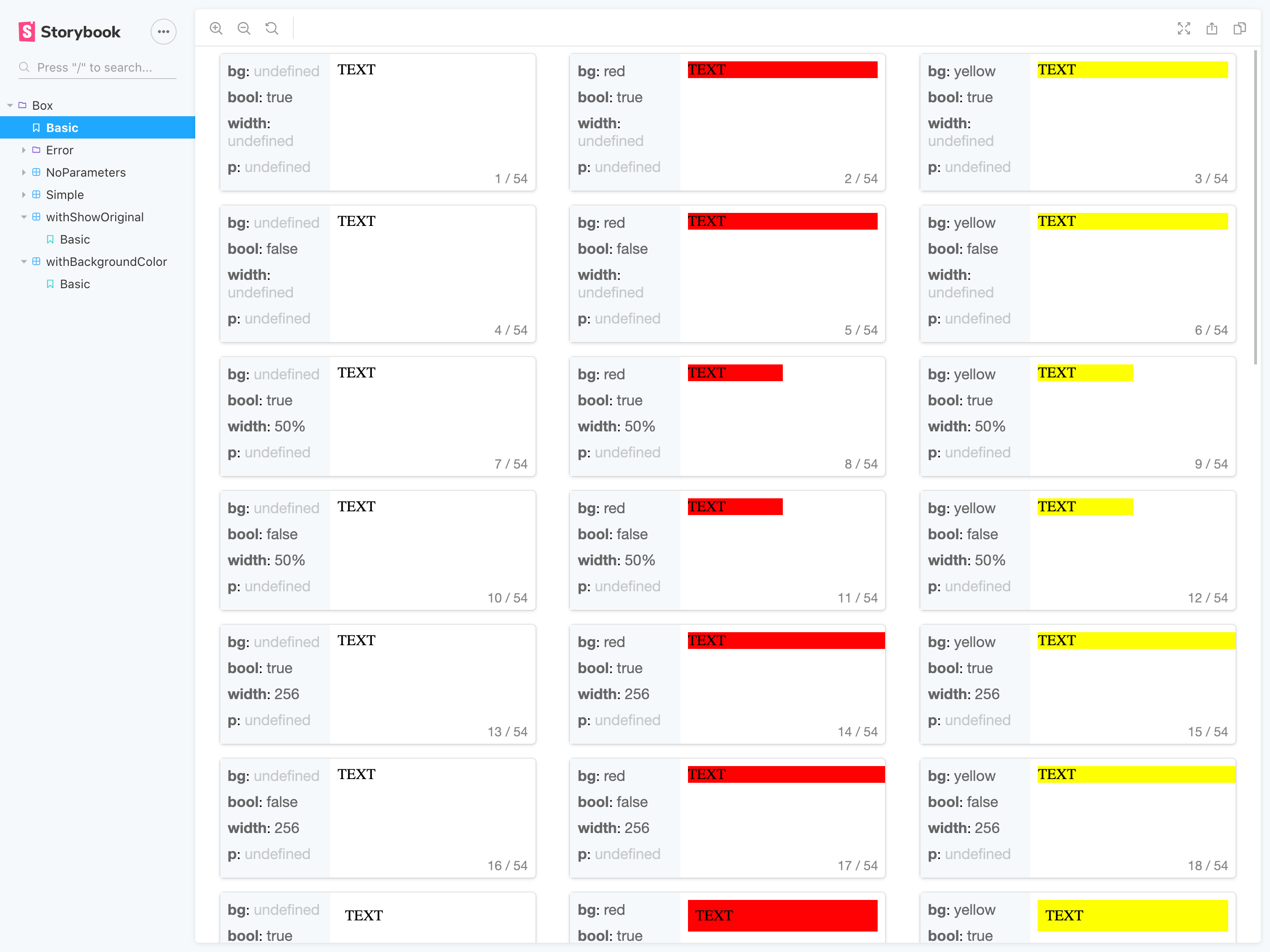
npm i storybook-addon-matrixView demo: https://storybook-addon-matrix.now.sh/
Usage
Globally
// .storybook/preview.js;; ; // Your.stories.tsx;; title: 'Box' component: Box // Must be present parameters: matrix: // Parameter name is matrix pattern: // Let you write your matrix pattern bg: 'white' ... // Format is key: [value1, value2, ...] width: undefined ... // backgroundColor: 'rgba(0,0,0,0.7)', // Optional: If you want to change backgournd color // showOriginal: true // Optional: If you want to show original component set to true ; const Basic = <Box>TEXT</Box>;Or individual
// Your.stories.tsx;;; title: 'Box' component: Box decorators: withMatrix parameters: matrix: pattern: bg: 'white' 'blue' 'red' 'yellow' width: undefined '50%' 256 p: 1 2 3 ;Do you want to more info? We have an example! Please let you try it.
$ git clone https://github.com/tomoya/storybook-addon-matrix.git$ cd ./storybook-addon-matrix/example$ yarn install$ yarn startContributing
- Fork it (https://github.com/tomoya/storybook-addon-matrix/fork)
- Create your feature branch (
git checkout -b feature/fooBar) - Commit your changes (
git commit -am 'Add some fooBar') - Push to the branch (
git push origin feature/fooBar) - Create a new Pull Request
ToDO
- Hide original componen
- Global options to use
addParameters()- Default backgournd color
- Show original component
- Number of columns
- Theme compatibility
- Show source
- Release automation
- Changelog