Gitter
Plugin for Tailwind CSS
This Tailwind CSS plugin adds additional utility classes for a fluid response grid system to facilitate the positioning and alignment of content and design elements. The number of columns can be configured for each breakpoint, respectively.
In contrary to common grid systems like the Bootstrap grid, Gitter cols have a fixed width according to the screen size and are independent of the width of their parent element.
Installation
Gitter is part of the npm registry and can be installed using npm or yarn:
npm install tailwindcss-gitter
or
yarn add tailwindcss-gitter
Then you can require the plugin in your Tailwind config:
plugins: [
  require('tailwindcss-gitter')
]
Introduction
Gitter divides the available space of the screen into a predefined number of columns of equal width:
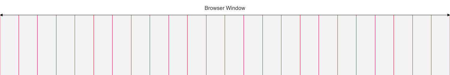
Each column has a defined left and right padding. This padding is referred to as gutter:
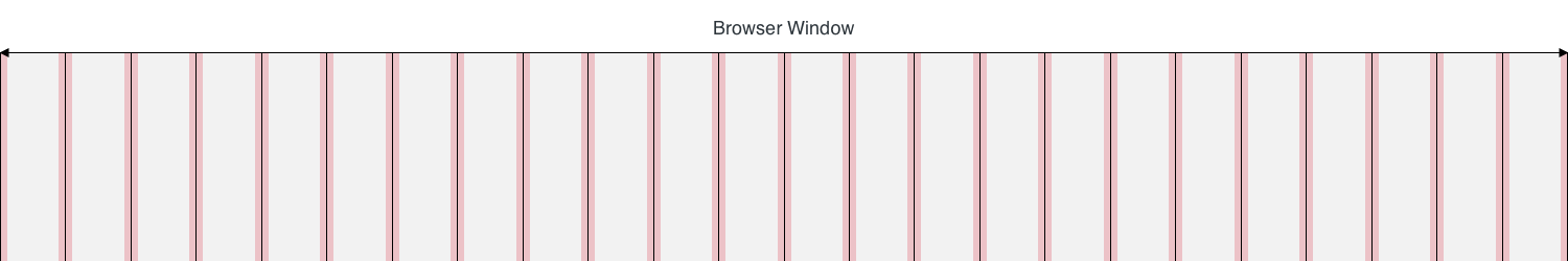
This gutter ensures, that there is a gab between the contents of two adjacent columns:


Additionally, there is an extra padding before the first and after the last column, to ensure, that all content on the page has at least one gutter width of distance to the edges of the screen (or browser window):

The gutter can be handled with Tailwind CSSs default utility classes for horizontal padding. The extra padding outside of the section can be configured in the gitter tailwind settings (outerGutter).
The number of columns can vary between different projects. However, it can also differ between screen sizes. For example a display with a width of 320 pixels could have six columns:

while from a width of 800 pixels, the number of columns could be twelve:

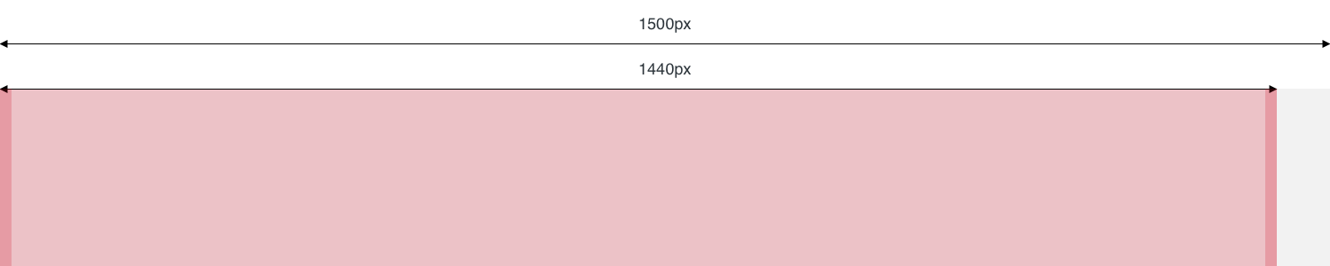
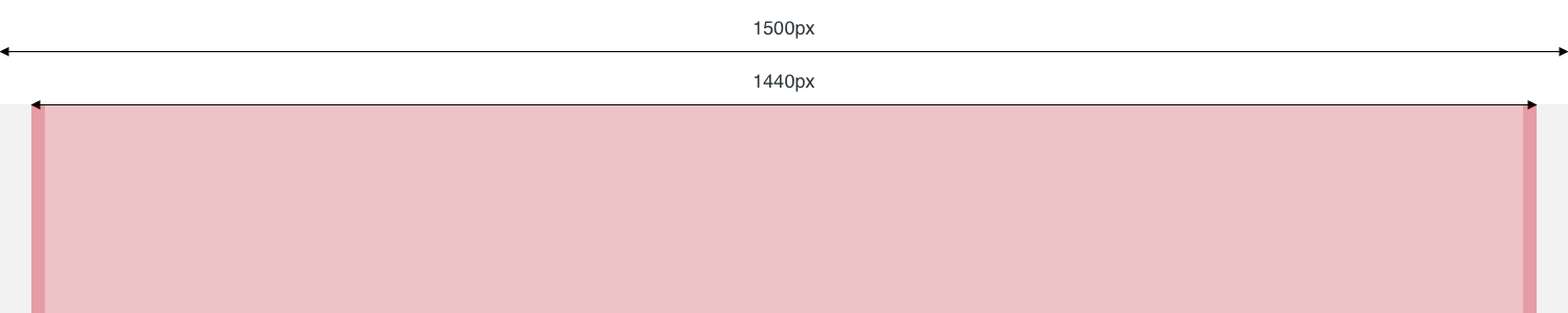
The previous illustrations would indicate, that the grid always spans across 100% of the available space and fill out the whole viewport. This assumption is true, up to a certain point. For large screens, there is often need for a maximum width for the content area, which is typically centered on the screen. The default value for the maximum content width is 1440 pixels:

In this case the grid is supposed to be used inside this area. The default number of columns for screens is 24:

Usage
Section Utility
Many layouts will have a maximum content width, where the content area has a width of 100% (minus the outer gutter) on smaller devices and a fixed with of e.g. 1440px for screens bigger than that. This is the exact use case of a Section. A Section is created by using the section utility class on an html-element. The element will than have the max-width defined for the project or a width of 100%, if the viewport is smaller than the defined max-width.
If the section should have a padding is up to you to define using Tailwinds padding utilities.
By default a Section is not centered. To get a centered Section, just use the Tailwind CSS default utility mx-auto:
Column Utilities
Per default Gitter will generate 24 utility classes for specifying the width of elements according to the configured grid:
| Utility | Description |
|---|---|
| w-col-1 | The width of the element should be 1 of 24 columns |
| w-col-2 | The width of the element should be 2 of 24 columns |
| w-col-3 | The width of the element should be 3 of 24 columns |
| ... | ... |
| w-col-24 | The width of the element should be 24 of 24 columns |
If costum responsiveCols are defined additional classes prefixed with the specified breakpoints will be genereated (using media queries).
Settings
Gitter offers various configurations to adapt to the needs of different projects:
| Setting | Default | Description |
|---|---|---|
| cols | 24 | Defines the default number of columns (if no breakpoints are specified). |
| responsiveCols | {} | Allows to define different amount of columns for specific breakpoints. The key must correlate with a breakpoint defined in Tailwind CSS and the value is the number of cols. |
| outerGutter | 1rem | Defines the spacing between the browser window and the section width. |
| sectionMaxWidth | 1440px | Defines the maximum width for a section. If set to false, section will have no max-width. |
Custom settings
Example config using a different number of cols on mobile and desktop:
// tailwind.config.js

module.exports = {
  ...
  theme: {
    ...
    gitter: {
      cols: 24,
      responsiveCols: {
        xs: '6',
        lg: '24'
      },
      outerGutter: '1rem',
      sectionMaxWidth: false
    }
  }
};
With this configuration, the following classes will be generated in addition to the default column utilities:
| Utility | Description |
|---|---|
| xs:w-col-1 | The width of the element should be 1 of 6 columns |
| xs:w-col-2 | The width of the element should be 2 of 6 columns |
| xs:w-col-3 | The width of the element should be 3 of 6 columns |
| ... | ... |
| xs:w-col-6 | The width of the element should be 6 of 6 columns |
| lg:w-col-1 | The width of the element should be 1 of 24 columns |
| lg:w-col-2 | The width of the element should be 2 of 24 columns |
| lg:w-col-3 | The width of the element should be 3 of 24 columns |
| ... | ... |
| lg:w-col-24 | The width of the element should be 24 of 24 columns |
Default config
If no custom settings are defined, Gitter defaults to the following values:
{
  cols: 24,
  responsiveCols: {},
  outerGutter: '1rem',
  sectionMaxWidth: '1440px',
}