Vue-Semantic-Modal
Modal component for semantic-ui without jQuery


Example
Usage
Confirmation needed Do you want to continue? No Yes components: modal { return showModal: true confirmed: true } { { thisconfirmed = true thisshowModal = false } } //...Include in the root component semantic-ui CSS:
@import '~dist/semantic.css';
Slot
-
header -
content -
actions
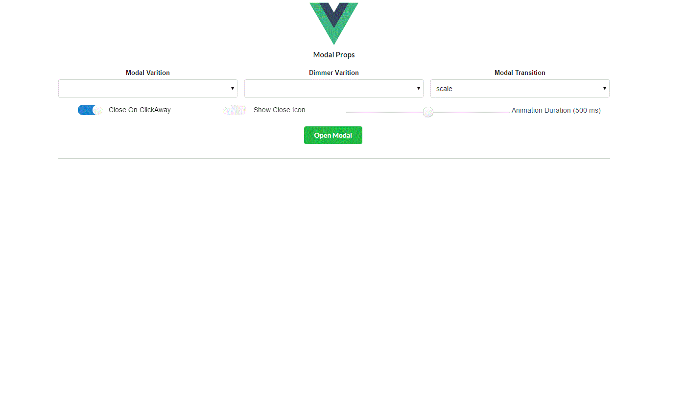
Props
| Name | Required | Type/Value | Default | Description |
|---|---|---|---|---|
| opened | no | Boolean |
false | triggers the opening/closing. Can be bind with v-model |
| hasImage | no | Boolean |
false | Should be true if the content contains image as per semantic-ui specification |
| animationDuration | no | Number |
500 | Opening and closing animation duration in ms |
| showCloseIcon | no | Boolean |
false | If true close icon of the model is displayed |
| modalVariation | no | 'fullscreen', 'basic', 'mini', 'small', 'large' or '' |
'' | Additional modal styling see here |
| dimmerVariation | no | 'inverted' or '' |
'' | Additional dimmer styling see here |
| modalTransition | no | String |
'scale' | name of the modal transition to be applied. See here |
Events
changed
Sent when the modal state changed with a boolean true if the modal is opened
displayChanged
Sent when the modal visual state changed with a string representing the modal visual state:
'closed', 'opening', 'opened', 'closing'
clickAwayModal
Sent when modal is opened and user click outside.
Installation
- Available through:
npm install vue-semantic-modal