Vue Slimgrid


A simple Vue wrapper component for SlickGrid using SlickGrid-ES6 as a foundation!
Includes some additional plugins/features built-in:
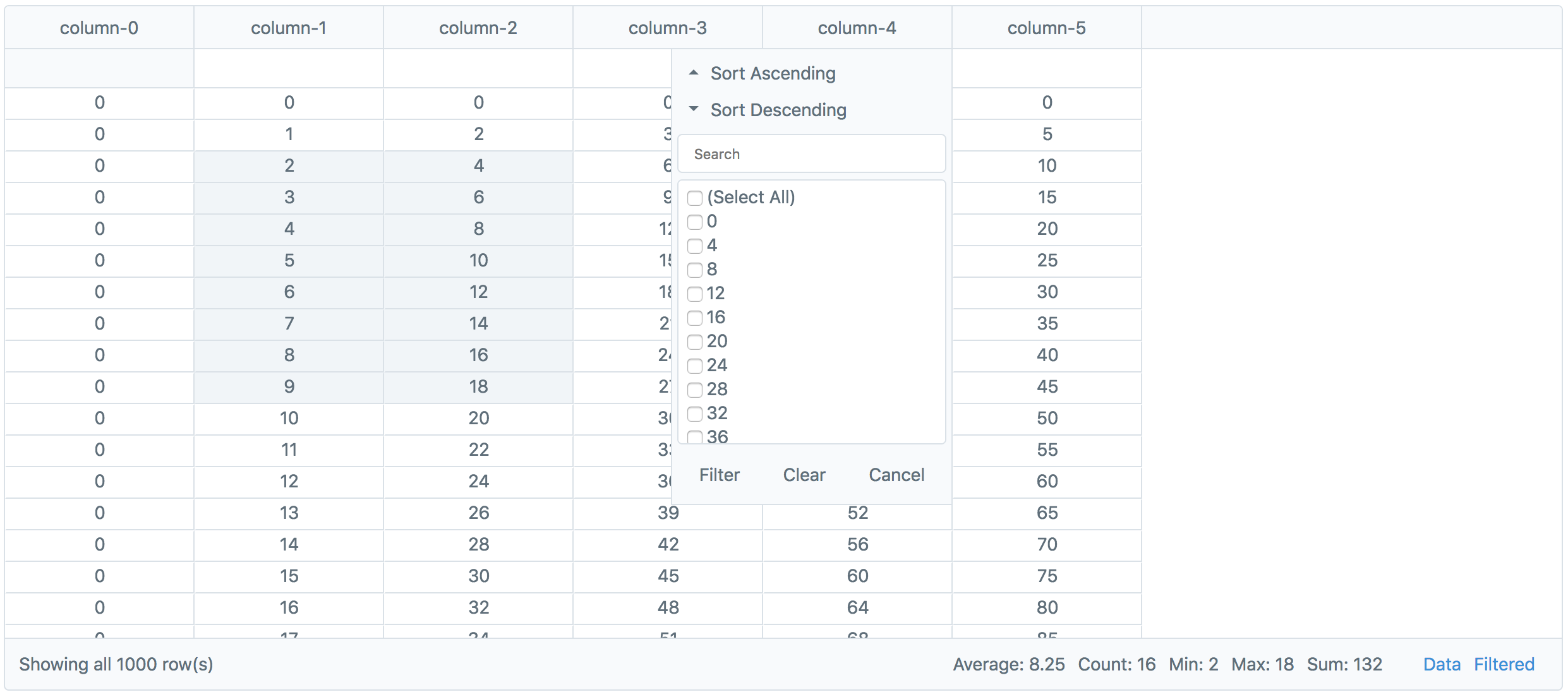
- Slick Header Filter (danny-sg)
- External Copy/Paste (Celebio)
- Conditional Input Filtering (ghiscoding)
- Pager w/ Selection Statistics (Avg, Count, Min, Max, Sum)
- Raw/Filtered Data Download to CSV
- Right-Click Context Menu
Installation
NPM
npm i vue-slimgrid --saveYarn
yarn add vue-slimgridExample.vue
Available Props
pk
The name of the column from your data to use as the primary key.
Default: id
Example:
data
The dataset to display in the grid.
Default: []
Example:
columnOptions
Options that can be applied to each column in the grid to maniplulate how they act and display.
Default: (applied for each column)
/** * Along with their normal values, all options may also be used with anonymous functions: * order(column) { * return column.id == 'col1' ? -1 : 0; * } */ /** * The position of the column in the header relative to others. * Lower number (more left), Higher number (more right) */ order: idx /** * Show or hide the column. */ hidden: false /** * Show or hide the header input field for this column. */ headerInput: true /** * Show or hide the header filter for this column. */ headerFilter: true /** * SlickGrid Column Option Defaults * * The documentation for SlickGrid specific options: * https://github.com/mleibman/SlickGrid/wiki/Column-Options */ id: columnName name: columnName field: columnName sortable: true resizable: true focusable: true selectable: true headerCssClass: null minWidth: 30 cssClass: "text-center" defaultSortAsc: true { return null; } { return value; }Note: The pk column is set as
hidden: trueandorder: -1by default.
Example:
explicitColumns
An array of column names that will be used when rendering the grid instead of auto-generating them from the provided data. Helpful when needing to show columns if the data is empty.
Default: []
Example:
height
The height in
pxto display the grid.
Default: 600
Example:
selectionModel
The SlickGrid selection model to use when rendering the grid.
Default: Plugins.CellSelectionModel()
Example:
customPlugins
Add, register, and enable events for custom SlickGrid plugins.
Default: {}
Example:
rowFormatter
Customize the appearance/handling of particular rows. See the SlickGrid Item Metadata Documentation for more details.
Default:
{ return null; }Example:
sort
The function to use when a sort operation is performed on data.
Default:
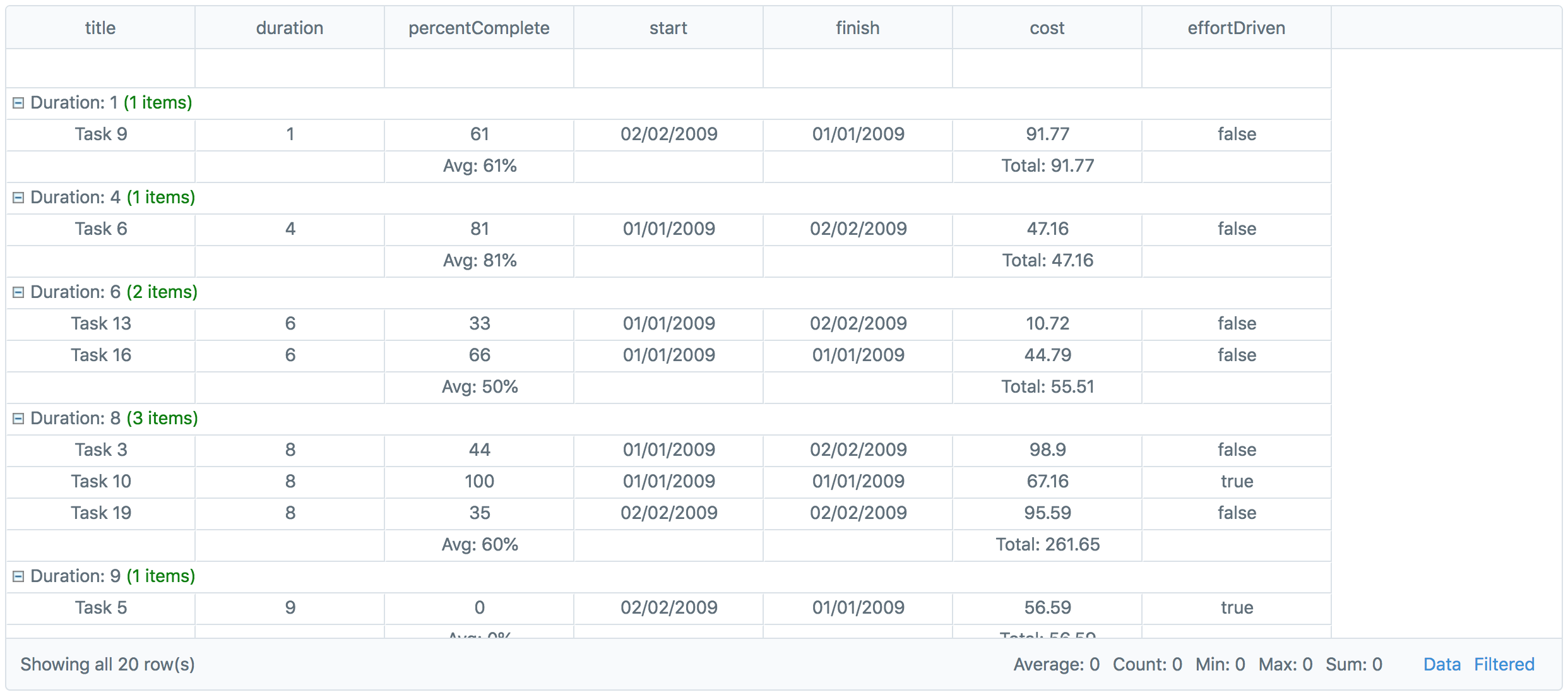
{ argsgrid; }grouping
Set multi-level groupings for rows. See the SlickGrid Grouping Example for more details.
Default: []
Example:
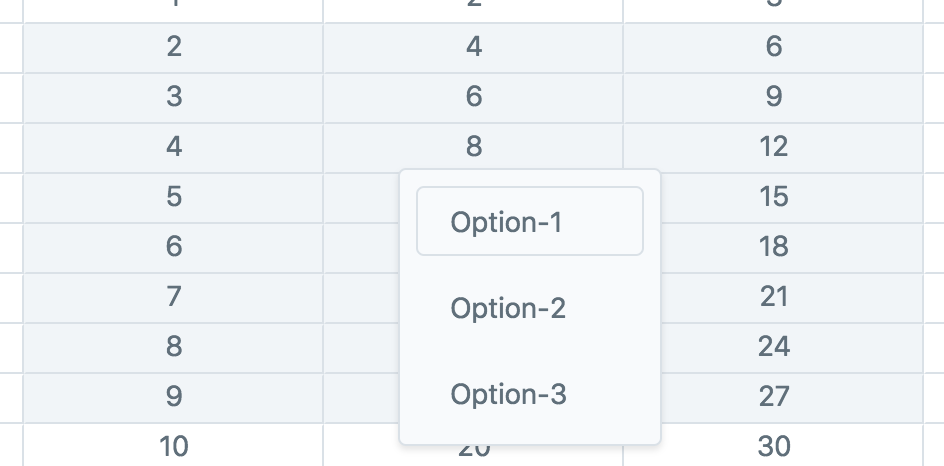
contextMenuOptions
Options to add to the context-menu that displays when a user right-clicks selected grid cells.
Default: []
Example:
showPager
Show or hide the pager at the bottom of the grid.
Default: true
Example:

downloadable
Show or hide the csv download links for raw/filtered data in the pager.
Default: true
Example:
showPagerStats
Show or hide the selection statistics in the pager.
Default: true
Example:
SlickGrid Options
Each of the base SlickGrid Grid options are also available. See the SlickGrid Grid Options Wiki for defaults and descriptions.
Enable Editing
You can enable editing of cells by enabling the SlickGrid edit options and setting editors on the columns you want. See the SlickGrid Examples for examples & cell editor info.
Available Events
All events you can listen for on the SlimGrid component use the kebab-case syntax:
before-init
Triggered right before the SlickGrid instance is created and initialized.
Params: args
after-init
Triggered right after the SlickGrid instance is created and initialized.
Params: args
before-data-update
Triggered right before the grid is updated with new data.
Params: args
after-data-update
Triggered right after the grid is updated with new data.
Params: args
data-view-update
Triggered when the underlying DataView data is updated.
Params: args
columns-generated
Triggered when columns and their options are generated.
Params: args
filters-generated
Triggered when filters are generated from the columns.
Params: args
columns-set
Triggered when the generated columns are set on the SlickGrid instance.
Params: args
context-menu-option-selected
Triggered when a context-menu option is selected.
Params: args
row-count-changed
Triggered when the row count of the data changes. See SlickGrid DataView Wiki
Params: e, args
rows-changed
Triggered when rows have been changed in the data. See SlickGrid DataView Wiki
Params: e, args
selected-ranges-changed
Triggered when the selected cell range is changed.
Params: e, args
SlickGrid Events
The following events were renamed from SlickGrid:
grid-click,grid-dbl-click,grid-key-down.
All other events exposed by SlickGrid are also available by using kebab-case and excluding the word "on" in the event name (see example below). See the SlickGrid Events Wiki for parameters.
Example:
Contribute
This package was built to simply make it easier to integrate SlickGrid into personal Vue projects. Some SlickGrid functionality may not work (I haven't tested it on everything), but any pull requests are welcome to add in features or fix bugs!
If you're looking for a fully featured, "battle-tested" grid solution, I'd check out ag-grid.
Install Dependencies
npm install
Compiles and Hot-Reloads
cd ./examples
vue serve