vui-input


This component contains Sass mixins and CSS which can be used to style different types of HTML input elements (text, checkboxes, radios, selects and textareas).
For further information on this and other VUI components, see the docs at ui.valence.d2l.com.
Installation
vui-input can be installed from Bower:
bower install vui-inputOr alternatively from NPM:
npm install vui-inputUsage
To style each type of input, first include its SCSS file from either bower_components or node_modules, depending on where it was installed from. Then, apply the mixin using a selector of your choosing -- an element or class selector is most common.
Text Inputs:
HTML:
SASS:
;// or... ; input,input,input,input Result:

Checkboxes:
Browser Compatibility: Due to lack of support for custom input styling in Firefox and older versions of IE, checkboxes rendered in those browsers will have the operating system default style.
HTML:
ketchup mustardSASS:
;// or... ; input .checkbox-label Note: the vui-input-checkbox-label mixin used above helps control the alignment of the label text in situations where it might wrap onto multiple lines.
Result:

Radios:
Browser Compatibility: Due to lack of support for custom input styling in Firefox and older versions of IE, radio buttons rendered in those browsers will have the operating system default style.
HTML:
hot dog hamburgerSASS:
;// or... ; input .radio-label Note: the vui-input-radio-label mixin used above helps control the alignment of the label text in situations where it might wrap onto multiple lines.
Result:

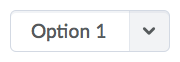
Selects:
HTML:
Option 1 Option 2SASS:
;// or... ; select Result:
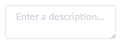
Textareas:
HTML:
SASS:
;// or... ; textarea Result:
Coding styles
See the VUI Best Practices & Style Guide for information on VUI naming conventions, plus information about the EditorConfig rules used in this repo.