wx-datetime-picker
基于微信小程序原生多列选择器的日期时间选择器,用于选择日期时间,支持同时选择日期和时间。
安装
npm
使用 npm 构建前,请先阅读微信官方的 npm 支持
# 通过 npm 安装
npm i wx-datetime-picker -S --production
构建 npm 包
打开微信开发者工具,点击 工具 -> 构建 npm,并勾选 使用 npm 模块 选项,构建完成后,即可引入组件。
使用
引入组件
在 app.json 中配置为全局引入
{
  "usingComponents": {
    "datetime-picker": "wx-datetime-picker/index"
  }
}
在 page.json 中配置为本页面使用
{
  "usingComponents": {
    "datetime-picker": "wx-datetime-picker/index"
  }
}
使用组件
<datetime-picker
  box-class="custom-class"
  min="{{min}}"
  max="{{max}}"
  fields="{{fields}}"
  value="{{value}}"
  disabled="{{disabled}}"
>
  <text>选择日期时间</text>
</datetime-picker>
示例
基础用法
<datetime-picker
  box-class="cell"
  value="{{value}}"
  bindchange="setValue"
>
  <view class="cell-title">选择日期时间</view>
  <view class="cell-value">{{value}}</view>
</datetime-picker>
禁用选择器
<datetime-picker
  box-class="cell"
  value="{{value}}"
  bindchange="setValue"
  disabled
>
  <view class="cell-title">选择日期时间</view>
  <view class="cell-value">{{value}}</view>
</datetime-picker>
自定义可选范围
<datetime-picker
  box-class="cell"
  min="{{min}}"
  max="{{max}}"
  value="{{value}}"
  bindchange="setValue"
>
  <view class="cell-title">选择日期时间</view>
  <view class="cell-value">{{value}}</view>
</datetime-picker>
选择 年-月-日
<datetime-picker
  box-class="cell"
  value="{{value}}"
  bindchange="setValue"
  fields="date"
>
  <view class="cell-title">选择 年-月-日</view>
  <view class="cell-value">{{value}}</view>
</datetime-picker>
选择 年-月
<datetime-picker
  box-class="cell"
  value="{{value}}"
  bindchange="setValue"
  fields="month"
>
  <view class="cell-title">选择 年-月</view>
  <view class="cell-value">{{value}}</view>
</datetime-picker>
选择 年-月-日 时
<datetime-picker
  box-class="cell"
  value="{{value}}"
  bindchange="setValue"
  fields="hour"
>
  <view class="cell-title">选择 年-月-日 时</view>
  <view class="cell-value">{{value}}</view>
</datetime-picker>
选择 年-月-日 时:分
<datetime-picker
  box-class="cell"
  value="{{value}}"
  bindchange="setValue"
  fields="minute"
>
  <view class="cell-title">选择 年-月-日 时:分</view>
  <view class="cell-value">{{value}}</view>
</datetime-picker>
嵌入式选择器
<datetime-picker
  box-class="picker"
  value="{{value}}"
  mode="picker-view"
  bindchange="setValue"
/>
API
参数
| 参数 | 类型 | 说明 | 默认值 |
|---|---|---|---|
mode |
'picker'|'picker-view' |
选择器表现方式 | picker |
min |
string |
表示有效日期时间范围的开始,任意合法 Date 字符串 | 1900-01-01 00:00:00 |
max |
string |
表示有效日期时间范围的结束,任意合法 Date 字符串 | 2099-12-31 23:59:59 |
value |
string |
表示选中的日期时间,任意合法 Date 字符串 | - |
fields |
'year'|'month'|'day'|'hour'|'minute'|'second' |
表示选择器的粒度 | minute |
disabled |
boolean |
是否禁用 | false |
headerText |
string |
选择器的标题,仅安卓可用 (仅 mode 为 picker 时生效) |
- |
事件
| 事件 | 说明 | 参数 |
|---|---|---|
column |
列改变时触发 (仅 mode 为 picker 时生效) |
改变的列和列的值 |
change |
value 改变时触发 change 事件 | 改变的值 |
cancel |
取消选择时触发 (仅 mode 为 picker 时生效) |
- |
外部样式类
| 类名 | 说明 |
|---|---|
box-class |
根节点样式类 |
indicator-class |
选择器中间选中框样式类 (仅 mode 为 picker-view 时生效) |
mask-class |
蒙层样式类 (仅 mode 为 picker-view 时生效) |
column-class |
选择器列样式类 (仅 mode 为 picker-view 时生效) |
unit-class |
选择器单元样式类 (仅 mode 为 picker-view 时生效) |
Demo
克隆本仓库,运行 npm i & npm run dev,将 miniprogram_dev 文件夹导入微信开发者工具。
效果预览
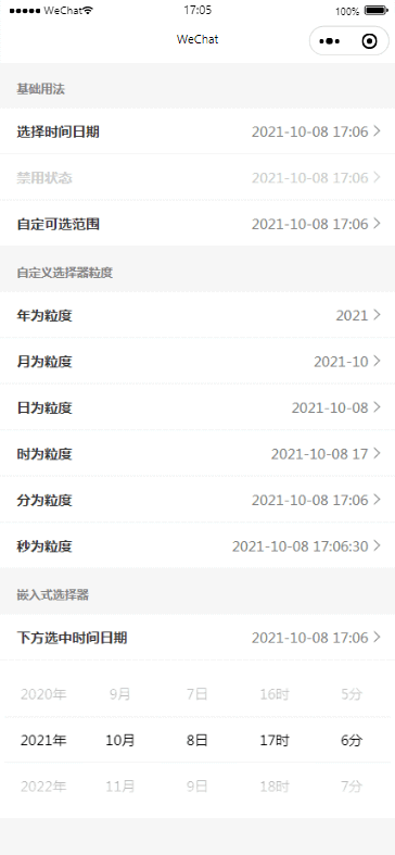
代码演示
<!-- index.html -->
<view class="container">
  <view class="label">基础用法</view>
  <datetime-picker
    box-class="cell"
    value="{{value}}"
    bindchange="setValue"
    data-field="value"
  >
    <view class="cell-title">选择时间日期</view>
    <view class="cell-value">{{value}}</view>
  </datetime-picker>
  <datetime-picker
    box-class="cell cell-disabled"
    value="{{now}}"
    bindchange="setValue"
    data-field="now"
    disabled
  >
    <view class="cell-title">禁用状态</view>
    <view class="cell-value">{{now}}</view>
  </datetime-picker>
  <datetime-picker
    box-class="cell"
    min="{{min}}"
    max="{{max}}"
    value="{{customize}}"
    bindchange="setValue"
    data-field="customize"
  >
    <view class="cell-title">自定可选范围</view>
    <view class="cell-value">{{customize}}</view>
  </datetime-picker>
  <view class="label">自定义选择器粒度</view>
  <datetime-picker
    box-class="cell"
    value="{{year}}"
    bindchange="setValue"
    data-field="year"
    fields="year"
  >
    <view class="cell-title">年为粒度</view>
    <view class="cell-value">{{year}}</view>
  </datetime-picker>
  <datetime-picker
    box-class="cell"
    value="{{month}}"
    bindchange="setValue"
    data-field="month"
    fields="month"
  >
    <view class="cell-title">月为粒度</view>
    <view class="cell-value">{{month}}</view>
  </datetime-picker>
  <datetime-picker
    box-class="cell"
    value="{{day}}"
    bindchange="setValue"
    data-field="day"
    fields="day"
  >
    <view class="cell-title">日为粒度</view>
    <view class="cell-value">{{day}}</view>
  </datetime-picker>
  <datetime-picker
    box-class="cell"
    value="{{hour}}"
    bindchange="setValue"
    data-field="hour"
    fields="hour"
  >
    <view class="cell-title">时为粒度</view>
    <view class="cell-value">{{hour}}</view>
  </datetime-picker>
  <datetime-picker
    box-class="cell"
    value="{{minute}}"
    bindchange="setValue"
    data-field="minute"
    fields="minute"
  >
    <view class="cell-title">分为粒度</view>
    <view class="cell-value">{{minute}}</view>
  </datetime-picker>
  <datetime-picker
    box-class="cell"
    value="{{second}}"
    bindchange="setValue"
    data-field="second"
    fields="second"
  >
    <view class="cell-title">秒为粒度</view>
    <view class="cell-value">{{second}}</view>
  </datetime-picker>
  <view class="label">嵌入式选择器</view>
  <view class="cell">
    <view class="cell-title">下方选中时间日期</view>
    <view class="cell-value">{{view}}</view>
  </view>
  <datetime-picker
    box-class="cell-picker"
    value="{{view}}"
    mode="picker-view"
    bindchange="setValue"
    data-field="view"
  />
</view>
/* index.js */
const formatNumber = (n) => (
n = n.toString(),
n[1] ? n : 0 + n
);
const now = new Date();
const nowYear = now.getFullYear();
const nowMonth = formatNumber(now.getMonth() + 1);
const nowDay = formatNumber(now.getDate());
const nowHour = formatNumber(now.getHours());
const nowMinute = formatNumber(now.getMinutes());
const nowSecond = formatNumber(now.getSeconds());
const nowDatetime = `${nowYear}-${nowMonth}-${nowDay} ${nowHour}:${nowMinute}:${nowSecond}`;
Page({
data: {
min: '2010-01-01 00:00:00',
max: '2030-12-31 23:59:59',
now: nowDatetime.slice(0, nowDatetime.lastIndexOf(':')),
value: nowDatetime.slice(0, nowDatetime.lastIndexOf(':')),
customize: nowDatetime.slice(0, nowDatetime.lastIndexOf(':')),
year: nowDatetime.slice(0, nowDatetime.indexOf('-')),
month: nowDatetime.slice(0, nowDatetime.lastIndexOf('-')),
date: nowDatetime.slice(0, nowDatetime.indexOf(' ')),
hour: nowDatetime.slice(0, nowDatetime.indexOf(':')),
minute: nowDatetime.slice(0, nowDatetime.lastIndexOf(':')),
second: nowDatetime,
view: nowDatetime.slice(0, nowDatetime.lastIndexOf(':')),
},
setValue(e) {
const { field } = e.currentTarget.dataset;
this.setData({
[`${field}`]: e.detail.value,
});
},
});